DPChallenge: A Digital Photography Contest You are not logged in. (log in or register
 
Challenge Entries
Portfolio Images
This image is not part of a public portfolio.
A Boys Life
A Boys Life
aurorab


Photograph Information Photographer's Comments
Challenge: From The Knees Down (Basic Editing)
Camera: Canon EOS-400D Rebel XTi
Lens: Canon EF-S 18-55mm f/3.5-5.6 IS
Location: Front Yard, Dallas Ga
Date: Oct 10, 2010
Aperture: 5.6
ISO: 400
Shutter: 1/60
Date Uploaded: Oct 10, 2010

it didnt take much convincing to get this little boy to get dirty. He had a blast which made taking the pictures fun for him. I jazzed up the saturation and contrast a bit but that is pretty buch it. No cropping.

Statistics
Place: 35 out of 83
Avg (all users): 5.6287
Avg (commenters): 6.6667
Avg (participants): 5.1500
Avg (non-participants): 5.7469
Views since voting: 685
Views during voting: 356
Votes: 202
Comments: 5
Favorites: 1 (view)


Please log in or register to add your comments!

AuthorThread
10/26/2010 08:48:09 AM
Hi Shannon, welcome to the Critique Zone!

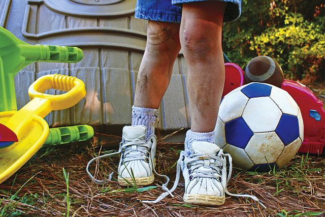
My initial take on this shot was that it is very cute, colourful and with plenty of interesting detail - and yet it only scored about an 'average' score. So why was that?

Technical: I'm guessing that light was a problem for you here - the slightly high ISO and the aperture still didn't really give you a particularly bright shot. With a stationary subject and an IS lens, I would drop the shutter to maybe 1/40 with those settings - or even 1/20 and make the aperture smaller (those kit lenses really aren't at their best wide open). It looks as if there is quite a bit of light, but you are taking it in a shadowed area - perhaps just move your 'set' into the light a bit more? Where you are, the natural light has given your model a really odd shadow just above the knee, which almost looks like an editing error.

Artistically: This is completely subjective, but... I don't think this is a time to break the rule of thirds, and I would pop the model a little further right to stop him being in the centre. There is also a lot going on in the background - I would think that the toys in the foreground would be enough, with just trees / bushes behind rather than the table (?) - this would also give it more contrast. On the other hand, the detail of the laces, the plaster etc on your model is excellent and makes the shot. It's all about balance!

PP: You mention upping the contrast - I don't know how you did this, but ideally I would use levels, or even better, curves. As it stands, the lack of direct light leaves the whole shot just a little gloomy and levels / curves can help with that.

In summary, it's a really cute shot, but the difference between good shots and great shots around here is all about getting the lighting right. I hope that helps!

Frank.
 Comments Made During the Challenge
10/18/2010 09:02:20 PM
Jeesh poor li'l feller! This looks like a card though...nice work! You should look into getting the book "Photographer's Market", comes out every January...can sell your pics there.
  Photographer found comment helpful.
10/18/2010 05:02:33 AM
Great title for this, well done 7
10/15/2010 05:56:01 PM
Oh my goodness. love this one. Take care bhabe.
10/14/2010 07:37:36 PM
I love the feel of this shot the colors pop and everthing from the untied shoes to the scars and bandaids screems boy.
  Photographer found comment helpful.


Home - Challenges - Community - League - Photos - Cameras - Lenses - Learn - Prints! - Help - Terms of Use - Privacy - Top ^
DPChallenge, and website content and design, Copyright © 2001-2024 Challenging Technologies, LLC.
All digital photo copyrights belong to the photographers and may not be used without permission.
Current Server Time: 04/24/2024 09:46:22 PM EDT.