DPChallenge: A Digital Photography Contest You are not logged in. (log in or register
 
Challenge Entries
Portfolio Images
This image is not part of a public portfolio.
She follows instructions
mundilitli


Photograph Information Photographer's Comments
Challenge: Henri Cartier-Bresson (Minimal Editing I)
Camera: Canon EOS-D60
Lens: Canon EF-S 15-85mm IS USM
Location: Gol, Norway
Date: May 26, 2011
Aperture: f/8.0
ISO: 500
Shutter: 1/80 sec.
Galleries: Candid, Black and White
Date Uploaded: May 26, 2011

Nothing to say, just a snapshot.
Rotated 90°
Resized

Statistics
Place: 90 out of 97
Avg (all users): 4.7532
Avg (commenters): 4.5000
Avg (participants): 4.5789
Avg (non-participants): 4.8515
Views since voting: 633
Views during voting: 341
Votes: 158
Comments: 3
Favorites: 0


Please log in or register to add your comments!

AuthorThread
06/08/2011 03:09:53 AM
Hi Arnmundur, welcome to the Critique Zone!

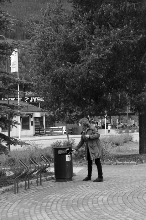
Firstly, I have to say that unlike the other commenters, I like this shot. It is something of a social commentary and I like the sense of solitude there. I definitely think that it was a shot worth taking but with 20/20 hindsight, I might have done it differently.

Technically: I think that the settings are fine, although an ISO of 500 seems a little high? I have also read that most DSLRs perform better at the 'standard' ISOs (100, 200, 400 etc) than the in between settings. The long DoF works really well here - this shot doesn't want a blurred background. It does need to be sharper though, there's no way around that.

PP: It's a minimal editing challenge, so tricky but this definitely needs some sharpening. For a minimal editing challenge, shooting in JPEG has to be the way forward to gain your camera's built in sharpening too. The black and white conversion is also a bit flat - again difficult to do anything about in this challenge, but to avoid editing, a filter (possibly blue for this shot?) might have added some depth to the contrasts.

Artistically: I can see the use of the rule of thirds, but only vertically. I would be tempted to place her less centrally on the horizontal as well. Also, the geometric pattern of the brickwork is quite interesting in a black and white shot - more so than the tree I think, so perhaps include more of that?

Overall, I think that the lack of sharpness and the DPC tendency to race through voting leave this shot a little under-rated. It is interesting and I encourage you to continue to develop this style.

Happy hunting!

Frank.
  Photographer found comment helpful.
 Comments Made During the Challenge
06/01/2011 08:06:39 PM
I don't understand why this might be interesting.
05/31/2011 01:04:06 AM
I see the resemblance in her stance to that of the "instructional placard" on the bin. But it's a bit too far away against a cluttered background to really stand out well, and other than being a great public service announcement, doesn't really strike me as a "keeper" per se.


Home - Challenges - Community - League - Photos - Cameras - Lenses - Learn - Prints! - Help - Terms of Use - Privacy - Top ^
DPChallenge, and website content and design, Copyright © 2001-2024 Challenging Technologies, LLC.
All digital photo copyrights belong to the photographers and may not be used without permission.
Current Server Time: 04/23/2024 03:37:13 AM EDT.