| Image |
Comment |
| 07/30/2004 05:32:15 PM |
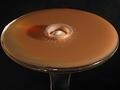
Primary Mergerby mcmurmaComment: This is an excellent abstract view of an every day object :) I love the color and contrast... great work :) = 10 |
 Photographer found comment helpful. Photographer found comment helpful. |
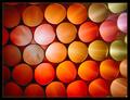
| 07/30/2004 02:14:46 AM |
Not to Be Administered Orallyby grigrigirlComment: I think this is a great idea and nicely composed as well. The post processing, for me, pushes it a bit beyond 'photography'. I'm starting to learn to accept that more these days, but I'm still a believer in DPChallenge as a site for 'photography' and this image speaks to me more as digital art than as photography due to the processing. I originally scored this image rather low because of that. After thinking about it a little more, I have changed my score to a 10. This is the first 'digital art' that I have scored a 10 also.
Great work :)
|
| Photographer found comment helpful. |
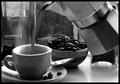
| 07/30/2004 02:06:17 AM |
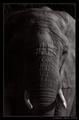
Early Morning Fuelby garlicComment: I love the smell of fresh brewed coffee. It's sorta strange because I don't care for the taste of it. This is an excellent black and white... nice work :) = 10 |
| Photographer found comment helpful. |
| 07/29/2004 07:34:36 PM |
|
| Photographer found comment helpful. |
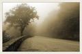
| 07/29/2004 06:51:52 PM |
The Treeby MaverickComment: This is a lovely composition. It reminds me almost exactly of a spot I pulled off the road on the Blue Ridge Parkway about a week ago as I was riding to Asheville, NC. I like the leading like created by the wall that takes me to the tree and back to the course of travel. The fog is beautiful. I love the way it interacts with landscapes in photography.
The sepia tone here bothers me slightly. In some way, it counters the effect of the fog. In general, when I think of fog, I think of cooler temperatures. The added warmth in the image with the sepia tone contradicts this feeling somewhat. If this was one of my own photos, I would have chosen the black and white route most likely and maybe added a very slight tint of blue to enhance the feeling of 'coolness' in this beautiful scene.
Beautiful photo :) |
| Photographer found comment helpful. |
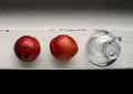
| 07/29/2004 06:43:41 PM |
On the Window Sillby adineComment: There is much beauty in simplicity. I like this image quite a bit. The negative space at the bottom is something I can't really determine how much I like. I can't seem to put a value on its purpose other than balancing the composition to a centered view across the horizontal. The image seems to wlrk well with that part cut out also. Either way, I like it.... very nice work :) |
| Photographer found comment helpful. |
| 07/29/2004 01:06:41 PM |
|
| Photographer found comment helpful. |
| 07/28/2004 11:25:10 AM |
|
| Photographer found comment helpful. |
| 07/28/2004 11:08:16 AM |
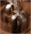
Chocolate Whirlby boomerComment: Greetings....
I didn't get to comment during the challenge, but this was my favorite photo in the chocolate competition. Excellent work :) |
| Photographer found comment helpful. |
| 07/27/2004 10:21:05 PM |
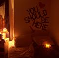
You Should Be Hereby cinamnshortcakeComment: Greetings from the Critique Club...
Hi Sarah...
I don't believe I have had the pleasure of commenting/critiquing any of your work before...
This image fits the challenge. The score you received shows a below average result overall. I believe that your score probably reflects the overall 'quality' of the photograph for the most part. Unfortunately, here at DPChallenge, the general populous prefers crisp and clean images. They don't really look beyond that to examine your idea and your thought process as much. This is an unfortunate fact though. Sad but true.
As I looked at your profile and noticed that you are a 16 year old female, I can see the relevance of this photograph quite easily. That information, however, is not avialable to the challenge voter. Since it is early in your 'career' here at DPChallenge, I will give you a couple suggestions that will help improve your scores.
1. Strive for crisp and clean photographs. If your camera struggles with this concept, use a tripod ALWAYS.
2. Never use your flash as a light source for a photograph.
3. Simplify your 'subject' and fill the frame with it.
Cheers and good luck :)
John Setzler
|
| Photographer found comment helpful. |
Home -
Challenges -
Community -
League -
Photos -
Cameras -
Lenses -
Learn -
Help -
Terms of Use -
Privacy -
Top ^
DPChallenge, and website content and design, Copyright © 2001-2026 Challenging Technologies, LLC.
All digital photo copyrights belong to the photographers and may not be used without permission.
Current Server Time: 06/14/2026 05:14:42 AM EDT.