| Image |
Comment |
| 05/21/2002 07:34:00 PM |
|
 Photographer found comment helpful. Photographer found comment helpful. |
| 05/20/2002 10:07:00 AM |
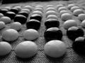
Solitareby PaulinaRDComment: I like to play solitaire too! I am asking myself why you may have chosen to clip the cards on each edge of this frame... I think I would like either a tighter view showing less cards or a wider view showing all the cards rather than losing someting on each edge of the frame... Nice shot! |
| 05/20/2002 10:11:00 AM |
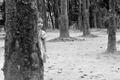
Hide 'n' Peekby iraeComment: This is a really nice photo.. I like the look on the girl's face :) I personally believe that a vertical crop on this shot would bring the hiding girl in as a larger part of the image... it's just personal preference though... good job! |
| 05/20/2002 10:04:00 AM |
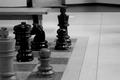
Chess showdown at the mall.by tydComment: This is an interesting photograph... I like black and whites. I am asking myself why you may have chosen to have the chess pieces only on the left side of the photograph. Did you consider taking a photo of the entire board? The bench in the background indicates to me that these are rather large chess pieces! Do people actually play chess on this set? I think I would have liked to see this shot with more chess pieces in the photo and less empty space on the right... Good job! |
| 05/21/2002 07:53:00 PM |
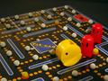
Pac Attackby MaverickComment: Good shot! I didn't even know that there was a board game version of pac man! |
| Photographer found comment helpful. |
| 05/21/2002 05:09:00 PM |
Ancient Atariby svaledaComment: I like the lighting and shadows in this photo but I have no clue what this game is... |
| 05/20/2002 02:25:00 PM |
Sin Is Inby ReubenComment: This is a good photo. I don't like the shadow in the foreground because it is coming from something that is not in the photo... Maybe your camera or someone standing in the light.... |
| Photographer found comment helpful. |
| 05/21/2002 05:06:00 PM |
Passing Go!by Susan2736Comment: I like your composition on this photo... Interesting lighting as well :) |
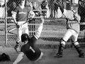
| 05/21/2002 05:24:00 PM |
One Steals Homeby cthenkComment: Very nice capture... This is an excellent photo for this challenge... I don't like the batter's head being clipped off but I know these types of shots are spur of the moment.. you don't have much time to think about framing and composition... good job! |
| 05/22/2002 09:55:00 AM |
Roll them bonesby daclozerComment: Nice composition! I like your layout here... I think the lighting may be just a touch on the bright side, but its a good shot! nice job! |
Home -
Challenges -
Community -
League -
Photos -
Cameras -
Lenses -
Learn -
Help -
Terms of Use -
Privacy -
Top ^
DPChallenge, and website content and design, Copyright © 2001-2026 Challenging Technologies, LLC.
All digital photo copyrights belong to the photographers and may not be used without permission.
Current Server Time: 06/14/2026 07:04:31 PM EDT.