| Image |
Comment |
| 08/23/2004 12:25:36 AM |
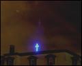
Defeatby moviemanComment: This is a neat high key concept. However, the high key nature of it seems to be contradictory to the theme of the shot. "Defeat" or despair... death... depression... whatever may be implied here is normally associated with negativity and darkness. Just something to think about when you are promoting an idea :) If the elements of the composition are supportive of that theme rather than contradictory, your idea may be better received.... |
 Photographer found comment helpful. Photographer found comment helpful. |
| 08/18/2004 11:33:33 PM |
|
| 08/18/2004 12:28:29 AM |
Not an Open Signby KolyaComment: This is a great shot.... I wish you had thought about the title a little more :) |
| Photographer found comment helpful. |
| 08/18/2004 12:27:20 AM |
Big Al'sby wahsabiComment: :O
I hate to admit that I have seen this sign before ;) |
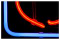
| 08/18/2004 12:26:20 AM |
Neon Gothicby melismaticaComment: This is incredible... i'll try to come back later and comment on this more :) |
| Photographer found comment helpful. |
| 08/18/2004 12:21:31 AM |
|
| Photographer found comment helpful. |
| 08/18/2004 12:16:17 AM |
|
| 08/18/2004 12:14:46 AM |
sure i'll drink......you firstby mrsamsaComment: too much negative space.... I don't feel like its adding anything to this image... the interest is in the color and shape rather than the emptiness.... |
| Photographer found comment helpful. |
| 08/18/2004 12:13:52 AM |
Neon Pensby GinaRothfelsComment: Interesting idea and composition... I can't see any advantage of not having the entire image in nice sharp focus.... |
| Photographer found comment helpful. |
| 08/18/2004 12:10:31 AM |
|
| Photographer found comment helpful. |
Home -
Challenges -
Community -
League -
Photos -
Cameras -
Lenses -
Learn -
Help -
Terms of Use -
Privacy -
Top ^
DPChallenge, and website content and design, Copyright © 2001-2026 Challenging Technologies, LLC.
All digital photo copyrights belong to the photographers and may not be used without permission.
Current Server Time: 06/14/2026 05:14:37 AM EDT.