| Image |
Comment |
| 08/26/2002 04:57:00 PM |
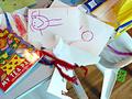
drawing timeby stormbikesComment: This is an interesting concept of childhood... The light glare on the book is slightly distracting, but not much. The overall image is just a bit 'busy' for my personal taste. The image may have had more overall impact if there was some central point of interest :) - jmsetzler |
| 08/27/2002 05:06:00 PM |
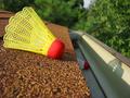
Not Again...by alanfreedComment: You must be a member of the "Frisbeetarianism" religion... Frisbeetarinaiasts believe that when you die, your soul leaves your body and gets stuck up on the roof :) Excellent shot... = 8 - jmsetzler |
 Photographer found comment helpful. Photographer found comment helpful. |
| 08/28/2002 01:14:00 PM |
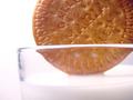
Milk and Cookiesby rdesaiComment: Excellent :) This is a great shot that fits 'childhood' very well... It also makes me hungry :) = 9 - jmsetzler |
| 08/30/2002 08:55:00 AM |
Rubber Ducky, You're the One!by karmatComment: I never had a rubber duckie when i was a kid :( I did have lots of toy cars and boats for the tub though... excellent shot :) = 9 - jmsetzler |
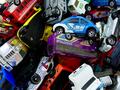
| 08/28/2002 02:54:00 PM |
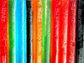
Flavor Ice!by jdincolspringsComment: This reminds me of the tv station sign off screen where they play the national anthem late at night :) - jmsetzler |
| 08/28/2002 06:23:00 PM |
|
| Photographer found comment helpful. |
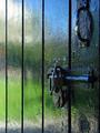
| 08/27/2002 04:52:00 PM |
shed doorby grahamgormanComment: This is a very nice photo. I love the way the green and blue reflections play off the black paint. I'm glad this didn't go black and white, even though it probably looks good that way too :) Kids are fascinated with things and places that they don't have access to. This is an excellent representation of that as well... I wonder if you took any closeup photos of that old lock? That lock carries quite a bit of intrigue for me on its own... great shot = 9 - jmsetzler |
| 08/27/2002 11:45:00 AM |
Please, please, mom!by Pep VentosaComment: I was one of those kids that was dragged screaming from the toy store :) I, too many times, got my 'reprimand' right there in front of God and everyone :) Good shot... - jmsetzler |
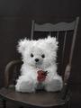
| 08/28/2002 12:11:00 PM |
With love from Grandma, on my 4th.by HBunchComment: THIS is my favorite photo this week. I fell in love with it as soon as I saw it. I have waited to comment so I could see if the effect of the image would be a lasting one... I love the 'cool' tone of this image. Thee are no harsh colors and the bear just contrasts beautifully with the rest of the image. You have also chosen a great composition by having the bear angled in the chair instead of head on :) The little bit of red from the flowers offers a very nice bit of extra contrast and 'eye candy' in this image. This photo speaks volumes about childhood! Now... critique... I feel fairly confident that you will get several comments about the background. The cloth is showing some creases that some will claim to be distracting. These don't 'distract' me, but they are noticeable. The almost give me the impression that it's a black wall behind the chair rather than a backdrop. If someone tells you that the background is 'distracting', I think they are looking for issues rather than letting the overall impact of the image 'absorb' into their system :) Flaws in a photograph that are insignificant don't bother me at all. The flaw has to stand out really painfully or create some other problem before I could call it distracting :) Great shot... I look forward to adding this one to my favorites list on Monday :) I really hope that I see this one on the main page with a blue ribbon on Monday too :) = 10 - jmsetzler |
| Photographer found comment helpful. |
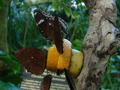
| 08/26/2002 01:21:00 AM |
Eat and Flyby gcosueComment: This is a neat photo... I'm struggling to see the 'childhood' aspect of it though... Maybe a childhood fascination wtih butterflies? - jmsetzler |
Home -
Challenges -
Community -
League -
Photos -
Cameras -
Lenses -
Learn -
Help -
Terms of Use -
Privacy -
Top ^
DPChallenge, and website content and design, Copyright © 2001-2026 Challenging Technologies, LLC.
All digital photo copyrights belong to the photographers and may not be used without permission.
Current Server Time: 06/23/2026 09:51:03 PM EDT.