| Image |
Comment |
| 04/30/2003 08:29:49 AM |
Public Transportby LarsPaysenComment: This is a great shot... the camera angle and the motion blur are very effective. The lighting on the train is also excellent... This looks like it could be an ad for The Wall Street Journal or something :) This could be some stock broker on his way to the daily grind... excellent work... = 10 - setzler |
 Photographer found comment helpful. Photographer found comment helpful. |
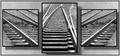
| 04/29/2003 01:04:06 PM |
On Trackby CLarson557Comment: I definitely like railroad theme photos :) This one is quite interesting as well... they layout is nice and the lines all seem to work nicely together... excellent work :) - setzler |
| Photographer found comment helpful. |
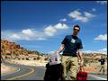
| 04/29/2003 09:43:51 AM |
Lone Travellerby SharQComment: I understand your dual image concept here, but this doesn't seem to fit the di/triptych theme for me... - setzler |
| 04/29/2003 09:42:33 AM |
Alishaby sherryk471Comment: this is a nice composition of portraits... i can't judge it as photography though... - setzler |
| Photographer found comment helpful. |
| 04/29/2003 09:32:54 AM |
sundown on the ridgeby billsweeneyjrComment: Greetings from the Critique Club :)
Hi Bill...
Meeting the challenge:
Definitely... sunrise/sunsets often show very beautiful elements of weather like cloud formations and nice atmospheric colors. Interestingly enough, pollution helps create some interesting sunrises and sunsets also :)
Emotional/Artistic Impact:
I think your color in this photo is probably the key. The blue and pink hues in the sky are saturated nicely and create a lot of color interest for me. I believe it needs some extras to improve this area and I will mention those in the Composition comments...
Composition:
I think this photo could be stronger it two ways. 1 - there is nothing interesting in the foreground. I would have possibly framed this differently to cut out some of the foreground and include more sky. I would have probably included MORE of the telephone poles and wires on the right to create somethign of interest in the image besides the color. The horizon itself doesn't offer any particularly interesting shapes and contrasts in the image, so these poles could offer that extra 'rural' element that could make this photo stronger in the long run.
Technical:
I don't see anything to comment on here for the technical aspects of the photo. The exposure looks good and the color saturation is fine as well. There is good sharpness and the overall image definition is fine...
Keep up the good work :)
John Setzler
|
| 04/29/2003 08:37:19 AM |
circle of zen by magnetic9999Comment: This composition is quite intriguing :) I think the creative lighting couples very nicely with the 'zen' mystique.
"Ah Cuckoo! My Impermanence! Deepen Thou My Solitude!" :) - Basho (I Think) |
| Photographer found comment helpful. |
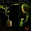
| 04/29/2003 08:30:39 AM |
Day's Endby welcherComment: I particularly like the center image in this series... the top and bottom images don't seem to 'flow' very well with the series for some reason... - setzler |
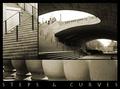
| 04/29/2003 08:28:36 AM |
Downtownby ursulaComment: I love good architectural photos and these are no exception. The toning you chose seems to add a nice mood to the lines and curves as well. The only possible improvement I can see would possibly to add a little more spacing between the photos to create a stronger definition between each... nice work :) - setzler |
| Photographer found comment helpful. |
| 04/28/2003 06:24:48 PM |
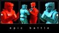
ROCKem SOCKemby scab-labComment: Excellent composition on this series.. The strong color really makes this image stand out nicely :) I have one of these but it's just an old and tattered relic of my childhood now... great shot :) - setzler |
| Photographer found comment helpful. |
| 04/28/2003 06:23:32 PM |
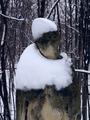
Sad angelby websterComment: Greetings from the Critique Club :)
Hi Webster...
Meetin the Challenge:
Without a doubt... snow is definitely weather :)
Artistic/Emotional Impact:
I think this photo is a little lacking in this area. From this particular perspective, It's really difficult to tell what I am looking at, therefore, the image takes on an abstract meaning of nothing more than lines, shapes and color. The color is flat and not really an integral part of this image for me.
Composition:
The composition seems to be ok, but maybe a different perspective would greatly enhance this image rather than a simple straight on view of the subject. Maybe a different time of day would also cast some shadows and bring out some detail with some different lighting across the image...
Technical:
The image feels a little soft. When I think of cold and winter, I think that crisp focus works very well...
John Setzler
|
Home -
Challenges -
Community -
League -
Photos -
Cameras -
Lenses -
Learn -
Help -
Terms of Use -
Privacy -
Top ^
DPChallenge, and website content and design, Copyright © 2001-2026 Challenging Technologies, LLC.
All digital photo copyrights belong to the photographers and may not be used without permission.
Current Server Time: 06/24/2026 06:29:02 PM EDT.