| Author | Thread |
|
|
04/29/2003 09:32:54 AM |
Greetings from the Critique Club :)
Hi Bill...
Meeting the challenge:
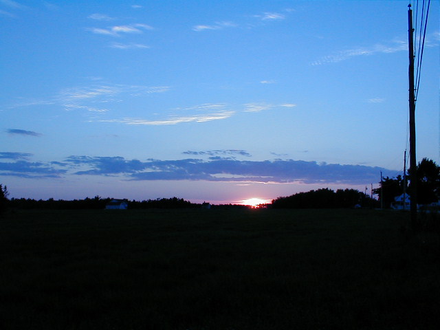
Definitely... sunrise/sunsets often show very beautiful elements of weather like cloud formations and nice atmospheric colors. Interestingly enough, pollution helps create some interesting sunrises and sunsets also :)
Emotional/Artistic Impact:
I think your color in this photo is probably the key. The blue and pink hues in the sky are saturated nicely and create a lot of color interest for me. I believe it needs some extras to improve this area and I will mention those in the Composition comments...
Composition:
I think this photo could be stronger it two ways. 1 - there is nothing interesting in the foreground. I would have possibly framed this differently to cut out some of the foreground and include more sky. I would have probably included MORE of the telephone poles and wires on the right to create somethign of interest in the image besides the color. The horizon itself doesn't offer any particularly interesting shapes and contrasts in the image, so these poles could offer that extra 'rural' element that could make this photo stronger in the long run.
Technical:
I don't see anything to comment on here for the technical aspects of the photo. The exposure looks good and the color saturation is fine as well. There is good sharpness and the overall image definition is fine...
Keep up the good work :)
John Setzler
|
|
Comments Made During the Challenge  |
|
|
04/20/2003 12:20:41 PM |
|
telephone poles are distracting on the right edge. Not much to hold interest in the image not enough color, clouds(weather) and the dark nothing of the siloute area is not interesting either. Good concept, try again.... |
|
|
|
04/17/2003 05:39:22 AM |
|
Very good image, although I would have prefered less darkness at the bottom and more sky. |
|
|
|
04/17/2003 12:54:33 AM |
|
Nice photo -- I think it might be a bit more effective, though, if you cropped out some of the black in the foreground so that the setting (rising?) sun had more focus. |
|
|
|
04/15/2003 03:48:38 PM |
|
Cropping out most of the ground plus the pole on the right would've made it a bit better. |
|
|
|
04/15/2003 02:40:24 PM |
|
Wow, what colours. I think if you moved the horizon the the lower third and cut out the first telephone pole it would look all that much better. |
|
|
|
04/14/2003 02:08:58 PM |
|
I like the lighting in this photo. |
|
Home -
Challenges -
Community -
League -
Photos -
Cameras -
Lenses -
Learn -
Help -
Terms of Use -
Privacy -
Top ^
DPChallenge, and website content and design, Copyright © 2001-2026 Challenging Technologies, LLC.
All digital photo copyrights belong to the photographers and may not be used without permission.
Current Server Time: 06/28/2026 04:47:42 AM EDT.