| Author | Thread |
|
|
11/13/2005 08:51:42 AM |
|
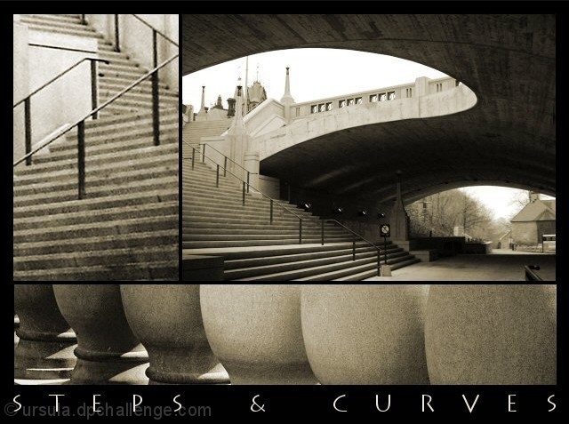
Really well done. Each photo is very good by itself, and the composition of the three photos put together works very well, too. |
|
 Photographer found comment helpful. Photographer found comment helpful. |
|
|
12/25/2003 11:36:32 PM |
|
I'm really drawn to this image collection. Even the font choice is bang on. Lovely stuff. |
|
| Photographer found comment helpful. |
Comments Made During the Challenge  |
|
|
05/04/2003 11:35:14 PM |
|
outstanding image. If I had one nit to pick it would be that the first set of stairs was a bit grainy in relation to the rest of the image. Still a 10, though. Great work! |
|
| Photographer found comment helpful. |
|
|
05/04/2003 11:34:31 PM |
|
I really love this one. Good architectural studies are fascinating, and hard to do, at least for me. This one is great. The only small complaint is the stairs. They seem a bit soft, or out of focus. |
|
| Photographer found comment helpful. |
|
|
05/04/2003 10:14:23 PM |
|
This is a nice piece to look at because of the contrast in images, tone and angles. The steps on the left upper pic look a tiny bit soft, or it could just be me. Good job. 9 |
|
| Photographer found comment helpful. |
|
|
05/04/2003 03:08:59 AM |
|
The top left image looks over cropped (blurry, low resolution). The top left, and bottom images are somewhat interesting, although not particularly drawing. However, the top right image is excelent. The curves and lines work quite effectively in it, and I think it would be better as a stand alone image than this is as a multi-image. |
|
| Photographer found comment helpful. |
|
|
05/04/2003 02:23:27 AM |
|
Nice but spoiled by the text. |
|
| Photographer found comment helpful. |
|
|
05/03/2003 12:36:08 PM |
|
A clean, unostentatious re-presentation of shapes, presenting a fresh consideration through simple juxtaposition, gentle use of sepia tone that lends itself to the urban. |
|
| Photographer found comment helpful. |
|
|
05/02/2003 01:58:40 PM |
the textures and color tones are beautifull :)
very well put together and this would make for a beautiful print. |
|
| Photographer found comment helpful. |
|
|
04/30/2003 12:43:08 PM |
|
Love those serpentine shapes! Top right is my favorite in this composition. |
|
| Photographer found comment helpful. |
|
|
04/30/2003 10:11:00 AM |
|
Very nice way to document a place, well cropped set of shapes. There is something that bothers me with the framing, perhaps the inner strips are too thin or the outer ones are to thick (?) The caption seems a little redundant, what we are seeing, you've made it pretty clear; the name of the city or bridge would have been an added value. 9 |
|
| Photographer found comment helpful. |
|
|
04/30/2003 06:48:53 AM |
|
Wonderful montage. The graininess does wonders to this image and the sepia toning is bang on. |
|
| Photographer found comment helpful. |
|
|
04/29/2003 09:53:29 PM |
|
| Photographer found comment helpful. |
|
|
04/29/2003 12:27:26 PM |
|
Some nice geometry, and monochrome was a good choice. |
|
| Photographer found comment helpful. |
|
|
04/29/2003 08:28:36 AM |
|
I love good architectural photos and these are no exception. The toning you chose seems to add a nice mood to the lines and curves as well. The only possible improvement I can see would possibly to add a little more spacing between the photos to create a stronger definition between each... nice work :) - setzler |
|
| Photographer found comment helpful. |
|
|
04/29/2003 06:00:06 AM |
|
Wow, very nice work! The steps in the upper left picture could be a bit sharper/in focus in my opinion, but otherwise I love it //9// |
|
| Photographer found comment helpful. |
|
|
04/29/2003 12:57:05 AM |
|
I love the tones you chose. Very interesting. I like it. Vote 9 |
|
| Photographer found comment helpful. |
|
|
04/29/2003 12:12:47 AM |
|
Beautiful. I love the textures and mix of lines. The sepia tone is perfect also. |
|
| Photographer found comment helpful. |
|
|
04/28/2003 09:02:31 PM |
|
Exellent text, composition, curves....love the look, feel, coloring. My top three. |
|
| Photographer found comment helpful. |
|
|
04/28/2003 01:41:19 PM |
|
Excellent! This is what I like! I might have emphasized the boarders a little more though |
|
| Photographer found comment helpful. |
|
|
04/28/2003 12:29:20 PM |
|
Curves are especially nice! Steps are a bit grainy and out of focus. Nice "through line" and composition. |
|
| Photographer found comment helpful. |
|
|
04/28/2003 12:04:12 PM |
|
Great images! I really like the forms and lines you've captured. I think this composite needs thicker black borders between the images. |
|
| Photographer found comment helpful. |
|
|
04/28/2003 11:05:59 AM |
|
I love the large shot on the top right! The close up of the steps look fuzzy and takes away from the rest of the shot. well composed and nice lettering/font. |
|
| Photographer found comment helpful. |
|
|
04/28/2003 10:09:25 AM |
|
I love this. All three are great compositions and your choice of putting them together is perfect. Sepia is good and the text too. My top favourite this week. Well done and good luck! |
|
| Photographer found comment helpful. |
|
|
04/28/2003 10:01:42 AM |
|
Good layout. Really moves the eye through the image nicely. |
|
| Photographer found comment helpful. |
|
|
04/28/2003 01:56:53 AM |
|
I had an idea to go with an archtectural poster type of thing, but ended up doing something else...I checkened-out of putting a title on mine too, but I'm glad you added your's. Only tiny thing I could suggest would be to make the upper-right photo a little larger, crop some of the result on the top and right, and have that upper "swoop" come close to the angle of the bannister, and lose all or most of the house through the tunnel, which I think is a little distraction. |
|
| Photographer found comment helpful. |
|
|
04/28/2003 01:40:44 AM |
|
| Photographer found comment helpful. |
|
|
04/28/2003 12:23:03 AM |
|
This is wonderful , the composition is beautiful and has a strong impact, I love the curves. The only nit-pick is that the top left image seems a little too grainy. Good Luck!9 |
|
| Photographer found comment helpful. |
Home -
Challenges -
Community -
League -
Photos -
Cameras -
Lenses -
Learn -
Help -
Terms of Use -
Privacy -
Top ^
DPChallenge, and website content and design, Copyright © 2001-2026 Challenging Technologies, LLC.
All digital photo copyrights belong to the photographers and may not be used without permission.
Current Server Time: 06/27/2026 09:49:26 AM EDT.