| Image |
Comment |
| 05/19/2003 07:53:20 AM |
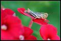
Spring Feverby severinComment: very nice work with the shallow depth of field... I think the only real improvement that this image could use would be more light on the leaves... the dark leaves don't really suppor the theme of complementary colors as well as they could. Complementary colors usually offer a very strong contrast... = 5 |
 Photographer found comment helpful. Photographer found comment helpful. |
| 05/19/2003 07:51:06 AM |
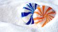
The Birth of Envyby harveymorrisComment: interesting abstract and excellent use of complementary colors. it looks like some sort of modern art painting to me... I like the simple elegance in this image... The title leaves me with questions... = 7 |
| Photographer found comment helpful. |
| 05/19/2003 07:48:45 AM |
Phloxby GordonComment: excellent use of shallow depth of field... the complementary colors theme is strong as well. this particular view has a nice surreal feeling to it with the thin plane of focus. = 8 |
| 05/19/2003 07:46:20 AM |
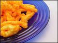
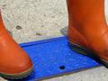
Cheesy and Crunchy - Orange on Blueby StevePaxComment: very nicely done... this is a strong composition and the complementary colors are very powerful in this image... It looks like a good product photo as well... makes me hungry :) = 7 |
| Photographer found comment helpful. |
| 05/19/2003 07:42:53 AM |
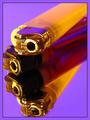
Yellow and Purpleby CLarson557Comment: excellent use of complementary colors... This photo also offers some intrigue for how it was done :) The exposure on this one seems a little hot overall. The yellow cast on the chrome elements of the lighter seem to be working with the color theme... = 6 |
| Photographer found comment helpful. |
| 05/19/2003 06:36:12 AM |
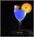
A Good Mixby RuchartComment: This is an excellent attepmt at this shot... I know how difficult this one is. The lighting is just a tad harsh which creates the hot spot on the right side of the glass and the stem... I believe that the reflections on the glass have to be perfect in a shot like this. The angle of the backlighting is letting your orange reflect on the top of the glass as well... These glass reflections need to be a bit more subtle in my opinion... excellent attempt :) = 6 |
| Photographer found comment helpful. |
| 05/19/2003 12:50:19 AM |
|
| Photographer found comment helpful. |
| 05/19/2003 12:42:48 AM |
Spooning Candiesby BigSmilesComment: good use of complementary color... the theme works well. I believe the depth of field is a bit too shallow for this particular shot. I can't see any purpose in the blue candy being soft in this shot... the sugar also has quite a few hot spots in it... maybe the shot is just a tad over exposed... = 5 |
| Photographer found comment helpful. |
| 05/19/2003 12:40:31 AM |
Complimentary Jacks Awayby RLSComment: I think the sky reflection is probably hurting this shot more than anything... the blue is a bit too dark for my taste and the reds are quite hot... my sony has trouble with reds in sunlight... maybe this is a sony shot... :) = 5 |
| Photographer found comment helpful. |
| 05/19/2003 12:39:23 AM |
complementary colors' encounterby kenboComment: complementary colors are visible... this shot just seems uninteresting to me though... it's a good non literal representation of your idea though... = 4 |
| Photographer found comment helpful. |
Home -
Challenges -
Community -
League -
Photos -
Cameras -
Lenses -
Learn -
Help -
Terms of Use -
Privacy -
Top ^
DPChallenge, and website content and design, Copyright © 2001-2026 Challenging Technologies, LLC.
All digital photo copyrights belong to the photographers and may not be used without permission.
Current Server Time: 06/22/2026 09:11:00 PM EDT.