| Author | Thread |
|
|
05/30/2003 12:49:09 AM |
*Critique Club*
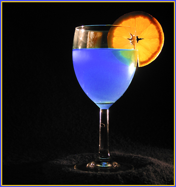
Nice ATTEMPT? I like how everyone assumes you were trying to "copy" something. I know the shot they're thinking of, but I've never really looked closely at it, so I wont be comparing you to him, nor this shot to that shot.
I do want to say that the ONLY thing that really bothers me at all about this shot are the light glare and the reflection of the orange on the left side of the glass. The glare on the right side below the orange does not bother me, and I actually like it.
I guess I do also wonder if a bit more black space would be better to the left. Either that, or center the subject dead on. It's not off center enough in this frame to really create a dramatic use of neg. space.
Otherwise, I love the colors. They stand out very nicely on the background, and are quite strong and vivid.
Your focus and clarity are great. I almost wanted to say that I wish the orange were a bit more clear, however, I like the darkness on it, and I don't think it would be easy at all to achieve both.
I also like how we are not looking straight on at the glass, but at an angle slightly.
Really nice. Love that color blue.
~Heather~ |
|
 Photographer found comment helpful. Photographer found comment helpful. |
Comments Made During the Challenge  |
|
|
05/25/2003 11:49:15 PM |
|
a little more contrast helps to hide the texture of the fabric... which I think would help the shot... great color though |
|
|
|
05/24/2003 11:20:25 PM |
|
Lighting is nice, but perhaps a bit too strong on the fruit. |
|
|
|
05/23/2003 10:33:36 PM |
|
I love the color of the liquid and the orange. I don't like the light on the material below the glass-it gives to much attention to it. There is also too much going on on the left top of the glass. I would also try centering the glass or lining it up on the 2/3 line with the orange on the inside. This might balance the photo better. |
|
| Photographer found comment helpful. |
|
|
05/23/2003 02:58:25 PM |
|
Nice set up. I don't think the choice of border was all that necessary but the picture works well overall. |
|
|
|
05/23/2003 03:02:45 AM |
First impression:
Glass filled with blue liquid, I can’t make out if it is an actual drink or not.
The photo meets the challenge with the two colors, blue/orange. Colors are good.
A different border may be needed or none at all.
I think a typical border is larger on the outside and small on the inside. That would have work better for me.
Lighting may need to be diffused. By doing this, you will get less glare on the glass and there will be less highlights on material under glass.
I would have like to see the focus closer to the orange slice.
=5 |
|
|
|
05/22/2003 11:27:52 PM |
|
I like this photo, the colours stand out well, but i think that the glass could have been cleaned better, it looks a bit dirty this way, but i like the lighting, = 7 |
|
| Photographer found comment helpful. |
|
|
05/22/2003 11:25:24 PM |
|
nice lighting. well done! |
|
| Photographer found comment helpful. |
|
|
05/22/2003 10:31:25 PM |
|
I can't put my finger on it, but the lighting is a little wrong. The colors are good, but the orange would look better with more light behind it. |
|
| Photographer found comment helpful. |
|
|
05/22/2003 07:39:30 PM |
Blue Curacao, by any chance?
Very nice, and something I haven't seen yet this round. I like choice of light direction as well; it nicely higlights the colours without introducing any real distraction. |
|
| Photographer found comment helpful. |
|
|
05/22/2003 09:14:54 AM |
|
i like the way the blue liquid glows, but note the deformity on the leg of the glass. |
|
| Photographer found comment helpful. |
|
|
05/21/2003 01:53:11 PM |
|
Nice set up, but the space on the left is a bit too much, I think. There is not enough of it to be effective negative space, but there is enough to make it feel unbalanced. |
|
| Photographer found comment helpful. |
|
|
05/21/2003 09:52:41 AM |
|
Nice contrast,better if you moved glass on left side more 8 from me! |
|
| Photographer found comment helpful. |
|
|
05/20/2003 06:35:01 PM |
|
Great color and composition |
|
| Photographer found comment helpful. |
|
|
05/20/2003 09:20:57 AM |
|
seen this too many times, fairly well done, but do something new!!! |
|
|
|
05/19/2003 08:17:42 PM |
|
Very neat. A few suggestions/nitpicks.. the glare on the glass is pretty distracting as is that curly thing (a hair?) on the stem of the glass and the lighter shade on the right side of the image. I would have tried illuminating the base a little bit more to bring out its shape. Overall it's very well done and I like the glowing blue. 7 |
|
| Photographer found comment helpful. |
|
|
05/19/2003 07:18:15 PM |
|
a hard shot to light well and you've made a good attempt. The specular highlights on the left of the glass don't add much - often glass is better to light from behind and let the light shine towards the camera - perhaps from a bright background with the light shining on it. |
|
| Photographer found comment helpful. |
|
|
05/19/2003 05:42:51 PM |
|
nice shootin' good colors and light. |
|
| Photographer found comment helpful. |
|
|
05/19/2003 03:42:30 PM |
|
All the black space is distracting. I know you're using the rule of thirds, but perhaps you could adjust the headspace a little, crop the left side, and make the orange appear in the top right third? |
|
|
|
05/19/2003 10:10:02 AM |
|
too much glare. the composition is very well done. the colors of the citrus aren't completely washed out. backlighting this as in other examples on the site would have been better...6 |
|
| Photographer found comment helpful. |
|
|
05/19/2003 06:36:12 AM |
|
This is an excellent attepmt at this shot... I know how difficult this one is. The lighting is just a tad harsh which creates the hot spot on the right side of the glass and the stem... I believe that the reflections on the glass have to be perfect in a shot like this. The angle of the backlighting is letting your orange reflect on the top of the glass as well... These glass reflections need to be a bit more subtle in my opinion... excellent attempt :) = 6 |
|
| Photographer found comment helpful. |
Home -
Challenges -
Community -
League -
Photos -
Cameras -
Lenses -
Learn -
Help -
Terms of Use -
Privacy -
Top ^
DPChallenge, and website content and design, Copyright © 2001-2026 Challenging Technologies, LLC.
All digital photo copyrights belong to the photographers and may not be used without permission.
Current Server Time: 06/28/2026 02:33:21 AM EDT.