| Image |
Comment |
| 02/09/2004 06:43:38 PM |
Tax Time is Hereby smellyfish1002Comment: This is a good example of 'extreme' shallow depth of field. I think it is extreme to the point (no pun intended) where the subject loses out to 'technique'. This is a good demonstration of the technique, but the photo itself doesn't seem to have much impact other than that. |
| 02/09/2004 06:24:18 PM |
Red Roseby neenee1999Comment: The 'red' saturation in this photo feels a bit harsh for me. Shallow depth of field works ok, but the parts of your image that are out of field are insignificant and don't support your subject with much strength. |
 Photographer found comment helpful. Photographer found comment helpful. |
| 02/09/2004 06:23:06 PM |
Florida Goldby ddmckinney1954Comment: The shallow depth of field works here... the lighting is a bit harsh for my taste. Subjectively, I can't find appeal overall. |
| Photographer found comment helpful. |
| 02/09/2004 06:22:21 PM |
push pinsby shutterflyComment: The shallow depth of field works here, but the lighting seems to be creating something that doesn't appeal to me visually. |
| Photographer found comment helpful. |
| 02/09/2004 06:21:21 PM |
Lazy Susanby Crafty SueComment: Your subject choice for this photo doesn't strike my interests in any way. The shallow depth of field doesn't seem to be happening either. |
| Photographer found comment helpful. |
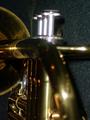
| 02/09/2004 06:20:16 PM |
Brass Instrumentby tolovemoonComment: The shallow depth of field worked out in this shot, but the part of the image that is in focus is insignificant in terms of the entire subject. The lighting is also a bit inappropriated to create a visually appealing image. |
| Photographer found comment helpful. |
| 02/09/2004 06:19:11 PM |
Watching Otter Anticsby banditis53Comment: I like the perspective of this shot... It makes me think the dog is stalking something in the snow... The dog is in a bit of an uncomfortable position in the frame for me though. Maybe higher or lower would work better. This shot also feels like it should be horizontal rather than vertical. The shallow depth of field didn't seem to work out very well here either... just the opposite has occurred... everything seems to be in field... |
| 02/09/2004 06:16:34 PM |
Viperby RHoldenSrComment: This is a nice 'product' style photo. The lighting is excellent. The red contrasts nicely with your white background and surface. I think this photo would also do well with a slightly lower camera angle and maybe a slight rotation of the car to create some more diagonal punch in the frame. As for shallow depth of field, I don't see any. |
| Photographer found comment helpful. |
| 02/09/2004 10:09:19 AM |
Touching Up my Shadow by BeagleboyComment: Originally posted by EddyG:
For the record, I disagree with jmsetzler. When voting, how do you know that the submitter didn't actually airbrush a shadow on to a wall and then set up the shot and take a picture? |
It's easy if you look at the photograph... look at the photograph... look at the photograph :) It's not hard to do :)
Yup.. the photographer could have done this, but not in this photograph :) |
| 02/09/2004 08:37:04 AM |
|
| Photographer found comment helpful. |
Home -
Challenges -
Community -
League -
Photos -
Cameras -
Lenses -
Learn -
Help -
Terms of Use -
Privacy -
Top ^
DPChallenge, and website content and design, Copyright © 2001-2026 Challenging Technologies, LLC.
All digital photo copyrights belong to the photographers and may not be used without permission.
Current Server Time: 06/18/2026 07:33:45 AM EDT.