| Image |
Comment |
| 11/04/2008 04:32:07 PM |
Decliningby h2Comment: This is just my opinion, and I am color blind, but the blue of the Euro symbol is too intense and the processing doesn't really ring my bell. Also, I have never really cared for the wide angle lens distortion which to me doesn't add to this image. |
 Photographer found comment helpful. Photographer found comment helpful. |
| 11/04/2008 04:30:06 PM |
Broke the bankby ClayaComment: Cute idea, well exposed and focused. For me it is one of cases of a good picture that lacks that special zing that propels the score higher. |
| Photographer found comment helpful. |
| 11/04/2008 04:28:46 PM |
YENOM : MONEYby Mark-AComment: The glare on the edge of the coin is quite evident and draws you from the writing on the edge. A little more light in general and taking that glare away would improve this IMO. |
| Photographer found comment helpful. |
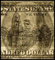
| 11/04/2008 04:27:49 PM |
And still . . . "We Trust"by LydiaComment: Well exposed and focused image, but like a lot in this challenge there isn't something to draw you into the image. |
| Photographer found comment helpful. |
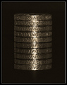
| 11/04/2008 04:27:05 PM |
Balanced Budget IIby sh0rtyComment: Very nice, I am going to increase your score from my first pass on this, but I would like a little less glare on the coin. |
| Photographer found comment helpful. |
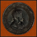
| 11/04/2008 04:26:22 PM |
One Cent, 1902by oscarthepigComment: To my eye there is either a little glare on the coin or the focus is a tad soft. There nothing about the image to really draw you in. |
| Photographer found comment helpful. |
| 11/04/2008 04:24:25 PM |
|
| Photographer found comment helpful. |
| 11/04/2008 04:23:39 PM |
The Power of Moneyby knowvakComment: Cute image, well exposed and developed. I guess for me that lacks anything to really drag me in. I am probably an old fogey, but I miss the point. |
| Photographer found comment helpful. |
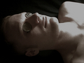
| 11/04/2008 04:22:29 PM |
Coins for Charonby smudgeSMJComment: For me this image lacks contrast, the darks aren't black enough and the shoulder is blown out. I also miss the point of the image. |
| Photographer found comment helpful. |
| 11/04/2008 04:21:36 PM |
Microprintby dpcollinsComment: This is a nice image, well exposed and focused, but it lacks the visual interest to draw you to look at it....OK, after looking at it closer I am going to raise your score one notch...good job |
Home -
Challenges -
Community -
League -
Photos -
Cameras -
Lenses -
Learn -
Help -
Terms of Use -
Privacy -
Top ^
DPChallenge, and website content and design, Copyright © 2001-2026 Challenging Technologies, LLC.
All digital photo copyrights belong to the photographers and may not be used without permission.
Current Server Time: 07/21/2026 10:45:46 PM EDT.