| Image |
Comment |
| 05/13/2003 09:32:20 AM |
Waterwayby vince31874Comment: Greetings from the Critique Club :)
I like the composition of the shot. The boat and reflection together is a presentation I know I would be partial to as well. The sun on the water does make the shot a little over exposed and too bright above the boat.
I think an off center presentation of the boat probably would have moved this image more toward art and a little away from "snapshot" as far a composition goes.
The focus is great. I like the detailing on the sail and the clear ripples in the water.
Overall I would say that this is a great shot. A little adjustment to the brightness and a minor shift in composition would improve it.
Shari |
| 05/13/2003 09:28:42 AM |
Dream Ride...by seasawComment: Greetings from the Critique Club :)
First impression is OOOOOOHHHHHH!!!!! I love the colors on the chrome and I'm a Harley fan anyway.
The focus is clear, the composition is interesting, though a tiny bit busy.
It's so hard to critique a great shot like this. I think you've done a fabulous job capturing the difficult media (chrome is notoriously difficult to get right) and you've cropped and presented the image perfectly.
I'll stand by my first impression and say it again...OOOOOHHHH!!!!
Shari |
 Photographer found comment helpful. Photographer found comment helpful. |
| 05/06/2003 09:55:22 AM |
Bobcatby rcrawfordComment: Greetings from the Critique Club :)
I like the clarity of focus on this shot, but the sepia toning seems to drag the image down a bit. It makes the image very dark and almost bland.
The overal sepia color of the shot also emphasizes the green plant sprouting from the top of the cat's head. Perhaps a different angle on the shot might have solved that particular problem.
Overall, it's a nice shot. Clear and nicely focused. The composition kudos would have to, in all honesty, go to the person who arranged the stuffed cat.
Shari |
| Photographer found comment helpful. |
| 04/29/2003 10:02:14 AM |
Sunbathing After Spring Showerby autoolComment: Greetings from the Critique Club :)
I like the clarity of focus on the feathers of the bird, but I must say that I find the DOF distracting. Perhaps a slightly tighter crop to reduce the amount of blurred green would make the impact of the bird stronger.
Otherwise, I like the impact of the shot. The bird is well captured.
Shari |
| Photographer found comment helpful. |
| 04/28/2003 07:58:42 AM |
50 years of shitty weatherby helgihelgiComment: Greetings from the Critique Club :)
I like the stark contrast between the light sky and the dark wall. However I feel the whole photo is a little too dark. I understand the necessity of the darkness to keep the mood and yet at the same time I crave something other than the glow from the sky to look at.
The perspective and angle of the shot is wonderful. I like the distance it implies.
Overall, a very nice shot. It is only personal preference that asks for a lighter foreground.
Shari |
| 04/28/2003 07:27:39 AM |
|
| 04/25/2003 08:48:13 PM |
After the stormby vcosmaComment: Greetings from the critique club :)
I'm going to diagree with nearly everyone who commented on this shot...I LIKE the uneven horizon. I think it is because I love to go to the beach and the horizon never looks straight there anyway.
The focus is great and the composition/choice of subject is wonderful. The overall effect of the photo is a little dark, but the darkness adds to the mood.
I also like the interesting little bit of reflection on the front edge of the waves.
Great Shot!
Shari |
| Photographer found comment helpful. |
| 04/24/2003 10:31:16 AM |
Blowing in the windby DustinComment: Greetings from the Critique Club :)
I'm going to have to go along with the other comments on this photo. I wonder where the rest of the image is. If the white is there for a purpose, I would suggest listing that purpose in the photographer's comments.
What I can see of the shot is somewhat dull in composition and color saturation. There is evidence of the wind blowing the tape, but overall, the image is not one that inspires a viewer in any way.
On the positive side, the focus is quite clear, though I probably would have striven for a shallower DOF to blurr the trees in the background.
Shari |
| 04/23/2003 09:26:02 AM |
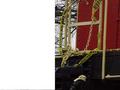
Railingby thatguyComment: Greetings from the Critique Club :)
I like this shot an awful lot. The clarity of focus is great. The DOF makes the railing a clear focal point. The colors are crisp and beautiful.
I think the only problem I see with this shot is that the out of focus rain drops in the background are a little distracting. I know what they are and why they are there, but on the surface they look like streaks on the photo. I don't know how you might avoid them and if I had taken this shot, I probably would have striven to have them.
Keep up the great work, this is a wonderful photo.
Shari |
| 04/23/2003 09:13:58 AM |
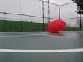
Wet dayby AllenComment: Greatings from the critique club :)
I really like the concept of this photo. My first thought was of the silent French film from the 1970s called "The Red Balloon." I think the dim lighting and greyish overtone are fabulous and definitely gives the feel of a rainy afternoon. However, I think the composition of the shot is lacking in a couple of areas.
First, the fence is very hard on the eyes. I almost get dizzy looking at it and it distracts the eye from what should be the obvious focal point: the red umbrella.
Second, the white line on the asphalt (basketball key, I'm guessing), also pulls the eye from the umbrella. It's a bold stripe of contrast before the eye reaches the umbrella.
Perhaps a slightly different angle to better use the lines as leading lines and a tighter crop to eliminate as much of the fence as possible would have made this a stronger photograph.
Shari
|
Home -
Challenges -
Community -
League -
Photos -
Cameras -
Lenses -
Learn -
Help -
Terms of Use -
Privacy -
Top ^
DPChallenge, and website content and design, Copyright © 2001-2026 Challenging Technologies, LLC.
All digital photo copyrights belong to the photographers and may not be used without permission.
Current Server Time: 07/16/2026 02:06:32 PM EDT.