|
|
|
Showing 421 - 430 of ~4058 |
| Image |
Comment |
| 01/10/2009 12:13:19 PM | Day 07 - Sunsetby shalrathComment: i like the first one better, only because the sun was ppeeking out behind her, but this one still looks really good. |  Photographer found comment helpful. Photographer found comment helpful. |
| 01/10/2009 12:12:31 PM | Day 06 - Sunsetby shalrathComment: i really like her hair in this one, how its flowing away. great job for a hit and miss! | | Photographer found comment helpful. |
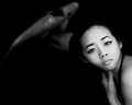
| 01/10/2009 02:46:03 AM | Swimming with Koiby lovethelightComment: This is Kari Ann, greetings from the Critique Club:
composition: Tiffany is placed very well in the frame, her face falls on the Rule of thirds line wonderfully. The fish is also helping to decrease the awkwardness of the negative space on the left side. The negative space accents the white of her face, in the photo, almost appearing as if she's floating in space.
color: Always a b/w lover, Its simply stunning in Black and white.
contrast: the contrast of her face is beautiful, it accents all her major features, and makes them pop off her porcelain skin. very well controlled too, its not overpowering.
focus: dead on. her eyes are so sharp and deep
depth of field: perfect so that her and the fish appear to be on the same level.
lighting: just the right amount of light, making the bottom seem to run on forever, and her face to light up like an angel. Also enough to reflect off the fish. perfect lighting
other: I thought this would have went a little higher, but the placing is awesome non-the-less. I hope you and Tiffany are both as happy with this shot as I was, i love it. I also enjoyed your transparency shot too, very well done. Keep up the awesome work, and I'll be looking for these Koi fish more often now!
-Kari Ann | | Photographer found comment helpful. |
| 01/10/2009 02:37:47 AM | Good Luck Coinsby TheStickComment: This is Kari Ann, greetings from the Critique Club:
composition: well thought out. leading lines from the red string add so much interest to an otherwise typical shot of coins.
color: the gold against the deep and bright reds make an interesting pair, both glimmering. also, the golds are a little dull, but thats a good thing, it adds to their conveyance of age.
contrast: perfect contrast, not too much, but just enough to separate the coins from each other
focus: very nice, i love the small sharpness area of just the one Chinese symbol, very symbolic.
depth of field: beautifully creamy. Abstract, but with just enough detail to make the viewer understand what is in the image.
lighting: again, well positioned to pinpoint the main focus of the image, which is the Chinese symbol on the one coin.
other: I cant think of any way to improve upon this image. its beautiful in its simplicity, yet so strong and powerful with its message its saying. Shallow DOF really made this image stand out to me, and the voters agree. Keep up the awesome work, its wonderful to see you submitting again.
-Kari Ann | | Photographer found comment helpful. |
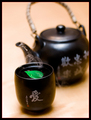
| 01/10/2009 02:28:37 AM | Hot Teaby peterComment: This is Kari Ann, greetings from the Critique Club:
composition: the kettle and cup land very well in the Rule of Thirds lines. They are right in the sweet spots of the photo. Only thing bothering me is the slight tilt of the cup.
color: The green is a little too perfect for me, but as others have said, it defiantly makes you look right at it. Good or bad, is your call. The neutral color of the background words well against the black
contrast: only thing that seemed disappointing to me was the lack of more steam. maybe a few inches to the left would have set the steam in front of the black kettle, thus more contrast between the two.
focus: very nice focus, crisp.
depth of field: nicely used, sets the tea more apart from the rest of the image
lighting: The light in the lower left hand corner is a little too bright. its not overexposed, but its quite a bit off from the rest of the creamy neutral background.
other: very well done in my eyes, the composition is nicely thought out, and this was a nice addition to the challenge.
If you have any more questions, feel free to PM me.
-Kari ann | | Photographer found comment helpful. |
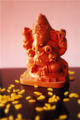
| 01/10/2009 02:20:27 AM | Indian Elephant God (ganesh)by thekfactorComment: This is Kari Ann, greetings from the Critique Club:
composition: The elephant is sitting in the middle of the photo, sometimes this can add to the photo, but i feel here that its making it a little less interesting
color: The tones are very rich and reminiscent of Asia. The soft reds and deep yellows are beautiful
contrast: I think this has just enough contrast. im itching to say "more contrast!" but, the more i look at it, the serenity makes more sense as a softer image.
focus: The lack of total focus on one specific object in the frame is what distracts me most. But, looking at  yospiff yospiff's comment, this may be due to the compression size. Either way, thats the part of the image I think should have been sharper. This is probably the reason most voted your image down
depth of field: interesting depth of field here. I really like how out-of-focus the little rice grains are in the lower half of the image.
lighting: the lighting overall is nice, but the dark black streak on the left side of the frame really distracts the eye from the rest of the photo.
other: overall, this is an ok image. Though the focus and DOF are sub-par (that's probably what led to such a low score) the colors and subject help make up.
Keep trying, we all have to start somewhere, and I hope this analysis has helped you out some. If you were looking for something else, feel free to PM me with any questions you may have.
-Kari Ann | | Photographer found comment helpful. |
| 01/10/2009 02:08:26 AM | #2by bspurgeonComment: she is such a sweet little girl, she always has that smiel ready for the camera! Great in black and white as well, keep it up! | | Photographer found comment helpful. |
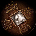
| 01/10/2009 02:02:30 AM | A different timeby aliquiComment: This is Kari Ann, greetings from the Critique Club:
composition: The middle being framed by the incredibly interesting coin adds such feeling and wonder as you stare deeper into the picture, trying to make out what is in the middle
color: the colors are very well played, they resemble that of the old ancient tombs of old, rusting and wearing out under the stifling heat of the sun
contrast: the contrast is beautifully handled in the image, both adding interest, but also helping to blur the center of the image more
focus: very well controlled with such large aperture (serious, what is at 32!?)
depth of field: extremely interesting, as I stated before, I could stare at the middle creamy-ness for hours, imagining what it may or may not be.
lighting: very well managed with so many little crevasses in the coin.
other: I love this. Its so intriguing and interesting. You totally deserved the nomination for a PostLuminous. Heck, i think this could have gone on the first page. I really don't understand the voting on this one, i expected it to be much higher. The only thing I can think of to improve is perhaps changing the middle image to something a little more discernible. Keep entering those challenges, and I hope this comment has helped you some. PM me if you have any more questions.
-Kari Ann | | Photographer found comment helpful. |
| 01/10/2009 01:53:12 AM | COLOURS of the ORIENTby hotpastaComment: This is Kari Ann, greetings from the Critique Club:
composition: A beautifully presented piece. The plates are all placed very well in the focus points of the picture.
color:Strong and alluring. The deep greens in the bowl and the red place-mat really work amazingly together
contrast: very good contrast, just enough to set the bowls of food out from the table below, but not too much so they are disjointed
focus: precise focus, I love how much detail can be seen in the food, its amazing
depth of field: the addition of the blur makes the piece even more interesting, adding that little bit of DOF really adds more emphasis to the food being showcased
lighting: lighting is very well done, bringing all the main characters into the light
other: gosh, this was just too yummy- i mean, fun to critique. You should be very proud of such an image, and
great job on such a great finish in the challenge. I can't think of anything for you to do to improve on it. | | Photographer found comment helpful. |
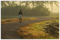
| 01/10/2009 01:45:02 AM | Life is all about finding a work for many...by renjith_varmaComment: This is Kari Ann, greetings from the Critique Club:
composition: the leading lines in the image are fantastic, leading the eye into the frame, and straight to the subject
color: I really like the subdued colors, they give such a feeling of early morning, going early to work to get a job done
contrast: the softer contrast also adds to the early morning nostalgia, just quiet and calm
focus: focus is perfect on the subject, crisp and sharp
depth of field: I usually push for decreased DOF, but here I like how much is in focus. It brings so much more into context and makes you look longer to see all the little things in the frame.
lighting: Breathtaking morning light, very well preserved
other: overall, I was wishing this would score higher as well, i saw this during voting (though didn't vote myself) and this was one of my favorites. It seems others agree as well. Sometimes, DPC just works that way i guess.
Don't be put down by the score, keep up this wonderful photography. I hope to see more of your work soon!
-Kari Ann | | Photographer found comment helpful. |
|
Showing 421 - 430 of ~4058 |
Home -
Challenges -
Community -
League -
Photos -
Cameras -
Lenses -
Learn -
Help -
Terms of Use -
Privacy -
Top ^
DPChallenge, and website content and design, Copyright © 2001-2026 Challenging Technologies, LLC.
All digital photo copyrights belong to the photographers and may not be used without permission.
Current Server Time: 06/18/2026 01:59:23 AM EDT.
|