|
|
|
Showing 971 - 980 of ~2210 |
| Image |
Comment |
| 08/09/2004 12:27:47 PM | |  Photographer found comment helpful. Photographer found comment helpful. |
| 08/09/2004 12:23:17 PM | |
| 08/09/2004 12:22:05 PM | Boat Shoesby davidbedardComment: I'd like the composition much better without the oar showing. This is kind of stretching the challenge, IMO. What came to my mind was, if this was a challenge called 'head' would a photo of a hat work?
I'd have to say no. Nice try though. |
| 08/09/2004 12:16:18 PM | Feetby JiaBobComment: The pink stuff in the background is distracting. I kind of like the yellow. | | Photographer found comment helpful. |
| 08/09/2004 12:15:10 PM | Painted Mandalaby RoosterComment: This needs a simpler background which doesn't compete with the painted designs. A sandy beach would have been appropriate.
Edited post-voting Hi there...I'm sorry my comment was kind of blunt and overly critical sounding.
My feelings about this image were that her feet were gorgeous and the painting was beautifully done but the rather busy carpet tends to compete with the painted elements. My instinct was that you chose the carpet to enhance the Eastern theme of the mandala and I should have made it clear that I was aware you had made a specific choice. My opinion is that an outdoors, natural background (my instinct says sand or sand and water) would have emphasized the organic,free-spirited quality of the woman who belongs to these lovely feet. Message edited by author 2004-08-20 14:28:53. | | Photographer found comment helpful. |
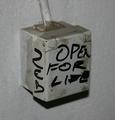
| 08/09/2004 11:59:31 AM | Electricityby runarComment: Hello from the Critique Club!
Hmmm....this is a challenging image for a Critique Club evaluation. At first glance, this is a very mundane subject. My guess is what captured your attention was the writing which appears to read "Open for Life". This certainly raises questions, the first being, "Did they mean to scribble, "Open for light?" Beyond this bit of interest, try as I might, it is hard to connect with this photo on an asthetic or emotional level. It seems to be a very literal documentation of an electrical box. There is very little in the way of form, color, or tonal contrast to create an interesting viewing experience. It is possible that a straight ahead shot of the front of the box would create a flattened, more abstract viewing plane and make the phrase, "open for life" the main focus. | | Photographer found comment helpful. |
| 08/09/2004 11:45:58 AM | Unsharpened Pencilsby webkingComment: Hi there from the Critique Club!
This photo has a lot going for it. Simplicity, great high key white background, and nice sharp focus on the subject. It is a good start. I find that the point of view, the centered subject, and the tight cropping combine to cause the subject to appear precarious and in danger of spilling off the edge of the frame. Since you clearly enjoyed the graphic quality of the unsharpened pencil tops, my suggestion is that bundling the pencils together into a tight circle, securing them with a rubber band, and shooting from directly overhead would create an interesting 'circles within a circle' pattern and eliminate the container which doesn't add much to the composition. |
| 08/09/2004 11:33:12 AM | Data Storageby menardmamComment: Hi there from the Critique Club!
Hmm...this one is a bit difficult for me. The subject matter is not something that I found visually interesting or appealing but that is a somewhat subject opinion. Obviously, judging by some of the comments, other people found this a highly interesting subject.
From a technical standpoint, the focus is sharp and the lighting is such that very few distracting glares or reflections were created. The cropping is tight so that there is very little to distract the eye from the main subject. I would suggest that the dust on the black base should have been wiped off before shooting. I wish
I could offer a more in-depth critique then this but, frankly, this just isn't the kind of image or subject that provokes an emotional response in me or raises any interesting questions. It clearly documents an object that I use but never see. That is about as far as this photo takes me. | | Photographer found comment helpful. |
| 08/09/2004 11:18:02 AM | On the Window Sillby adineComment: This was an image I kept coming back to. It displays the wonderful trickery of photography. This is due to the infinite DOF. All the objects are at equal distance in the viewing plane. My eye is seeing an impossiblity which creates a moment of pure confusion until my brain catches up. This two-dimensionality was precisely what fascinated some of the great early landscape photographers. It is clear you made a deliberate choice when you framed your image this way. You could have gone for a conventional still-life POV and still had a nice image but I find this approach for more interesting and humourous. The only thing I might suggest is cropping out the area of shadow at the top of the frame which adds a bit of depth and detracts a bit from the flat, abstract quality. Very strong graphical image which I enjoyed immensely. It was one of my favorites from this challenge.
Thanks for sharing it. | | Photographer found comment helpful. |
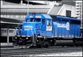
| 08/09/2004 11:08:31 AM | Conrail 3347...One of the few Blues Leftby OneSweetSinComment: Hi there from the Critique Club!
Looks like you got me again. I hope you don't mind too much. This image is a bit of a challenge for me since I'm not a fan of selective desaturation, but I'll try to be objective.
For starters, I like the subject. The train is a lovely shade of blue and it's a shame they are being painted black. I don't know what the shooting environment was like but can't help wishing you were able to get in a bit closer for a more impressive view of the train and less boring background. Looking at the background, I understand why you would choose the selective desat approach. The concrete structures and highrise in the background make for drab background. Unfortunately, I don't think the selective desat is working hard enough to create an 'invisible' background. This is because, in spite of the gray tones, there is still quite a bit of business created by the various lines and blocks of shape. There are the v-shaped diagonals created by the roof of the depot, more diagonals in the ramp-like structure that appears just above the train, the curved lines that radiate across the roof of the foremost structure, and the 'box' of stripes created by the structure that is above the ramp-like structure. All this suggest to me that the DOF is simply to deep, creating a flatness to the entire viewing plane. There is no distance between the train, the foremost building, and the highrise which logic tells me is in the distance but which my eyes tell me is in the same space as the train.
It is possible you were far away from the train and chose an infinite focus range in order to be sure to capture it which leads me back to the suggestion that a closer viewpoint would have made a big difference, creatively. As it is, it is a nice record of something which will soon be only a memory. |
|
Showing 971 - 980 of ~2210 |
Home -
Challenges -
Community -
League -
Photos -
Cameras -
Lenses -
Learn -
Help -
Terms of Use -
Privacy -
Top ^
DPChallenge, and website content and design, Copyright © 2001-2026 Challenging Technologies, LLC.
All digital photo copyrights belong to the photographers and may not be used without permission.
Current Server Time: 07/24/2026 04:59:36 AM EDT.
|