| Image |
Comment |
| 08/24/2004 07:16:50 AM |
Tigerby kirtiebuComment: nice frontal lighting but looks a little static - as if he is sitting on a chair doing nothing.
Also needs a bit more focus on the tat if your trying to point that out as a focal point.
|
 Photographer found comment helpful. Photographer found comment helpful. |
| 08/24/2004 07:15:57 AM |
Love Immaculateby RoosterComment: I find when using a pure black background, people need to really be standing up otherwise it appears as if the subject is floating in mid-air.
This is what has happened here. There is nothing to suggest any kind of flooring so it look s a bit lost just plonked in the middle.
Your pose - whilst probably not for everyone, does have good qualities to is - you joined, combined and merged into one which gives me a sense of harmony.
I can't help but feel had this been shot on a nice antique wooden floor then your score would be much higher than it is.
The yellow cast isn't needed IMHO - black and white or subdued colors would work better here for me. Choosing color casts in people is very difficult -yellow looks like jaundice - red is like scolding - blue is like dead people - green is like illness. etc etc
Full marks for the other qualities though. |
| Photographer found comment helpful. |
| 08/24/2004 07:12:01 AM |
The Two Towersby BassieComment: great tonal range, well exposed and composed. (also a very nice straight handstand sir)
My only gripe is the main focus of the photograph. I can't see why you have included the ugly tower. Your figure takes all the attention because it's well lit and it's at the forefront - so the tower is a secondary thought.
Without that this picture would be a 10. With much nice blank space giving the photo room to breath.
|
| Photographer found comment helpful. |
| 08/24/2004 07:09:51 AM |
Natashaby photoqwestComment: Very nearly very good.
The lighting is a bit harsh for me, and dies too quickly either side. I would like to see a more gradual fading of colors to black.
The mode being littered with tattoos will make it attractive to some and not to others depending on taste, but whilst it adds interest it is more a distraction for me
You have posed here well however, and the setup looks good, as is the idea.
l |
| Photographer found comment helpful. |
| 08/24/2004 07:07:27 AM |
Suite pour violoncelle.by BiduleComment: Nice idea, but I don't see why you have used selective desaturation here. There is a lot of potential here with the nude and instrumnet, I think a re pose coudl be better. |
| 08/24/2004 07:06:17 AM |
Stripedby kosmikkreeperComment: I like this Venetian blind effect - even though it's quite popular. I think more work needs to be done on the focusing side of things though. Her hand has good definition, but her body and face seem little softer.
When this blind effect works, it tends to be with more simplified poses - with a crunched up pose it can look a bit too much messy.
A valiant effort.
|
| Photographer found comment helpful. |
| 08/24/2004 06:58:37 AM |
Marble nude in blueby mandypComment: yeah very unique -good thinking here. Also with the marble effect you ahve used a blue cast - probably the first person to sue a color cast to their advantage.
Nice depth and composition here to - eyes go right up her legs. great stuff. |
| Photographer found comment helpful. |
| 08/24/2004 06:57:27 AM |
Togetherby midnightride2Comment: OK I see what your trying to do here, but it comes off as very tacky porn to me - sorry if that was not intended - if it was full marks :D
The woman is attractive, but her pose is more slutty than arty purely because she is grasping her own breasts which i see no real need for unless it's for the pure reason to draw attention to tits.
The male seems to be there for no reasons - his grasp on her waist isn't strong or convincing.
Exposure wise it's also a bit over done - maybe your screen is a bit too dark -I would recommend looking at the bar below every vote page and seeing if you can see the last 4 blacks on the left.
If not feel free to PM me and I will explain the calibration process.
|
| Photographer found comment helpful. |
| 08/24/2004 06:07:19 AM |
Ashamedby KonadorComment: Great light - and pose - left most foot looks distorted a little mid you.
Lovely use of negative space and good tones. |
| Photographer found comment helpful. |
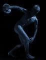
| 08/24/2004 06:06:23 AM |
Discus Athleteby willemComment: Great pose, very much like a statue, but really can't understand why you have given it a blue cast - black and white would be wonderful here.
If B&W then a 10 for sure, as is a 6 |
| Photographer found comment helpful. |
Home -
Challenges -
Community -
League -
Photos -
Cameras -
Lenses -
Learn -
Help -
Terms of Use -
Privacy -
Top ^
DPChallenge, and website content and design, Copyright © 2001-2026 Challenging Technologies, LLC.
All digital photo copyrights belong to the photographers and may not be used without permission.
Current Server Time: 07/17/2026 06:17:25 AM EDT.