| Author | Thread |
|
|
09/12/2004 04:59:15 PM |
|
It is a great photo with extreme taste. I like the dramatic effect so the lighting served its intended purpose . more power to the women that encourage us.great for you and great for jodie.should have scored better by all means. |
|
 Photographer found comment helpful. Photographer found comment helpful. |
|
|
08/30/2004 07:35:19 PM |
|
well you did well with it! :) Only.. I still lost the bet. Look for the purchase of one of your shots in the next two weeks. ;) |
|
| Photographer found comment helpful. |
|
|
08/30/2004 10:39:12 AM |
|
Entirely undeserving of the place it got, one of the top 5 for me |
|
| Photographer found comment helpful. |
|
|
08/30/2004 12:42:38 AM |
|
Congratulations on your 20th placing. This study sets off a mood. |
|
| Photographer found comment helpful. |
Comments Made During the Challenge  |
|
|
08/29/2004 08:15:24 AM |
|
| Photographer found comment helpful. |
|
|
08/27/2004 11:09:06 PM |
|
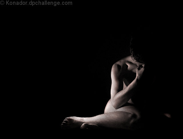
nice moody lighting... i will tell you what i don't like... the bit of something all the way to the right.. i would have cropped it out... also, the top foot looks really blocky and strange. still a good shot |
|
| Photographer found comment helpful. |
|
|
08/27/2004 03:03:16 AM |
Great composition and lighting.
Well done. |
|
| Photographer found comment helpful. |
|
|
08/26/2004 07:51:49 PM |
|
Nice... like how you captured him hiding in the shame of darkness |
|
| Photographer found comment helpful. |
|
|
08/26/2004 01:45:34 AM |
|
underlit in my eyes. I'd have liked to see more of the facial/head area, but nicely composed otherwise |
|
| Photographer found comment helpful. |
|
|
08/25/2004 09:27:54 PM |
|
Thank god for the fact that I came back...I had accidently given you a 3....I am sooo sorry, very very good shot. |
|
| Photographer found comment helpful. |
|
|
08/25/2004 09:22:14 PM |
Returning for comments.
This is a classic pose and the selection for sepia gives it more character. There is one minor problem with the angle of the light and its distribution. This is very common with single lights. Look at the knee and the eye receives no help to discern the detail of the joint and the patella. This is solved by gently moving the light slightly about to find the best form. If it is a self portrait then you chalk-up your sitting place and rotate slightly for each take. You may need 20 or 30.
Bumping to 7 because the composition is superb. |
|
| Photographer found comment helpful. |
|
|
08/25/2004 03:31:19 PM |
|
I like the minimalistic approach and the sculpting with light. |
|
| Photographer found comment helpful. |
|
|
08/25/2004 11:38:44 AM |
|
| Photographer found comment helpful. |
|
|
08/25/2004 08:53:30 AM |
|
lovely mood captured, like the lighting nice job |
|
| Photographer found comment helpful. |
|
|
08/24/2004 09:52:55 PM |
You should be ashamed of this image!
It's poorly lit,
bad composition,
a mere snapshot.
looks like you didn't even try!
BTW
I love it... a perfect 10 :) |
|
| Photographer found comment helpful. |
|
|
08/24/2004 08:54:24 PM |
|
Good use of empty space to add to mood. The bit of arm in lower corner is bit distracting I probably would off blacked that out. The hot spots on the arm and leg a bit to hot. An 8 |
|
| Photographer found comment helpful. |
|
|
08/24/2004 05:33:32 PM |
Good composition & lighting. The dark vs light works very well.
Personally I see a slight Magenta cast on the skin tones and wonder how it would look in B&W. Anyway, nice work. |
|
| Photographer found comment helpful. |
|
|
08/24/2004 05:16:09 PM |
|
brilliant use of negative space and I like the shape created by the form. Very emotive and suggestive of a greater story. |
|
| Photographer found comment helpful. |
|
|
08/24/2004 11:11:18 AM |
|
Nice shot, good use of light and shadow. I'm not sure about your composition... I think I would have used more negative space to communicate your subject's sense of isolation. I'd have liked a bit more sharpness. |
|
| Photographer found comment helpful. |
|
|
08/24/2004 10:04:14 AM |
|
I like the way this is lit to allow the body to merge into the black background. Excellent use of negative space to emphasise loneliness and desolation. |
|
| Photographer found comment helpful. |
|
|
08/24/2004 08:53:54 AM |
|
This is very original and really stands out. Well done, very clever. [6] |
|
| Photographer found comment helpful. |
|
|
08/24/2004 06:07:19 AM |
Great light - and pose - left most foot looks distorted a little mid you.
Lovely use of negative space and good tones. |
|
| Photographer found comment helpful. |
|
|
08/24/2004 02:36:17 AM |
|
Yep. That'll do. Could be more contrast but a brilliant shot. |
|
| Photographer found comment helpful. |
|
|
08/23/2004 11:04:30 PM |
|
| Photographer found comment helpful. |
|
|
08/23/2004 04:36:37 PM |
|
Nicely lit, emotive shot. Good use of negative space too. Good Luck, Todd. |
|
| Photographer found comment helpful. |
|
|
08/23/2004 10:53:15 AM |
|
Stunning and powerful. Everything about this image is wonderful and deeply moving. A very professional look and feel. Oh, to create photographs like this... |
|
| Photographer found comment helpful. |
|
|
08/23/2004 10:27:52 AM |
|
| Photographer found comment helpful. |
|
|
08/23/2004 10:19:26 AM |
|
Stunning image. The only suggestion I have is to crop closer to the right. The bit of hand(?) seems out of place and disjointed from the rest of the image. I love the use of light and large negative space. |
|
| Photographer found comment helpful. |
|
|
08/23/2004 07:29:57 AM |
|
Great title, good lighting. strong positioning. |
|
| Photographer found comment helpful. |
|
|
08/23/2004 01:39:14 AM |
|
powerfull lighting and composition. I like that its in b/w and that tones used are excellent as well. |
|
| Photographer found comment helpful. |
|
|
08/23/2004 12:46:33 AM |
|
Good lighting and positioning. I can almost see what the face is saying... |
|
| Photographer found comment helpful. |
|
|
08/23/2004 12:40:30 AM |
Noise arount the head... you can clen that in member challenge..
should have remove the white left spot...
nice pose and light
a7 |
|
| Photographer found comment helpful. |
Home -
Challenges -
Community -
League -
Photos -
Cameras -
Lenses -
Learn -
Help -
Terms of Use -
Privacy -
Top ^
DPChallenge, and website content and design, Copyright © 2001-2026 Challenging Technologies, LLC.
All digital photo copyrights belong to the photographers and may not be used without permission.
Current Server Time: 06/27/2026 04:22:44 PM EDT.