| Image |
Comment |
| 12/20/2008 01:21:59 PM |
Pleasing Bokehby bj0920Comment: Your focus is great. I find that the dog so tightly fitted into the frame does not do the game he is playing justice. In order to convey a sense of fun, you really have to have a sense of movement and energy. This might have been achieved by panning out on the shot a bit to capture more of the dog in the frame so we can see what he is doing and positioning him on the right side of the frame to give him something to move into. This would have been a good place to use a little fill flash as well. It would have enabled you to balance the shadows in the front with the light in the back. While his face is properly exposed, the back of his head, his back, and some of the light in the bg is blown out. Good luck in the challenge :) |
 Photographer found comment helpful. Photographer found comment helpful. |
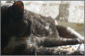
| 12/20/2008 01:17:35 PM |
Cat Napby jhomrighausComment: Your soft window lighting is pretty. I think this could have been improved greatly if the cat were looking at the camera though. The way it is, I almost can't tell it is a cat unless I read the title. Your focus is very crisp on the head/ear. There is something yellow in the middle right of the photograph that takes my attention away though. I believe that some of the best cat photographs are setups and you seem to have a willing model so keep shooting what you love. I hope this helped a little. Good luck :) |
| Photographer found comment helpful. |
| 12/20/2008 01:13:12 PM |
Dark Dancersby perotyComment: Well, to start, I'll say that your light is interesting. An interesting use of foreground bokeh as well. Your overall composition is a bit boring. There is really nothing there to catch attention. Perhaps if there were certain keys that were in the focal plane, it would be a bit better. It just seems uninspired. Your focus is a bit soft as well. When I see a photo, I search for a focal point where the subject can be studied. This leaves me a bit lost in the frame. Perhaps a higher DOF would have worked here to bring more of the bg into focus. Anyway, good luck in the challenge. :) |
| 12/19/2008 03:27:37 AM |
Welcome to the Partyby JuliBocComment: This is very whimsical. I believe this could have used a hair larger DOF as I would really like to see the hat in focus too because it is really popping off the page and in my face. I am not fond of the crop simply because it looks a bit like a decapitated doll. Including more of the body would have improved this, IMO. You also seem to have lost the tip of the hat. While that may have been intentional, it is going to seem to most like a mistake. I am not sure what the thing is on the left of the image, but may have been able to tell with the deeper DOF. It is very distracting to the overall composition. With a little more attention to detail and a few little tweaks, this has great potential. Good luck! :) |
| Photographer found comment helpful. |
| 12/19/2008 03:19:41 AM |
Last cigarette on this night.by pedrobopComment: Your idea might need a little bit of tweaking... I do find your focus a bit off and the entire image is just a hair too dark. Your lights in the bg are pretty but they don't really enhance the image I feel you are trying to portray. Perhaps a great iced glass of scotch or whiskey as the bokeh would have complimented it more... maybe just a table with empty chairs. I just don't feel like the lights were the right choice here. I hope this helps some :) Good luck! |
| Photographer found comment helpful. |
| 12/18/2008 10:38:35 PM |
On Lifeby Covert_OddityComment: A point to remember when shooting a photograph. Your subject needs to catch and hold interest. While your bokeh is very pretty, I can't tell what it is and it frustrates me. So it doesn't make a good subject. Therefore, I turn to the person. Still, I am frustrated because I can't see that person and the silhouette isn't giving me any indication of what is going on here either. Perhaps if you would have included more of the person in the frame or blurred the bokeh just a tad less it would have worked beautifully. As it is, it doesn't catch and hold my attention. Good luck :) |
| Photographer found comment helpful. |
| 12/18/2008 07:08:47 PM |
An Ornament with Lightsby banmornComment: You probably already have been told this, but you have a lot of what resembles sensor dust on your lights. While they are a pretty effect, the spottiness of them really detracts from the beauty. Also, your main subject (the ornament) gets a little bit lost in the background of black. Some soft light coming from the other side might have helped this (flashlight, perhaps?). The ribbon(?) that the ornament is hanging on is way too colourful for this shot. A pretty hook would have been a better choice. Remember to compliment your main subject, not take away the attention. Check out this thread and this thread. The second has a lovely part about how to find out if you actually have sensor dust. I hope this helps :) Good luck! |
| Photographer found comment helpful. |
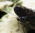
| 12/18/2008 07:00:12 PM |
butter.fly.effectby crayonComment: While the DOF is very narrow and blurs out the foreground and the background nicely, there is little interest beyond the eyes of the butterfly. A different angle to give a more pleasing overall composition would have helped this tremendously. Also, either centering the critter completely or setting it fully to one side or the other is always a better choice than having it slightly off. Your exposure is perfect, btw. As is the sharpness. Good luck! :) |
| Photographer found comment helpful. |
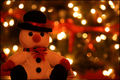
| 12/18/2008 06:56:37 PM |
Christmas Warmthby Skippy_NFComment: Brightened up a bit, this would make a very pretty Christmas card. :)
On to the C&C:
You managed to get very nice catchlights in your snowman's eyes but you left the tag on and it distracts a bit from his cuteness. His placement in the frame is nice but the lights overpower him from the back a bit. Sometimes, less is more. Snowmen are supposed to be white and while the lighting looks very warm and toasty and makes me feel very at home, I'd like to see a bit more of that whiteness. Your images is a bit dark overall (as already mentioned) and I understand that if you brightened it too much, the lights in the back went all blown out. This is where an advanced ruleset would have behooved you as you could have brightened just the man. Perhaps a small flashlight on him would have helped... I hope this has helped in some way. Good luck! :) |
| 12/18/2008 06:43:03 PM |
The Heart of the Matterby mgsmith53Comment: While the area on the left is causing an interesting effect in the bg, I find it a tad unnecessary. It really detracts from the main subject (the cross). The overall image is very highly saturated (a bit too much for my taste) but the colour is nice and warm and gives a homey feeling to the tree and cross. Your placement of the cross is okay but the composition is a little loose... a move to the right slightly would have given more visual pleasure, IMO. Also, and this is just a little personal preference thing, I would like to have seen your cross with a bit more dramatic lighting... maybe with a black card behind it to only light it from the front... Crosses, by nature, create emotion. I think the emotion here would have been better played up by a little creative light :) Good luck! |
| Photographer found comment helpful. |
Home -
Challenges -
Community -
League -
Photos -
Cameras -
Lenses -
Learn -
Help -
Terms of Use -
Privacy -
Top ^
DPChallenge, and website content and design, Copyright © 2001-2026 Challenging Technologies, LLC.
All digital photo copyrights belong to the photographers and may not be used without permission.
Current Server Time: 07/16/2026 10:08:20 PM EDT.