| Image |
Comment |
| 02/20/2004 05:03:58 AM |
From the Beachby JeileenComment: Black background is well done. The only place I really feel texture in the shot is on the extreme edge of the top right shell, which should tell you something about the lighting and what you could do better here - very very close, and I would have thought that the contrast of those textures would be interesting, but that too head-on light lets you down. |
 Photographer found comment helpful. Photographer found comment helpful. |
| 02/20/2004 05:01:53 AM |
Ezekielby dsrayComment: Don't 'get' the title, but who cares? Good photograph, just a little let down by the moment of light you've chosen - seems a very very general light, without much shadowing, and therefore without much communication of texture. I do like it graphically, very much however. Has great balance and flow. |
| Photographer found comment helpful. |
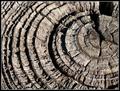
| 02/20/2004 04:59:52 AM |
Rough & Readyby boomerComment: The best composed of the concentric rings shots that I've seen so far. Good sense of texture, especially where the light becomes more shallow toward the right of frame - I think to really communicate the feel of the wood you could have used a shallower angle of light throughout the image, perhaps, as right on the edge of frame you've really caught it, just a bit too far out of frame to really focus the attention there. Good toning and detail. |
| Photographer found comment helpful. |
| 02/20/2004 04:56:15 AM |
smooth drivingby sweetnsourgeoffComment: Very small, very dull compositionally, and the bump in those lines suggests the opposite of your title anyway. Unless you were being ironic, of course. |
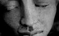
| 02/20/2004 04:55:10 AM |
MOMENTby SIDUS1Comment: Ah, the tip of a nose. Pushing the focus back to the eye-plane, which would also allow us to see more detail in the curve of stone on the cheek-bone areas, would make this more punchy i think: probably you could even kep the dof as shallow, letting the protrusion of the nose drift out of focus, and have quite a good shot - the placing os the nose in frame is so weak that I don't think it would register as a focus problem. |
| 02/20/2004 04:53:01 AM |
Copper Shineby KentuckyGalComment: Too much of a direct reflection, and too much brighter than the rest of the coins - in short the balance of the light you've used to reflect, and the ambient lighting is too heavy. Wiped out almost all details in that bright coin, which because of its brightness is what really draws the yee in this shot. And with the detail goes the texture. |
| Photographer found comment helpful. |
| 02/20/2004 04:51:15 AM |
Another Brick In The Wallby garrywhite2Comment: The light is perhaps too direct to give a good sense of texture to this shot - too harsh, I mean. The patterning of the brickwork is well expressed, and you've found a strong subject and used those textures well, but the detailing is lost in that light, the sense of variability of surfaces, which would otherwise have made this a wonderful shot. |
| Photographer found comment helpful. |
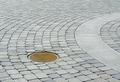
| 02/20/2004 04:48:26 AM |
Circlesby fayenetComment: The first thing that really bothers me with this shot is your cropping so close to the main headlight. Compositionally it should be the strongest thing in the shot, to me: the most contrasty part of the image, the stongest shape, most defined area of frame, and yet you've almost cut some of it out with that crop. Why not let it have it's space, allow it some framing? Good high-tech quality, the refletions are effective, great sense of smoothness. Good work, other than that crop. |
| Photographer found comment helpful. |
| 02/20/2004 04:45:43 AM |
Silky Soft Waterby browntComment: I'd never have considered this subject apt for this challenge - and I've seen five or six so far. This is quite good, near abstract (that abstract quality applies to all these shots, and I think tis the conjunction of that and patently real world subjects that makes them so effective). It communicates more a sensation of the rush of water than of an invented texture to me, perhaps. It's a pretty enough shot though - would lookwell on a card, for sure - but mor for its painterly quality than anything else. Nice photo - for this challenge I think you'll get marked down more harshly by others than by me. |
| Photographer found comment helpful. |
| 02/20/2004 04:42:22 AM |
soft stareby buckman7578Comment: Lacking that level of fine detail that really portrays texture - could as much be from a bland lighting as anything else, though it has that slight, almost indefinable blurriness that's the hallmark of camera-shake. |
Home -
Challenges -
Community -
League -
Photos -
Cameras -
Lenses -
Learn -
Help -
Terms of Use -
Privacy -
Top ^
DPChallenge, and website content and design, Copyright © 2001-2026 Challenging Technologies, LLC.
All digital photo copyrights belong to the photographers and may not be used without permission.
Current Server Time: 06/21/2026 07:15:54 AM EDT.