| Author | Thread |
Comments Made During the Challenge  |
|
|
02/24/2004 11:00:07 PM |
|
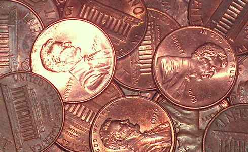
Nice idea and interesting shot. |
|
|
|
02/24/2004 02:18:19 PM |
|
Good texture but a bit on the small side |
|
|
|
02/24/2004 11:01:41 AM |
|
I like it, but, I'm sure you debated the light too. hmm. One of the better 'pile of' shots. |
|
|
|
02/23/2004 08:09:37 AM |
|
money is quite dull, we see it every day. Light seems a tad harsh too. |
|
|
|
02/21/2004 05:38:25 AM |
|
The piled up pennies gives a feeling of scales of an animal. Very interesting idea. The composition would really be brought out if lighting was from the sides so that highlights and shadow would make the subjects pop out of the shot. Currently the hotspot on the one penny is distracting. "7' |
|
 Photographer found comment helpful. Photographer found comment helpful. |
|
|
02/21/2004 12:41:29 AM |
|
Not sure if the one bright penny distracts from the rest of the shot, demanding attention. |
|
| Photographer found comment helpful. |
|
|
02/20/2004 09:41:33 PM |
|
pretty overexposed on the left side. |
|
|
|
02/20/2004 03:57:25 PM |
|
Good idea, unfortunately the bad reflections here causes too much of a glare... |
|
|
|
02/20/2004 10:13:01 AM |
|
This is a good take on the Challenge. Maybe a little hot on some of the pennies, but not bad. To make this really interesting, you might try adding another shape or contrasting color as a foil. Nevertheless, it's a creditable job! |
|
| Photographer found comment helpful. |
|
|
02/20/2004 08:28:08 AM |
|
That over exposed penny hurts this a lot. The focus seems just a tad off, but I think that might have been OK. One question: why are all the pennies the same? Why not an old one thrown in to give a different but similar thing to look at? |
|
|
|
02/20/2004 04:53:01 AM |
|
Too much of a direct reflection, and too much brighter than the rest of the coins - in short the balance of the light you've used to reflect, and the ambient lighting is too heavy. Wiped out almost all details in that bright coin, which because of its brightness is what really draws the yee in this shot. And with the detail goes the texture. |
|
| Photographer found comment helpful. |
|
|
02/19/2004 06:20:26 AM |
|
Using external lighting to get some shadow, less reflectio & more contrast would improve the image |
|
| Photographer found comment helpful. |
|
|
02/19/2004 04:45:26 AM |
[World Record Attempt]
+ There are textures present.
- One coin is almost overexposed and that is distracting; photo doesn't have a long attention span. |
|
|
|
02/18/2004 10:24:21 AM |
|
Got the idea and I see the texture, but the lighting needs improvement. The bright glare off of the one penny, while it may be intentional, just detracts IMO. Focus is good. |
|
| Photographer found comment helpful. |
Home -
Challenges -
Community -
League -
Photos -
Cameras -
Lenses -
Learn -
Help -
Terms of Use -
Privacy -
Top ^
DPChallenge, and website content and design, Copyright © 2001-2026 Challenging Technologies, LLC.
All digital photo copyrights belong to the photographers and may not be used without permission.
Current Server Time: 07/02/2026 05:43:27 PM EDT.