| Image |
Comment |
| 06/24/2002 12:51:00 AM |
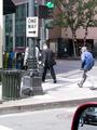
No, Not That Way!by maknbaconComment: The drivers side view mirror doesn't belong in the frame and thus should have been cropped out. |
| 07/01/2002 12:18:00 PM |
|
| 06/24/2002 01:13:00 AM |
Street Ballby kristie380Comment: this image appears to be stretched vertically or compressed horizontally. |
| 06/24/2002 01:05:00 AM |
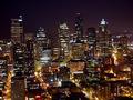
Night Seattleby YuliyaGComment: A couple of things bothered me about this particular photo. First, the lack of use of a tripod to prevent camara shake (always evident with long exposure shots). Second, image grain.... either due to using a high ISO (>200) or oversharpening. The rest of the image is quite nice though. |
| 06/24/2002 01:26:00 AM |
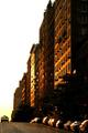
Past Rush Hour by BeeGeeComment: Phenomenal shot! The colours are so vivid with good detail, great subject too! Fits the challenge very nicely! One very minor fault though... the image appears to be a degree or two rotated right. |
| 06/24/2002 12:42:00 AM |
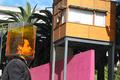
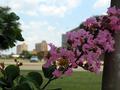
Drowningby drewmediaComment: Interesting, but the composition needs some work.... too many subjects in focus (ie. the pink wall, the building) ; thereby distracting the viewers eye from the true subject. |
 Photographer found comment helpful. Photographer found comment helpful. |
| 06/24/2002 12:50:00 AM |
Disinterestby curtis_meansComment: I quite like this shot. It's too bad the image is out of focus though. Also, this is a photo which would have greatly benefited had the 'rule of thirds' been followed (ie. Your subject, the girl, should be placed either more towards the left or right, instead of dead centre). |
| 06/24/2002 12:58:00 AM |
|
| 06/24/2002 12:39:00 AM |
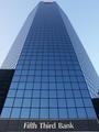
True Blueby daverx7Comment: I like the repition of the window frames and the composition, however, the top seems to be too tightly cropped and the building is slightly tilted to the right. Not bad, but i fail to see the connection with city life. |
| 06/24/2002 12:37:00 AM |
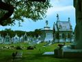
City of the Deadby arippsComment: This image appears to have a very distinct cyan colour cast to it. Removing the colour cast and increasing the contrast would have improved the overall quality of this image. Also found this image to be a bit too busy. |
Home -
Challenges -
Community -
League -
Photos -
Cameras -
Lenses -
Learn -
Help -
Terms of Use -
Privacy -
Top ^
DPChallenge, and website content and design, Copyright © 2001-2026 Challenging Technologies, LLC.
All digital photo copyrights belong to the photographers and may not be used without permission.
Current Server Time: 05/29/2026 11:06:09 PM EDT.