| Author | Thread |
Comments Made During the Challenge  |
|
|
06/30/2002 10:04:00 PM |
|
Very odd lighting, but it pretty m uch works... the greens/blues are superb. |
|
|
|
06/30/2002 09:03:00 PM |
|
Good colors. This shot would have also been good in bw -- then it would have had a darker mood to it. |
|
|
|
06/30/2002 01:00:00 PM |
|
Well-composed. A little dark but that works given the subject. |
|
|
|
06/30/2002 12:45:00 AM |
|
|
|
06/29/2002 09:42:00 PM |
|
It looks like you're trying to create a "gloom and doom" effect by darkening your pic. Unfortunetly, it doesn't look scary. I think you need to balance it out with some light and lots of contrast which will create a better effect. |
|
|
|
06/28/2002 09:46:00 PM |
|
|
|
06/28/2002 01:24:00 PM |
|
Initaly I rated this low, but when I came back to comment I considered artistic license should be applied. 'City Life' eventualy does end up here therfore with the strech applied it does address this weeks challenge. It is a good photograph though a bit too cold and morbid for my tasts it does deserve to be rated in my top ten. |
|
|
|
06/28/2002 03:08:00 AM |
|
a little brighter would get another point or two |
|
|
|
06/27/2002 11:56:00 PM |
|
awsome idea and photo, i love the colors |
|
|
|
06/26/2002 08:52:00 PM |
|
Interesting relationship to the challenge |
|
|
|
06/26/2002 08:19:00 PM |
|
good sharpness. interesting white balance. |
|
|
|
06/26/2002 07:10:00 PM |
|
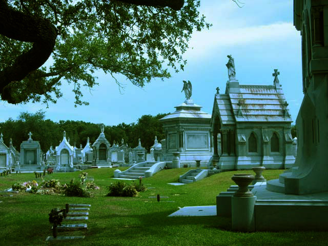
Very blue (on a couple of levels), seems overly dark, but the sky is a beautiful blue. A bit unexpected for a "city life" shot, but an interesting thought/contradition. Tone down the blue (IMO) and you have a near winning shot. Photo 7 City 6 total 7 |
|
|
|
06/26/2002 06:46:00 PM |
What's up with the color? It looks like too much cyan. Pretty good composition.
6 -Tim |
|
|
|
06/26/2002 05:30:00 PM |
|
interesting shot, not sure about city life though. |
|
|
|
06/26/2002 12:01:00 AM |
|
I think your colors have a little too much cyan in them, white balance not working right? |
|
|
|
06/25/2002 08:46:00 PM |
|
I love the ambiance created by the light here. Colors are great and that tree branch is incredible. I'd prefer a less creepy name though. 8 |
|
|
|
06/25/2002 07:02:00 PM |
|
great title and concept. eery. |
|
|
|
06/25/2002 03:53:00 AM |
|
This could of been a winner but IMHO there is too much of a blue tint on the tombs. They needed to be whiter and the contrast is a little too much. Great shot tho and nice to see some1 taking a different angle to the challenge "8" Dogman. |
|
|
|
06/24/2002 11:16:00 PM |
|
You've captured a wonderful lighting effect here....very nice! |
|
|
|
06/24/2002 10:01:00 PM |
|
You have a major colour cast (mostly cyan and a bit yellow) in this photo. Is your monitor calibrated correctly? |
|
|
|
06/24/2002 06:40:00 PM |
|
I really like the composition on this photo but I believe it's a bit underexposed. Based on the shadows in this photo, it appears that the sun is high in the sky and i'm wondering if this was toned down with software. It's hard to tell :) I think the photo is good but I would have rather seen a stronger interpretation of city life :) = 6 - jmsetzler |
|
|
|
06/24/2002 06:12:00 PM |
|
the picture is very green |
|
|
|
06/24/2002 03:55:00 PM |
|
Hmm, a bit high on the blue/green area.. maybe b&w would have looked better? Nice shot though! |
|
|
|
06/24/2002 03:29:00 PM |
|
Can't argue with this title or shot. Well done. Kee |
|
|
|
06/24/2002 01:40:00 PM |
|
Very nice. Rich color, clear, good composition. Overall good! |
|
|
|
06/24/2002 01:14:00 PM |
|
Whacky colors. Good whacky. |
|
|
|
06/24/2002 12:32:00 PM |
|
|
|
06/24/2002 11:30:00 AM |
|
|
|
06/24/2002 08:51:00 AM |
|
The color seems to be a bit blue on my monitor. I think compositionally it would have been better to try to focus on a few less of the tombs...but then you probably would have risked people not calling it 'city' enough. The tree makes a nice frame, but that black loop on the side is sort of distracting...can't tell if it's part of the tree or some sort of statuary. |
|
|
|
06/24/2002 12:37:00 AM |
|
This image appears to have a very distinct cyan colour cast to it. Removing the colour cast and increasing the contrast would have improved the overall quality of this image. Also found this image to be a bit too busy. |
|
|
|
06/24/2002 12:13:00 AM |
|
Home -
Challenges -
Community -
League -
Photos -
Cameras -
Lenses -
Learn -
Help -
Terms of Use -
Privacy -
Top ^
DPChallenge, and website content and design, Copyright © 2001-2026 Challenging Technologies, LLC.
All digital photo copyrights belong to the photographers and may not be used without permission.
Current Server Time: 06/28/2026 07:19:49 AM EDT.