| Image |
Comment |
| 07/27/2003 11:56:56 PM |
Wet 'n Dryby JackoComment: One of the best. high 9. I love the running over here. This is such a mess! And looks good! |
 Photographer found comment helpful. Photographer found comment helpful. |
| 07/27/2003 11:56:29 PM |
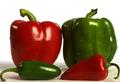
spicy combinationsby magnetic9999Comment: Hot shot...oh damn...what a bad joke. :) Anyways, I do like it. I wish the crop wasn't QUITE so tight on the left side, but that's alright. Nice artificial looking water too. 10 |
| Photographer found comment helpful. |
| 07/27/2003 11:55:19 PM |
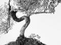
Zenby mbardeenComment: Zen! Ha!
Love the many MANY contrasts presented here. |
| Photographer found comment helpful. |
| 07/27/2003 11:52:58 PM |
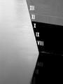
HM--Navy Shipby hortopthComment: Excellent image - I wish I could see the WHOLE reflection (all the numbers) a bit more clearly, but it's a nit. 9 |
| Photographer found comment helpful. |
| 07/23/2003 12:51:38 AM |
Political Centsby friscaComment: Great idea for a shot! This is almost as great of an idea as the Dyslexic shot. ;)
M |
| Photographer found comment helpful. |
| 07/23/2003 12:15:54 AM |
|
| 07/22/2003 09:27:30 PM |
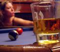
gettin' down/ a night on the townby pupparazzoComment: Greetings from the Critique Club!
I'm surprised how this shot fared. I didn't rate it so highly because I don't think it's a technically well-done photograph and even though it's somewhat interesting, it wasn't enough to carry the shot. Now I'll try to back up what I'm saying so you don't think I'm just some random jerk.
This shot looks hue adjusted. It has the noise like blues with greens, reds with blues...it doesn't look like this shot was taken like this. I think maybe you brightened it up too much, or something. The post processing really hurt it.
The focus works well for this shot. The woman's 'pose' and blowing out smoke aren't all that nice. I don't find it attractive, nor do I find it particularly pleasant. I think the smoke adds to the mood, though it's not a mood I can relate to.
Nice score and nice photograph. Happy shooting!
Mav |
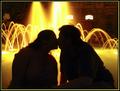
| 07/22/2003 09:24:13 PM |
Midnight Romanceby SatelliteSpeckComment: Greetings from the Critique Club!
(No I'm NOT kidding.)
-----
First of all, in case anyone reads this posthumously and doesn't think it's post humorous, I AM the male model in this shot and that's my gf. :)
-----
Ok, let me take a stab at this.
The colors are awesome. I was struck by this the moment we saw this fountain and I wanted my picture taken in front of this. The background is a great silhouette.
Problems:
1) My hair is sticking up - very noticable in a silhouette. Should've taken the time to wet it and pat it down with the fountain water.
2) The silhouette doesn't feel dark enough. I know you played with this based on the outtakes you sent me later, but I think the darker, artzier ones looked better. The less detail I could see, the more I liked the shot.
3) Our pose doesn't look "romantic" enough for Bob. Well, I would have rather had her in my lap too. :)
Overall, I said it before and I'll say it again. This is THE single best shot of us that exists. It is one of the few "art" shots of us that exists. I am UNBELIEVABLY happy with this shot - you did amazingly well with it.
Thanks again!
Matt |
| Photographer found comment helpful. |
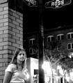
| 07/22/2003 09:20:15 PM |
Ross and Marketby me2you1Comment: Greetings from the Critique Club,
Hi Andy!
I already addressed my main problems with the shot in my previous comment, but I'll gladly explain more now. I think the main focus of the picture is what? Your cousin, right? Ok, let's start there. Did you want the street signs in the picture? If you did, put them ALL in the picture. If not, get them out. What about the lights across the street. Weren't they a little bright? Try moving over to your right and take a more straight shot at your model, maybe getting the lights out of the center of the picture.
I like your choice of black and white here. I wish that there was more interest and she looked more like she wanted her picture taken! :)
Good job and happy shooting. Keep up the good work and learning. You'll get there! :)
M
|
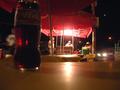
| 07/22/2003 09:17:18 PM |
Mexican hot-dogs, Navojoa, Mexicoby pcManComment: Hi from the Critique Club~
Focus - it could be better. What is the main subject here? The man on the left of the coke bottle is very blurry and distracting because he has no light on him and he's in the way. Maybe if you cropped the whole left side of the picture and left only the bottle you'd have a better picture.
Lighting/color - it's hard to use night lighting that you can't control, but you did well here. The men are well lit at the end but too far away. Although this is an interesting picture, it would be so much more interesting if I could see their faces, see what they are like, meet them, you know?
Good picture, keep shooting!
Mav |
Home -
Challenges -
Community -
League -
Photos -
Cameras -
Lenses -
Learn -
Help -
Terms of Use -
Privacy -
Top ^
DPChallenge, and website content and design, Copyright © 2001-2026 Challenging Technologies, LLC.
All digital photo copyrights belong to the photographers and may not be used without permission.
Current Server Time: 06/17/2026 02:13:09 AM EDT.