| Image |
Comment |
| 01/21/2010 01:27:28 PM |
2 - Emptyby odriewComment: Wonderful moody tones and I really like the composition. I probably would have been tempted to lighten the bench and remove the white spots and would have killed the soul of the photo LOL.
|
 Photographer found comment helpful. Photographer found comment helpful. |
| 01/21/2010 01:25:10 PM |
The King (Week 3)by ScapeshotsComment: Great shot and processing! I love the slight tilt of the head and the great tones in the face. I would have liked the body to remain "connected" instead of black all around it because it looks odd to me..it needs its body for a base! |
| Photographer found comment helpful. |
| 01/21/2010 01:21:40 PM |
Lunch Breakby sulamkComment: I too like the wing patterns. As others have suggested I think those patterns would have really jumped out if you had used f4 or f5.6 at 300mm and gotten closer. I think a lower perspective would have been better too, I always like seeing these critters at their eye level. |
| Photographer found comment helpful. |
| 01/16/2010 12:13:57 AM |
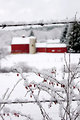
Quietby caseyfaceComment: Greetings from the Critique Club
I love this photo and glad that I was assigned it for a critique. My favorite aspect is the deep reds in the barn and berries. I’m assuming that you liked that as well considering your tweaking of the reds. I think you did a perfect job on the colors and the contrast is wonderful. The framing of the barn with the wire is a great compositional feature to me and the depth of field is perfect at f9.
A couple of thoughts on why this didn’t score a 6 is that it does seem to have a balance issue as lissylou mentioned it “feels” crooked. Maybe if there was a way to get square on the fence and straight on with the barn it would have been more level? Perhaps another problem is the “fit of challenge”. The processing doesn’t fit the idea of “quite” because of the reds and high contrast, and the foreground bush creates tension in the composition, again not “quite”. In my opinion voters here like “clean” compositions with no distractions in them. I think in a free study or in a “rural” challenge this would easily score 6+.
Overall this is a wonderful photo and I wouldn’t change a thing if it were mine. I gave you some possible reasons why it didn’t get a 6, but a 5.75 is a great score here at dpChallenge.
|
| Photographer found comment helpful. |
| 01/15/2010 10:58:26 PM |
|
| Photographer found comment helpful. |
| 01/15/2010 10:56:18 PM |
Running Late?by Covert_OddityComment: Great contrast and composition. I love the blurred bus zooming by. Did you hand hold this at 1/6? I can see a little blur in the bottom of the sign but it in no way takes away from the photo. |
| Photographer found comment helpful. |
| 01/15/2010 10:51:49 PM |
Week 2by jdannelsComment: The composition doesn't really work for me I guess, the placement of the subject with regards to the golden mean and Fibonacci is fine, but the negatives (Really bright bank entrance, shoulder on the left, blue skin tones, slightly tilted) out weight those patterns. All just my opinion and photographic tastes of course. |
| Photographer found comment helpful. |
| 01/15/2010 10:42:29 PM |
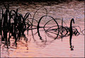
Pseudo Swanby jomariComment: Love the colors in the water and the great ripples. The black "swans" are very neat too! Great photo. |
| Photographer found comment helpful. |
| 01/15/2010 10:40:53 PM |
Passion Vineby jomariComment: Great job taking an ordinary subject and through processing and composition making it interesting. Really nice shot. |
| Photographer found comment helpful. |
| 01/14/2010 10:25:52 PM |
Ice Coldby KRKComment: Greetings from the Critique Club
This is a very moody photo and I think you captured “cold” wonderfully! With the subject being “Cold” I love the way you included all the supporting elements to tell that story. It starts with those great icicles. The blue tones support the feeling of coldness as well. I love they misty fog rising off the water as well. Other commenter’s mentioned the movies and that is one of the first things I thought of as well..looks like the scene from a movie.
The first thing that comes to mind as to why this photo didn’t score higher is the overall darkness of it. If you look at a histogram of this photo you will see that all of the tones are in the first 3/4ths of the histogram and none in the last 1/4th. I think a simple curves adjustment layer where you pulled those highlights over and applied a slight s-curve to the line would have easily bumped this up to a 6+ scoring photo. The ice is the central point of the photo (being at the 3rds and lighter than anything else) and would really pop against the dark background. You could also burn that rock in a little to lighten it up and get some textures showing.
Overall I really like this photo and I think with some simple adjustments it could be a really stunning capture that would have the “wow” factor.
|
Home -
Challenges -
Community -
League -
Photos -
Cameras -
Lenses -
Learn -
Help -
Terms of Use -
Privacy -
Top ^
DPChallenge, and website content and design, Copyright © 2001-2026 Challenging Technologies, LLC.
All digital photo copyrights belong to the photographers and may not be used without permission.
Current Server Time: 06/22/2026 02:53:54 AM EDT.