| Image |
Comment |
| 02/03/2008 04:44:12 PM |
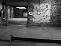
Inside Viewby BAMartinComment: Are you trespassing again Barbara???LOL
the offbalance of the image and the fact the floor seems tilted provides a great sense of tension to the shot, that and the beam left lying about make me wonder about the safety of the place
the thing that draws me in is the small sign/ calendar on the wall - it seems so out of place, so left behind, so forgotten
|
 Photographer found comment helpful. Photographer found comment helpful. |
| 02/03/2008 04:40:52 PM |
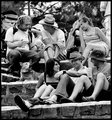
one, two, three & roverby RetroesqueComment: a community of friends is a wonderful thing to capture and the joy in companionship is so well displayed here -
on a technical side - the choice of higher contrast to display the people works so well here - they seem more real than real |
| Photographer found comment helpful. |
| 02/03/2008 04:31:15 PM |
Week 5: Williamby jasonlpriceComment: those are some amazingly big eyes he has! you need to use them more often...
the lighting from behind does not let the eyes shine as much as they could - play around with the angle of light to really emphasize his face |
| Photographer found comment helpful. |
| 02/03/2008 04:27:41 PM |
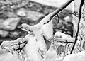
01 - Tree at Water's Edgeby ErikVComment: cold, wind, snow, gray and black and white - a simple metaphor for winter
the placement of the subject, the line of the rocks leading to it, and the sun to illuminate from behind create multiple layers for us to grab - well done |
| Photographer found comment helpful. |
| 02/03/2008 04:25:21 PM |
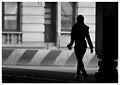
Street Walkerby pawdrixComment: this one simply kicks but - the lighting coming from the left on the subject so that the boots shine is a wonderful little touch - the timing to get an attractive stance and the use of the diagonal lines behind the subject all work so nicely together |
| Photographer found comment helpful. |
| 02/03/2008 04:23:56 PM |
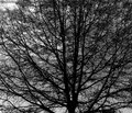
main-02-02-08-5425.jpgby fixedintimeComment: the lace work of this big old brute of a tree is pretty neat as a 2D image - i think as an image itself it lacks a center or point of interest, but it sure would make a fantastic texture to another photo... |
| Photographer found comment helpful. |
| 02/03/2008 04:22:33 PM |
pensiveby beneeComment: the crop and the background work well together - i like the contemplative face of the statue - i am not a fan of the heavyhanded touch with the burn and dodge - i can see where you are trying to go - illuminate the statue so it glows or radiates - but i wonder if the transitions between the burn and dodge are too severe |
| Photographer found comment helpful. |
| 02/03/2008 04:17:51 PM |
5.52 Then and nowby MelethiaComment: Deb - really nice work on this conversion and edit. I like how the b/w version captures the subtle textures of the paint. I just wish the crop included the entire VW emblem |
| Photographer found comment helpful. |
| 02/03/2008 04:15:35 PM |
WK 2 300_0115.jpgby salmiakkiComment: the technique you used to convert to b/w really seems to have worked extremely well - it reminds me of photos i took using TMax 100 when I was in school - you get a richness of whites and blacks that are hard to emulate in basic desaturation techniques. - i would love to learn more |
| Photographer found comment helpful. |
| 02/03/2008 04:07:55 PM |
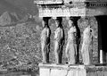
Caryatidsby kolasiComment: A DPC 5 second voter....
" the background is too busy - you really should blur it out - it is very distracting - and you really should add a bunch more color to the foreground - it is too blah- also, the rule of thirds are violated - what is it with this fill half the scene with the subject"
Me...
"Fabulous use of background to set the place, excellent use of split screen to show the ancient and the modern, fantastic lighting on the faces. I especially like how the lady on the far right is missing her arm - but has not neglected her duty to stand in place - very honorable? |
| Photographer found comment helpful. |
Home -
Challenges -
Community -
League -
Photos -
Cameras -
Lenses -
Learn -
Help -
Terms of Use -
Privacy -
Top ^
DPChallenge, and website content and design, Copyright © 2001-2026 Challenging Technologies, LLC.
All digital photo copyrights belong to the photographers and may not be used without permission.
Current Server Time: 06/25/2026 12:51:36 AM EDT.