| Image |
Comment |
| 03/27/2008 03:53:21 PM |
|
 Photographer found comment helpful. Photographer found comment helpful. |
| 03/27/2008 12:44:38 PM |
Light Studyby doc_gonzoComment: the light really glows on the child - great capture
i like how you chose to anchor the left side of the image with the post
the top right of the photo actually adds a good touch to the image - it creates a story, making this not just a light study Message edited by author 2008-03-27 12:45:34. |
| Photographer found comment helpful. |
| 03/27/2008 12:43:08 PM |
The Weary Travelerby doc_gonzoComment: very contemplative and emotive shot - really well done and delivered
hopefully you are able to find peace in yourself while traveling - it can be quite trying - especially when you HAVE to do it... |
| Photographer found comment helpful. |
| 03/27/2008 12:40:57 PM |
Reflecting Giantby trevytrevComment: the composition is right on the money
i am not a big fan of the grain that you have applied - it comes off to mee as too blotchy and artificial - How did you add the grain? |
| Photographer found comment helpful. |
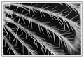
| 03/27/2008 12:39:02 PM |
Cactusby VeioletsComment: i am a big fan of the repeating liness created by the cactus thorns - i am just not crazy about the out of focus areas in the lower right -it seems to contrast too much the sharpness of the rest of the image in a distracting way |
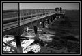
| 03/27/2008 12:30:37 PM |
Fort Rodman.jpgby of-snowComment: i love how ice builds up on piers etc near the shore - i just wish the ice was illuminated so we could see the textures a bit better |
| Photographer found comment helpful. |
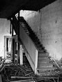
| 03/27/2008 12:29:10 PM |
|
| Photographer found comment helpful. |
| 03/26/2008 10:03:42 PM |
Wk_6_B&W_Applesby twmaxComment: absolutely delicious! the use of water to add some reflection and texture to the apples really works well here in b/w |
| Photographer found comment helpful. |
| 03/26/2008 09:56:10 PM |
|
| Photographer found comment helpful. |
| 03/26/2008 09:52:35 PM |
|
| Photographer found comment helpful. |
Home -
Challenges -
Community -
League -
Photos -
Cameras -
Lenses -
Learn -
Help -
Terms of Use -
Privacy -
Top ^
DPChallenge, and website content and design, Copyright © 2001-2026 Challenging Technologies, LLC.
All digital photo copyrights belong to the photographers and may not be used without permission.
Current Server Time: 06/25/2026 06:52:27 AM EDT.