| Image |
Comment |
| 03/19/2007 02:47:22 PM |
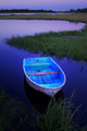
un beau jourby silverfoxxComment: Svetlana - this is simple gorgeous. Your investments in lighting (and your ever growing talent) are really paying off. |
 Photographer found comment helpful. Photographer found comment helpful. |
| 03/19/2007 02:25:30 PM |
Till I'm red in the faceby mambaComment: This is really cool - love the concept and the facial expression. I didn't get a chance to vote in this challenge, so here is my take:
This seems REALLY dark on my screen - I mean - really dark! This is probably why it was voted low than you expected. By the way - I love the devilish look in your outtake - maybe even more than the entry.
I think you had a lot going on with the image and your dedication to the site is appreciated! |
| Photographer found comment helpful. |
| 03/19/2007 01:58:17 PM |
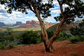
Zeek's Creekby wildirisComment: very cool color choices on PP. the perspective and use of portait mode with the meandering water works very well |
| Photographer found comment helpful. |
| 03/19/2007 11:36:37 AM |
DAY 7. unedited. FACES .by rozComment: roz - this image really works - the expressions are really well captured and the colors are really nice and vibrant |
| Photographer found comment helpful. |
| 03/19/2007 11:32:39 AM |
|
| Photographer found comment helpful. |
| 03/19/2007 09:58:13 AM |
|
| Photographer found comment helpful. |
| 03/19/2007 09:46:14 AM |
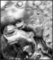
Tiny Bubblesby TheStickComment: I liked the image - nice and clear, good conversion to B/W (gave you a 6 during the challenge) - but most of the bubbles were not circles. That probably hurt your score some. |
| Photographer found comment helpful. |
| 03/19/2007 08:32:50 AM |
Emergency!by posthumousComment: i like the expression on the two ambulance drivers and gives this a real 70's feel |
| Photographer found comment helpful. |
| 03/19/2007 08:31:36 AM |
I-Tunedby cabaComment: i like the lighting but the grain is strange colored - reds and greens and really takes the image down. |
| Photographer found comment helpful. |
| 03/19/2007 08:19:11 AM |
|
| Photographer found comment helpful. |
Home -
Challenges -
Community -
League -
Photos -
Cameras -
Lenses -
Learn -
Help -
Terms of Use -
Privacy -
Top ^
DPChallenge, and website content and design, Copyright © 2001-2026 Challenging Technologies, LLC.
All digital photo copyrights belong to the photographers and may not be used without permission.
Current Server Time: 05/10/2026 09:58:47 AM EDT.