| Image |
Comment |
| 05/03/2007 11:54:30 AM |
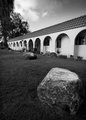
Day 2by edmengComment: The crispness and depth of the focus is very impressive and the conversion to B/W provides very nice contrast and good tones and textures. That sigma lens sure seems to work pretty good! |
 Photographer found comment helpful. Photographer found comment helpful. |
| 05/03/2007 11:04:06 AM |
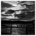
Day 1 - Towards the Light.by sherpetComment: Shez - love the processing on this image. I know it is really annoying to not be able to get out and about right now to take many new shots, but you sure have found some great images to process for this challenge. Your treatment with the high contrast is excellent - almost comes off like a drawing rather than a photographic image. |
| Photographer found comment helpful. |
| 05/03/2007 05:06:37 AM |
House of Sand and Fogby noranekoComment: Catherine - i really like this image a great deal. The repeating line from the beach fence -especially being almost completely black - really reinforces the idea that this scene goes on forever. Your choice of cropping works really well - closed in and tight - so that no unnecessary information is brought to the viewer. One thing I have seen with your B/W photos so far is a tendency not to kick up the contrast enough. B/W photos tend to have the full dynamic range from full black to full white. Muted tones can work on some images, but using the full range (pushing it a bit more than you already have in your first three entries) will create a more film like image. Message edited by author 2007-05-03 06:31:02. |
| Photographer found comment helpful. |
| 05/03/2007 04:14:42 AM |
|
| Photographer found comment helpful. |
| 05/02/2007 09:26:51 PM |
|
| Photographer found comment helpful. |
| 05/02/2007 09:18:32 PM |
|
| Photographer found comment helpful. |
| 05/02/2007 09:12:33 PM |
Railroad Bridgeby Bravo23Comment: I really don't follow the symmetry based on the perspective shown. I see repeating shapes and angles, but it doesn't seem symmetric |
| Photographer found comment helpful. |
| 05/02/2007 09:11:47 PM |
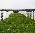
Dandelion Laneby sallyjo1Comment: I like the effort here - but I think you could have been a little more powerful if the 'reflection' of the fences was more dead center rather than offset to the left. |
| Photographer found comment helpful. |
| 05/02/2007 09:07:43 PM |
|
| Photographer found comment helpful. |
| 05/02/2007 06:53:56 PM |
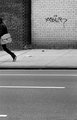
2by sevilduvarciComment: i really like this style of photo - and you executed it so well. I never have the confidence to shoot and edit this type of shot |
| Photographer found comment helpful. |
Home -
Challenges -
Community -
League -
Photos -
Cameras -
Lenses -
Learn -
Help -
Terms of Use -
Privacy -
Top ^
DPChallenge, and website content and design, Copyright © 2001-2026 Challenging Technologies, LLC.
All digital photo copyrights belong to the photographers and may not be used without permission.
Current Server Time: 05/14/2026 12:01:32 PM EDT.