| Image |
Comment |
| 11/17/2004 01:47:15 AM |
...by UniversalTheoryComment: this is nice. very nice. it's a little off-kilter and i think i like that :) very good BW conversion given the limited basic editing rules. good find. |
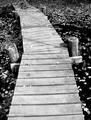
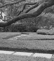
| 11/17/2004 01:46:01 AM |
Pathwaysby jaredldrComment: a little flat, but really interesting subject. like the winding path, and like the tree cutting the image. would love to see this a little more contrasty, specifically with blacker blacks (that's just my preference). |
 Photographer found comment helpful. Photographer found comment helpful. |
| 11/17/2004 01:25:09 AM |
JD in B&Wby WobbleComment: yes please. :) (though it's "Gentleman Jack" for me this evening). this kind of shot tends to get hammered on DPC - high key, grainy, a little off the beaten path...all the things i love in a photo that get 4s around here.
you get a 7 from me, and a high five. |
| Photographer found comment helpful. |
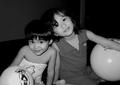
| 11/17/2004 01:23:42 AM |
Friendsby jazperComment: either you used a flash on this, or a REALLY strong spot light. unfortunately close up flash makes for some nasty highlights, as evidenced in the reflection on the balls and their noses and cheeks. it also makes the background unnaturally dark. if you can use more notural or ambient light with a higher ISO, you can minimize this effect, even with a little fill-flash. composition is ok, kids are adorable, BW conversion is quite nice, particularly given the annoying basic editing rules. overall a nice effort.
P |
| Photographer found comment helpful. |
| 11/17/2004 01:17:36 AM |
At Easeby ClubJuggleComment: dammit i wish this wan't basic editing, since his face is begging for a little dodging. composition is pretty basic, but the technicals are nice; well exposed and focused. in advanced editing this could be improved a ton in my opinion. in the absence of that - great job. |
| Photographer found comment helpful. |
| 11/17/2004 01:15:12 AM |
|
| Photographer found comment helpful. |
| 11/17/2004 01:13:20 AM |
Light and Darkby yeouaComment: nice. love the contrast, though i might have liked it better if you pushed your blacks a little more, so your right eye disappeared. completely. good idea on the background; sort of a double entendre on the theme. |
| Photographer found comment helpful. |
| 11/17/2004 12:01:57 AM |
Tear Drop Blues by kosmikkreeperComment: Yeeeeehaw! Well done Yanik - you are without a doubt my hero (damn too late for that challenge.
P-ness |
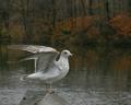
| 11/09/2004 11:10:21 AM |
Novemberby TooCoolComment: very nice except for the exceptionally noisy background. usually a result of oversaturation, but the rest doesn't look that way, so i'm not sure. the colour in the background is great, and punctuates the month nicely, but the noise is quite distracting.
the rest is great. nice shallow depth, crisp focus, nice positioning of the gull within the frame. i can just hear the sounds: "mine! mine! mine!" (sorry - Finding Nemo reference; how can you tell i have a four-year old?)
:)
Pedro |
| Photographer found comment helpful. |
| 11/09/2004 11:07:14 AM |
May 2005by agrimaceComment: Assuming that the Persons headstone is the focus of the pic, it seems like it's crowding the lower left edge a little. I like the low perspective and the shallow depth, but my eye still drifts towards other things because the subject os too far off the picture to keep me there. if *that* makes any sense at all :)
Pedro |
| Photographer found comment helpful. |
Home -
Challenges -
Community -
League -
Photos -
Cameras -
Lenses -
Learn -
Help -
Terms of Use -
Privacy -
Top ^
DPChallenge, and website content and design, Copyright © 2001-2026 Challenging Technologies, LLC.
All digital photo copyrights belong to the photographers and may not be used without permission.
Current Server Time: 06/24/2026 11:26:07 AM EDT.