| Image |
Comment |
| 02/16/2005 12:17:28 AM |
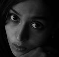
Up close and personalby arpitaComment: i don't mind the low-key approach, but I'd like to see a little more contrast, especially in your eyes. raising your light source (or - if it's the sun - angling your head towards the light) would help some i think. nice to see another one (there are very few) that faces the challenge head-on. lots of half-faces and blurred faces etc out there.
|
 Photographer found comment helpful. Photographer found comment helpful. |
| 02/15/2005 11:09:49 PM |
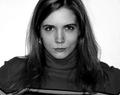
Contrastby Erin_KComment: your titls is exactly what this is missing for me. there's contrast between you and the background, but the tones in your face are a little on the flat side (lots of shades of grey...but no so many blacks or whites. better lighting and less fixing after the fact would solve that i think (but don't really know since i don't know how you lit it :))
i like the pose - kind of a visual affront - no fear or shame...just 'welcome to me'. nice.
P |
| Photographer found comment helpful. |
| 02/15/2005 11:07:14 PM |
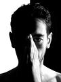
Half (Grief for My Father)by TiberiusComment: I'm a big fan of this pic. i saw the thumb and it didn't do much for me, but now that i see the full version i really like it. a little hot in some places, but that's a minor complaint.
well done. |
| Photographer found comment helpful. |
| 02/15/2005 11:03:14 PM |
Diffident Selfby davidbedardComment: you just don't hear the word diffident enough in a day. though this is a fairly bold portrait for one who claims not to be ;)
i like it. i like the skew to it, and i really like the red thing above your head...adds a twist.
nice work.
P |
| Photographer found comment helpful. |
| 02/15/2005 11:01:09 PM |
Yo Yo Manby orussellComment: yo yo with a strobe? Cool, Owen. i think if people realised how you did this you'd get higher marks...i like it.
P |
| Photographer found comment helpful. |
| 02/15/2005 10:59:16 PM |
Off In My Own Little Worldby space amoebaComment: would like to see your face a little more contrasty...the sepia tones don't seem to hit all the way down to black, and that washes you out a little. it just a personal preference thing...perhaps that's exactly what you wanted. the expression is good; apt for the title (chicken or egg...dunno)
nice.
P |
| Photographer found comment helpful. |
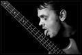
| 02/15/2005 10:57:34 PM |
Bass Loverby NazgulComment: this is hilarious. it freaks me out a little too...but still awesome. great duo conversion, and very good lighting. and who doesn't love bass? :)
P |
| Photographer found comment helpful. |
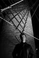
| 02/15/2005 10:55:46 PM |
Death is in the Windsby chefsamComment: hey i know that face :) very nice. great lighting...i'll be interested to see how you did this. i like how all the diagonals converge and point right to the top of your head...very creative.
P |
| 02/15/2005 10:54:21 PM |
Thesisby ZoomdakComment: maybe a little more at the bottom so it doesn't look like your legs are cut off. other than that this is fabulous. dunno if you intended to have the sun peek over your shoulder like that, but it's really quite cool.
P |
| Photographer found comment helpful. |
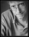
| 02/15/2005 10:51:28 PM |
Miyka'elby mcmurmaComment: this is awesome. the shallow depth is very effective in highlighting your face. the border's not my favourite, but it's not awful either. Magnificent lighting. very little reflection on the glasses...just a little on the rim above your right eye...a difficult feat indeed. well done.
P |
| Photographer found comment helpful. |
Home -
Challenges -
Community -
League -
Photos -
Cameras -
Lenses -
Learn -
Help -
Terms of Use -
Privacy -
Top ^
DPChallenge, and website content and design, Copyright © 2001-2026 Challenging Technologies, LLC.
All digital photo copyrights belong to the photographers and may not be used without permission.
Current Server Time: 06/24/2026 07:20:06 AM EDT.