| Image |
Comment |
| 07/26/2006 11:49:56 AM |
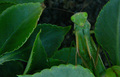
Camouflageby CaltropComment: If that ugly little bug was more the focus of this shit, perhaps with some lighting on his face, this shot would have been excellent. The way he is cocking his head really gives life to what is otherwise 'another bug shot'. A noble attempt! 5. |
 Photographer found comment helpful. Photographer found comment helpful. |
| 07/26/2006 11:48:55 AM |
|
| 07/26/2006 11:48:17 AM |
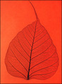
Red Leafby DigiFotoBuddyComment: This is a good idea and the photo is well taken. However the cropping off of the top of the leaf and setting the leaf smack in the center of the shot makes this uninteresting. Moving the leaf off to a side so the contrast between those nice veins and the flat background would really have added some pop to the shot overall. |
| Photographer found comment helpful. |
| 07/26/2006 11:46:35 AM |
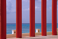
Blue on Blue Abstractby dleachComment: Ok I'm lowballing this and here is why. Blue on Blue is what you present as your theme. Yet the dominant subject in the photo are the large red bars. Add to this the white railing or knee wall and the brown bit of concrete showing and this is about as far removed from color on color as could be.
Compositionally, this was a nice idea. As this is advanced editing, I think you could have taken this and played with the colors to get everything up as shades of blue to better meet the challenge. Also would have been good to clone out that piece of hair or whatever is in the top right corner. |
| Photographer found comment helpful. |
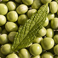
| 07/26/2006 11:43:42 AM |
Minted Peasby frogletComment: This is a nice shot and a really appealing balance between shades of green.
With the flat dof, it loses some spark. I would have liked it if the peas were a bit out of focus, drawing the eye to the leaf. Or setting the leaf off to one side or the other of the shot. Any of that or some other method to improve the contrast between subjects would improve the shot, but really nice overall.
6. |
| Photographer found comment helpful. |
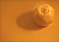
| 07/26/2006 11:41:34 AM |
Citrusby BigKComment: Really nice. I like the halo around the orange. Wish the shadow were a bit darker to provide a bit more contrast. Also would have liked to see that little bit of green stem plucked out so this would have been purely a composition of oranges.
6. |
| Photographer found comment helpful. |
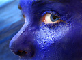
| 07/26/2006 11:40:36 AM |
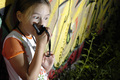
Blue gazeby Gaby_GComment: Pros: those blue eyes really make the shot. Texture of the paint on the skin really nice. I like the highlight under the eye. Like the dof.
Cons: The little bit of the other eye that is showing, and the eyebrow, detract from the shot. Would like to see all of the main eyebrow, and if you had painted or powdered it a lighter shade of blue as well that really would have sex'd it up. As this was advanced editing, another thing that could really have added some spark would be to either get rid of the veins in the eye or else tint the white part of the eye a light shade of blue as well.
6. |
| Photographer found comment helpful. |
| 07/26/2006 10:19:57 AM |
Body & Linesby hannekeComment: I voted a 5 on this.
The image is so dark that the rope prop becomes a distraction.
I didn't feel that using the contrast between the skin and the black background was really showing lines. I guess it is splitting hairs, but this is just exploiting contrast that highlights the edges of the body parts. If an edge is the same as a line then a picture of anything in the physical universe would meet the challenge. ;)
Were the rope more prominent in the photo, it would have better relayed the concept to me.
So, there ya go. I get a lot of hatemail for being a troll, so a 5 from me is probably a 7 or 8 from someone else ;). Above comments aside, I really did like the photo. |
| Photographer found comment helpful. |
| 07/26/2006 01:28:33 AM |
Susan on the Lake Shoreby RebeccaComment: The perspective of your outtake is better, but the PP gives too much of a digital look. The original shot is perfect in that regard. |
| Photographer found comment helpful. |
| 07/26/2006 12:53:11 AM |
|
| Photographer found comment helpful. |
Home -
Challenges -
Community -
League -
Photos -
Cameras -
Lenses -
Learn -
Help -
Terms of Use -
Privacy -
Top ^
DPChallenge, and website content and design, Copyright © 2001-2026 Challenging Technologies, LLC.
All digital photo copyrights belong to the photographers and may not be used without permission.
Current Server Time: 06/21/2026 08:45:07 AM EDT.