| Image |
Comment |
| 08/02/2006 12:29:36 AM |
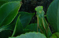
Camouflageby CaltropComment: Wow man, I had a really unfortunate typo in my comment! 'this shit' should have been 'this shot'!!! I am very sorry! |
 Photographer found comment helpful. Photographer found comment helpful. |
| 08/02/2006 12:10:03 AM |
|
| Photographer found comment helpful. |
| 08/01/2006 11:01:38 PM |
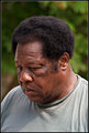
Bargain Hunterby SDWComment: Like the expression on this guy's face. Good candid shot, nice crop, nice bokeh. |
| Photographer found comment helpful. |
| 08/01/2006 10:58:58 PM |
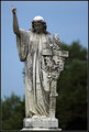
Weatheredby SDWComment: Looks a little blurred at the base, but I hope you find time/inclination to process this black and white - I think it would look great. Looks good as is, but BW would really show off the grunge on that statue. Nice one. |
| Photographer found comment helpful. |
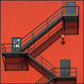
| 08/01/2006 10:57:31 PM |
Shadowsby SDWComment: Of all your recent batch of shots, I like this one best. In part because I like architecture shots, and in part because of the stark contrast between the red and black. I would rotate it clockwise a hair to try and get things level, but really this is great. I love the shadows too. That little light and the windows on the one door break up the picture just enough to keep it from looking sterile. This is a really nice photo. |
| Photographer found comment helpful. |
| 07/31/2006 05:04:23 PM |
|
| 07/31/2006 04:17:36 PM |
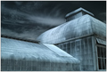
Zen & the Art of Architectureby lwkimagesComment: It's a nice shot, like the color and the composition. It gives me a sense of nightmare though as it is so unnatural. To that end, I don't find serenity or harmony here. Ethereal - yes, other worldly - yes, gothic - yes. Nice shot, just not the shot for this challenge. 5. |
| Photographer found comment helpful. |
| 07/31/2006 04:17:30 PM |
Chopsticksby shudderbugComment: Very simplistic. Certainly presents a serene image. The composition would benefit from moving the plants down and more to the right and cropping out about half of them. Overall this needs more contrast. Meets the challenge, but the shot itself could use some work. 5. |
| Photographer found comment helpful. |
| 07/31/2006 04:17:25 PM |
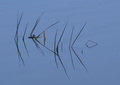
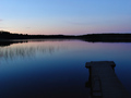
Midnight Sunby andy74Comment: Nice photo, I'm sure it will fare well. The pier (I assume it's a pier) is a big distraction here. An odd angle on it, completely blacked out anyways. It interupts the eye when taking in an otherwise perfect attempt at capturing the mood of the challenge (serene, harmony, etc). Like the colors, like how the blades of grass break up the water. Very nice. 5. |
| 07/31/2006 04:17:20 PM |
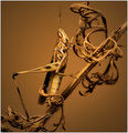
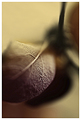
the heart of the matterby IreneMComment: This is an interesting image. I like the material you've used and the textures it presents. I like how the lighting plays across it. The yellow/greenish banding in certain areas detracts greatly (and I've checked this on 3 monitors now). Possibly a shallower DOF would enhance the shot. Composition is nice. This has a very edgy feel to me though, something that might have been muted with a little blur or more subdued lighting especially in that center hotspot. It doesn't show me harmony or serenity and even though it is a simple object it is a very complex arrangement of lines for the eyes to follow. So I'm judging it a good photo that wasn't so hot for this challenge. 5. |
| Photographer found comment helpful. |
Home -
Challenges -
Community -
League -
Photos -
Cameras -
Lenses -
Learn -
Help -
Terms of Use -
Privacy -
Top ^
DPChallenge, and website content and design, Copyright © 2001-2026 Challenging Technologies, LLC.
All digital photo copyrights belong to the photographers and may not be used without permission.
Current Server Time: 06/21/2026 03:00:33 PM EDT.