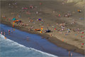
Surf Patrolby
NuzzerComment: Well, hello fellow Critique Club member! This is my first official critique as a member, so I hope you truly find it helpful in some way.
Okay, here goes. Ahem...
Composition
I'm a big fan of this type of corner composition. I like that you have the ocean coming in from the lower left and the bright spot of grass in the upper right. They combined give a good balance.
I remembered this image instantly from the challenge when it was selected for me to critique. I remember hitting next pretty quickly, but then coming straight back to it to check out the tilt shift. Nothing stopped me from cruising past it initially though. I can't help wanting something larger in the photo, something more demanding of my attention other than the center flag.
Settings
Nothing jumps out at me as an incorrect setting. In a single exposure you pretty much have to expose for your whites or your blacks. Clearly you wanted to keep your tide from blowing out and your people from becoming little white glowy balls with no detail. Everything seems well exposed and sharp to me.
Processing
I love the shift tilt style, and you had a great vantage point for it.
The colors are great. There's a lot of sandy tan, but the blue tide coming in and all the bright spots of clothing give your eye something to hop around on. I might have lightened up some of the sand to give the appearance of more sun. It looks pretty cloudy especially towards the top.
Summary
Clearly your commenters loved it. Look at that 7.4! I think overall just nothing jumped out to the average voter.