| Image |
Comment |
| 11/27/2006 12:04:02 PM |
|
 Photographer found comment helpful. Photographer found comment helpful. |
| 11/27/2006 11:59:27 AM |
|
| Photographer found comment helpful. |
| 11/25/2006 11:31:44 PM |
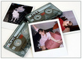
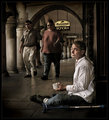
1963's new technologyby ClayaComment: While I agree that the pose of the girl is the right choice for the top photo, the cushion/pillow looks pretty nasty. |
| Photographer found comment helpful. |
| 11/25/2006 11:23:30 PM |
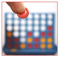
four on a rowby HeidieComment: It would have been funny to have the reaction of the other player fuzzed out in the background. Doing kind of the "Ahhhhhh! Don't put it! I'm gonna lose! Oh God why!?" |
| Photographer found comment helpful. |
| 11/25/2006 11:15:38 PM |
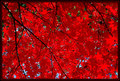
under the Japanese mapleby fisheyeComment: It looks like the contrast was bumped up too high, but that doesn't make me not like the photo entirely. It kinda looks cartoonish. That could be very good in certain situations. This is one to think about. |
| 11/25/2006 11:04:31 PM |
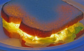
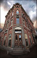
Bittersweetby humanprotocoldroidComment: I would have liked to see you bump up the red hue in this to bring out the brick more. On a side note I noticed too is that if you turn the reds all the way down the painting of the guy in the top center window stands out more which is pretty cool. |
| Photographer found comment helpful. |
| 11/24/2006 07:57:44 PM |
|
| Photographer found comment helpful. |
| 11/22/2006 06:09:02 AM |
|
| Photographer found comment helpful. |
| 11/22/2006 04:47:25 AM |
|
| Photographer found comment helpful. |
| 11/20/2006 01:16:13 AM |
|
| Photographer found comment helpful. |
Home -
Challenges -
Community -
League -
Photos -
Cameras -
Lenses -
Learn -
Help -
Terms of Use -
Privacy -
Top ^
DPChallenge, and website content and design, Copyright © 2001-2026 Challenging Technologies, LLC.
All digital photo copyrights belong to the photographers and may not be used without permission.
Current Server Time: 06/26/2026 10:50:21 PM EDT.