| Image |
Comment |
| 03/13/2007 03:14:13 PM |
KERMIT the frogby rosiehallComment: I can see him. I'm just not sure what I think though, heh. There's a combination of "what the hell" and "awww." |
 Photographer found comment helpful. Photographer found comment helpful. |
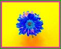
| 03/13/2007 03:07:59 PM |
Circles of goldby hajekaComment: This is pretty cool. You did a nice job of controlling your glare. One thing I would suggest would be a border. I know a lot of people are against borders in the challenges, but I think there's certain photos that really stand out with a good border. |
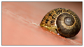
| 03/13/2007 03:04:36 PM |
Slimy @by ValdoComment: I like the colors and composition, but eeeeeew!
This is a very nice use of diaginal composition. =) |
| Photographer found comment helpful. |
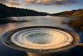
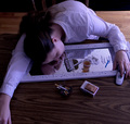
| 03/12/2007 03:40:47 PM |
Down the Hole by FalcComment: My first thought: Whoa.. where the hell is that?!
Firstly I think your horizon is tilted just a wee bit. I probably only notice that though, because I've been staring at it for a few minutes, heh.
I'm not sure what the area was like, but I'm curious what the shot would have looked like a few steps to the left and facing more of the green hills that are on the right side. I'm not sure what the triangle shaped object is on the lower right. Would it have interferred with getting more of those hills in the shot?
This is definately something I would try getting tons of shots of. It's not something you see very often, and it has a lot of potential. I think a few minutes earlier you could have gotten a stronger warm glow on those rightside hills and maybe used a quicker shutter speed to freeze the water a bit more.
Like I said though, I think there's a ton of options with this location. Very interesting. |
| Photographer found comment helpful. |
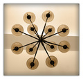
| 03/12/2007 03:32:27 PM |
12 Circlesby AdiGriComment: I think that if the line were straight across the photo rather than slanted it would prove to be a much stronger photo. The border is also lessening the impact with the blur. I think no border or a 10 pixel black border would really give this photo punch. The colors are nice. |
| Photographer found comment helpful. |
| 03/12/2007 03:26:17 PM |
Moss Moistureby pointandshootComment: I really like the simplicity of this. My complaint is that there's a very noticable grain. I think running this photo through NeatImage would do it wonders. |
| Photographer found comment helpful. |
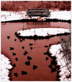
| 03/01/2007 03:19:18 PM |
Red Pondby gsalComment: Someone once told me about colors vs emotion. When you see snow your mind says "cold." So to prevent a mental conflict you want to stay in the cool area of the color wheel. I agree with that to a point. With solo pictures I'd agree. If you're making a collection and the whole collection is going to make a statement then I'd say you can wander off in whatever color direction you want.
In this case I'm not really digging the red. Red + water = blood. If your intent was to make the poor ducks swimming in blood then I guess you accomplished your goal. However I'm not sure that was your intent, so I would have suggested using a cool blue/purple/grey. I struggle sometimes with choosing colors like this. The red certainly does look cool on certain elements of the photo, but as a whole it doesn't completely work. |
| Photographer found comment helpful. |
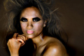
| 03/01/2007 03:12:21 PM |
F E R A Lby njsabsComment: The white of the eyes look very unnatural. The lips look like they were touched up too, but I think if the eyes were less obviously doctored the lips would be okay. |
| Photographer found comment helpful. |
| 02/07/2007 12:15:55 PM |
|
| Photographer found comment helpful. |
| 02/07/2007 12:06:41 PM |
|
| Photographer found comment helpful. |
Home -
Challenges -
Community -
League -
Photos -
Cameras -
Lenses -
Learn -
Help -
Terms of Use -
Privacy -
Top ^
DPChallenge, and website content and design, Copyright © 2001-2026 Challenging Technologies, LLC.
All digital photo copyrights belong to the photographers and may not be used without permission.
Current Server Time: 07/17/2026 12:54:25 AM EDT.