| Author | Thread |
Comments Made During the Challenge  |
|
|
03/17/2007 04:29:45 PM |
|
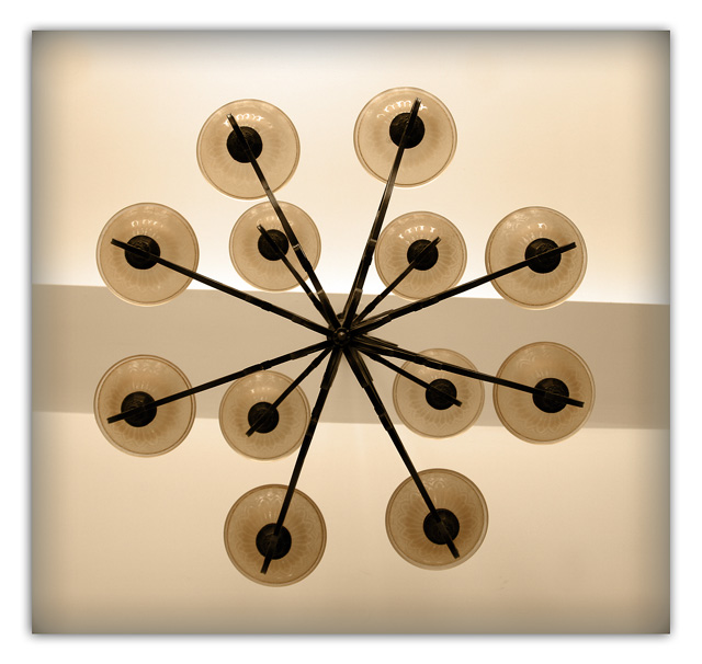
in general I like this idea and shot. the only thing that is a bit distracting is that the center stip of colour is not level or evenly placed in the center of the lights.. 6 |
|
 Photographer found comment helpful. Photographer found comment helpful. |
|
|
03/15/2007 01:23:48 AM |
|
| Photographer found comment helpful. |
|
|
03/12/2007 08:08:29 PM |
|
i like the tones on this, but the vignette around the outside of the image does not work for me - I would have preferred a sharp border around the image instead. Still, its a good image 7 |
|
| Photographer found comment helpful. |
|
|
03/12/2007 07:44:49 PM |
|
This looks like a chandelier photographed from above. Very cool. |
|
| Photographer found comment helpful. |
|
|
03/12/2007 03:32:27 PM |
|
I think that if the line were straight across the photo rather than slanted it would prove to be a much stronger photo. The border is also lessening the impact with the blur. I think no border or a 10 pixel black border would really give this photo punch. The colors are nice. |
|
| Photographer found comment helpful. |
Home -
Challenges -
Community -
League -
Photos -
Cameras -
Lenses -
Learn -
Help -
Terms of Use -
Privacy -
Top ^
DPChallenge, and website content and design, Copyright © 2001-2026 Challenging Technologies, LLC.
All digital photo copyrights belong to the photographers and may not be used without permission.
Current Server Time: 06/29/2026 10:53:18 PM EDT.