| Image |
Comment |
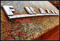
| 12/26/2007 06:44:03 AM |
Rusty n' Crustyby Yo_SpiffComment: I have to say at first glance I really liked this photo. However, because I liked it so much, I sat and stared at it... then I got picky...
The texture is beautiful and colorful. I think you're limiting your fan club with the baby blue border. Maybe over-sharpened as a whole? From a distance your focal point looks crisp and sharp, but when you get closer, the detail seems pixelated. You might be a touch overexposed just going by the glare off the F, but it doesn't bother me too much.
I still think it's a beautiful photo, though! You should do well. |
 Photographer found comment helpful. Photographer found comment helpful. |
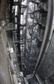
| 12/26/2007 06:23:14 AM |
New Yorkby mb2006Comment: This has incredible perspective. The brown is really distracting though. I wish you would have completed the desaturation and boosted the contrast between white and black.
With a true black and white version I would say this is up there with many other New York classics. ...if only it were a true black and white, heh. |
| Photographer found comment helpful. |
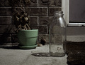
| 12/20/2007 07:20:04 AM |
Waiting for the milk manby smurfguyComment: I love the muted colors of this. The reflections and shadows are great, and the textures have great depth and interest.
With that said I don't like the crop, heh. It seems too tall to me. I copied it into Photoshop and played with some different crops. I found that cutting a bit off the bottom, a bit off the top, and a bit off the left side added more punch to the photo (a bit = about 1/4 of an inch). |
| Photographer found comment helpful. |
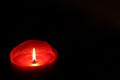
| 12/20/2007 07:07:34 AM |
A lone flame. A guiding light. The beauty and magic of a single candle is endless...by AbraCadabRa13Comment: Your exposure is great, and your focus is dead on.
Unfortunately I can't say the image does much for me. Without reading the title I wouldn't know that the flame is your focus.
While I appreciate the simplicity and minimalism of the background, I don't think it adds anything. I think you could get away with a much tighter crop and accomplish the minimalism effect you're going for. As it is right now, there's so much black that it's competing with your lone flame. |
| Photographer found comment helpful. |
| 12/20/2007 06:42:14 AM |
Protectionby SherwinJamesComment: I have to admit that my first thought was that the jewel was out of focus. In the time it took me to sip my coffee, I started to appreciate the depth a bit more.
This photo is actually quite funny. I really like how the chain is laid leading back to the jewel. This is very well presented. I hope others stop to take a second glance. |
| Photographer found comment helpful. |
| 12/12/2007 04:42:22 PM |
A Formal Affairby idnicComment: At the risk of being slaughtered by adoring idnic fans, I have to be honest. This photo makes you look like you have a bubble head.
I've seen other photos of you, so I know you don't have a bubble head. Like a couple others pointed out, it most likely has a lot to do with the lens/angle.
It could also be a bit of an illusion since you are so tiny at the bottom and at the top there's your head, your hair, and your hands over your chest in the long black gloves. You're also shrugging a little. The image looks very top heavy, which could be creating an unnatural distortion for some of us. |
| Photographer found comment helpful. |
| 12/01/2007 01:32:00 AM |
The Last Days of Autumnby staticoyComment: The idea of this shot is actually quite moving.
I would say I'm not sold on the post processing, but I actually think shooting this at a different time of the day would help drastically. There's some pretty harsh light on her fare skin.
I might have cloned out the bush creeping in from the left next to the tree. Otherwise I really like the composition. |
| Photographer found comment helpful. |
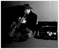
| 11/28/2007 06:08:08 AM |
Pocket Change Improvisations  by bassboneComment: Look at you, Mister Fancy Pants with a blue ribbon now!
This was very believable as a street sidewalk. You look very calm for a timer photo, heh. An excellent black and white, my friend.
Congratulations! |
| Photographer found comment helpful. |
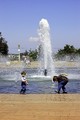
| 11/20/2007 03:26:49 PM |
Purity of Youthby CKYidiotComment: 1)Your original isn't balanced. By putting the fountain as the center focal point, the photo seems less cluttered. To me making the fountain the focal point, actually focuses the viewer on the children more. Cropping also chopped out the tree that was coming in from the left. I did crop out a small bit of empty blue sky, but I left most of it, because it shows the height of the fountain. As a bonus with the tighter crop, I noticed the bicyclist behind the fountain. Ooo, depth!
2) Your original really was over sharpened. I tried correcting this by blurring the youngest one's face a tad and dodging/burning it at the pixel level. (Meaning, I zoomed WAY in, heh) The best way to fix this is to not over sharpen. It's easy to get carried away trying to sharpen water drops from fountains, but don't forget to look at what it's doing to the image as a whole. You lost nearly all detail in the faces of the children, and they were your subject, not the fountain. I also ran the image through Neat Image in attempts to soften it.
3) I cloned out the wire that other people were talking about. It really was distracting, heh.
4) I Dodged and Burned the bricks a little.
My Edit

|
| Photographer found comment helpful. |
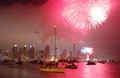
| 11/20/2007 03:00:00 PM |
And the rockets' red glare...by CKYidiotComment: I have to admit, this photo was the first to jump off the screen. Like everyone else I said "ooo pretty pink." (I hate pink, mind you)
1) I cropped out the blacker bit of sky in your top left corner. To me this image is about the pink water. Sure, the firework is pretty, but we've all seen fireworks, and they themselves don't have a "wow" factor. With that in mind, it doesn't hurt to chop a little bit of it out.
2) I used the Sharpen Tool on your foreground boat.
3) I Dodged Highlights and Burned Shadows. I find that this helps sharpen images without actually using any of the sharpening tools. It also helps with fog/haze. I used it to bring out your city a bit. I also used it on the main boat to clear it up.
4) If I could I would move your foremost boat, but I can't, heh. Composition wise, it needs to be at least 1/2 inch to the left.
My Edit
 |
| Photographer found comment helpful. |
Home -
Challenges -
Community -
League -
Photos -
Cameras -
Lenses -
Learn -
Help -
Terms of Use -
Privacy -
Top ^
DPChallenge, and website content and design, Copyright © 2001-2026 Challenging Technologies, LLC.
All digital photo copyrights belong to the photographers and may not be used without permission.
Current Server Time: 07/17/2026 07:33:05 AM EDT.