| Image |
Comment |
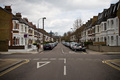
| 04/12/2008 03:37:27 PM |
Hammersmithby jorundtmComment: You'll probably get some "snapshot" comments with this shot. This could use some stronger saturation to bring out the yellows, reds, and maybe some blue from the sky. The whites could use a bit of a Curve boost also. |
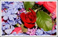
| 04/12/2008 03:33:57 PM |
A Single Red Roseby TerComment: I'm not sold on the harsh flash/light for this photo.
I've seen some harsh sun, but if I had to guess, I'd say that this is a flash. I'm still learning about flashes, so I don't know exactly how you could have made this better. With the delicate pastel flowers I would say you usually would want a softer light. Natural light is great for these types of shots with maybe a soft bounced fill flash. |
 Photographer found comment helpful. Photographer found comment helpful. |
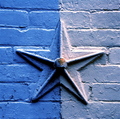
| 04/12/2008 03:07:40 PM |
Row Home Detailby cstein96Comment: The colors are nice and pleasant to the eye, but there's nothing terribly interesting about the photo to me. This is not to say that it's not a nice photo, but it just doesn't draw any emotional attachment for me. |
| 04/12/2008 02:53:51 PM |
Pluto the cat watching me leaveby PompouspeteComment: Often times centered composition begs for a square crop, and I think this is one of those cases. I think the image would have a lot more power as a square crop. As it is right now the green beams take away from the adorable cat.
When you have horizontal lines like that, most people will expect them to be straight. Your cat's eyes appear to be level, so the more you can minimize the green bars, the better it will be. |
| Photographer found comment helpful. |
| 04/12/2008 02:47:09 PM |
This Time You Will Not Escape !!!by bialas88Comment: Ahh!
A more interesting background would help this photo significantly. If you're going to have your background in focus it needs to somehow support the image's message.
Speaking of message.. what does the shirt say? A t-shirt that the viewer can't clearly read is distracting.
I assume this is a self portrait and that's why one hand is out of focus. It looks like it was a bit too close to the lens. Gotta love the distortion though, heh. |
| Photographer found comment helpful. |
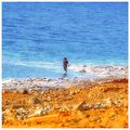
| 04/12/2008 02:39:32 PM |
Against a blue screenby HighNoonerComment: I love the complimenting colors and how they're layered. I wish I could see more of what she were doing. I associate that position with cell phone texting, heh.
I think the photo as a whole is just a tad over-sharpened. I'd imagine you were trying to get the subject sharper, but with the limitations of Basic, you couldn't just single her out. The smaller rocks along the shore look a bit busy and pixelated with the sharpening. It might also be caused by the compression to JPG.
The centered composition certainly works for this photo. |
| Photographer found comment helpful. |
| 04/08/2008 03:51:11 PM |
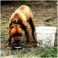
Abused and Neglectedby JamesKWComment: Thank you for giving these pups food and a voice.
I think the photo is great as is without digging into the technicals from a journalism standpoint.
In digging into the technicals it looks a tad over exposed or contrasty on the whites and could have used a fill flash on the face (that would have gone over well, I'm sure, heh). I'm not sold on the square crop and would have liked to see more of the chain in a horizontal crop.
Again, thank you and I hope you follow up once that bag of food is gone. |
| Photographer found comment helpful. |
| 03/30/2008 04:50:08 PM |
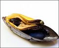
On the half shellby ShutterPugComment: I agree with others said about nice colors. The yellow might be just a bit hot, but it honestly doesn't bother me much. I like the lighting and the composition.
One thing I'm surprised no one has mentioned is the motion blur. Despite all these nice elements, nothing is in focus. In a way I'm thankful, because it's incredibly gross! How do people eat that?? |
| Photographer found comment helpful. |
| 03/30/2008 04:40:48 PM |
Day-30.jpgby ZeppKashComment: That's the prettiest toilet paper roll I've seen in a long time. It almost looks like a valley wall where you see the different layers of sediment.
I wonder what it would look like if you let it sit in some food coloring and let it suck up some color. I know when I've dropped my roll in the toilet, it dries with some pretty interesting curves. It could be a Curves challenge entry for you, heh. |
| 03/22/2008 07:50:59 PM |
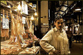
The Butcherby IraklisComment: Very interesting and well balanced. There's a lot going on, but it doesn't seem cluttered. You've created a nice centralized flow for the viewer. I'm also a sucker for muted colors like these, and there's great contrast balance.
As commentary, that butcher scares the crap out of me, heh. |
| Photographer found comment helpful. |
Home -
Challenges -
Community -
League -
Photos -
Cameras -
Lenses -
Learn -
Help -
Terms of Use -
Privacy -
Top ^
DPChallenge, and website content and design, Copyright © 2001-2026 Challenging Technologies, LLC.
All digital photo copyrights belong to the photographers and may not be used without permission.
Current Server Time: 07/17/2026 12:30:44 PM EDT.