|
|
|
Showing 3921 - 3930 of ~8163 |
| Image |
Comment |
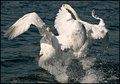
| 04/27/2009 11:56:55 PM | Gloves Off!by lyn100Comment: wow, amazing shot of swans squabbling! great lines as one bird pursues another. 8 |  Photographer found comment helpful. Photographer found comment helpful. |
| 04/27/2009 11:55:26 PM | | | Photographer found comment helpful. |
| 04/27/2009 11:54:33 PM | | | Photographer found comment helpful. |
| 04/27/2009 12:32:59 AM | Awakening by goinskiingComment: OMG Matthew, that is such a terrific shot. Great work and huge congrats on your first ribbon! | | Photographer found comment helpful. |
| 04/26/2009 11:55:17 PM | Color Of Lifeby bonjoviComment: Greetings from the Critique Club!
Initial impression: Basically a good colourful shot of a popular theme in this challenge, but lacking in the WOW factor. In voting I would have given this a 6.
Technical: Good even lighting, but a bit flat. The pov is fine for this sort of immediate overhead shot; the dof could use a little work as it does look a little soft. Good use of thirds and lines.
Artistic: I love that the ends of the pencils have that odd white band, it really helps draw attention to the heart...
FWIW: ...in fact, I would have cropped this way down to drive home the shape, and really hit it with the saturation, then after resizing, used unsharp mask at least once and probably sharpen edges too.
Overall a pleasant pic and very well done in terms of execution, just needs a little more tweaking to make it pop.
Feel free to PM me with any questions.
Susan | | Photographer found comment helpful. |
| 04/25/2009 01:16:26 AM | Winkby jwaddisonComment: Greetings from the Critique Club!
Initial Impression: A fun, playful, clean shot and yes I also tried to brush the crayon 'crumbs' off my screen! And cool double-colour crayon, where were those when I was growing up?!
Technical: I like the comp and leading lines here. Light is quite good but risks being flat, and that teeny little shadow gives the shot some dof. Focus is a little soft. I have that lens in MF, and it really makes you work for a sharply-focused macro.
Artistic: No problems with the concept here, and the execution is very good, but macros (and the dpc crowd) demand tack-sharp focus. I see you're also where I am at in terms of lights; you could use a secondary light to knock out that shadow if you wanted to.
FWIW: In a word, or name...  IreneM IreneM. Even better, try to replicate one of her shots! After resizing your pics, try a couple of passes with unsharp mask and see if you like the result.
Overall a very pleasing pic to look at, I think you're going in the right direction. Good work!
Feel free to PM me with any questions.
Susan | | Photographer found comment helpful. |
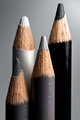
| 04/25/2009 12:51:45 AM | Grayscale Family Portraitby aliquiComment: Greetings from the Critique Club!
Initial impression: A very simple, cleanly executed shot of a 'family' of pencils that cover most of the bases on the grayscale. I would've given this an 8.
Technical: The composition is great, all the varying heights of the pencils adds flow and interest to the shot; the lighting is wonderful and offsets the pencils to advantage. No pencil is lost against the b/g. I would have liked to see more dof. That f1.8 is a great lens; I love it because it makes me to work so hard to get a good shot.
Artistic: Love the idea of a family portrait, the clean lines and flow here, such a simple idea and very well done. Obviously the dpc crowd agrees. Can't argue with a top-20 finish!
FWIW: Apart from the dof, I wouldn't change a thing. A perfect example of a shot showing the KISS principle at work. Well done!
Feel free to PM me with any questions.
Susan | | Photographer found comment helpful. |
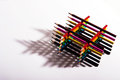
| 04/24/2009 01:39:22 PM | Inside, we are all the same.by witt34Comment: Greetings from the Critique Club!
Initial impression: very interesting concept and execution, a refreshing look at crayons. Risks coming across as dull until you really look at it.
Technical: The centred comp works well here as does the plain black b/g; the red stubs do all look like they belong to each crayon. Like the vignetting, helps to draw attention to the middle.
Artistic: The idea behind this shot is what really sells in imho, that the outer packaging is just that and nothing more. Using a circle is perfect because it is the universal symbol of unity. Like that all the colours' labels show too.
Overall a nice, clean shot that carries a message which I hope others latch onto. And looking at your final score and placing, I'd say you did a good job of that. Well done!
Feel free to PM me with any questions.
Susan | | Photographer found comment helpful. |
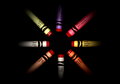
| 04/24/2009 01:32:01 AM | Fish Shadowby AmeedEl-GhoulComment: Greetings from the Critique Club!
Initial impression: You sure get dizzy after looking at this shot for awhile, in a nice way :-) Colourful and clearly a painstaking amount of work went into this setup and shot. Glad that the voters appreciated it. I would have given this a 7 or 8.
Technical: Good comp, effective use of thirds. Shadows are tough to do on this site. If they're too strong you usually get blasted. However, shadows can also add dof to a shot and here the shapes created by the shadow are crucial. So in this case I would've tried to bump up the shadow a bit, either by moving the light closer or shooting at a slower speed. 1/100 may have done the trick.
Artistic: I love that you used exactly the same coloured pencils on each layer, and how you got them to stack so precisely is a testament to your patience. The shape of the shadow moves nicely into all that available space.
FWIW: I find that Levels are useful but quite limited. Experiment with the Curves option in Adjustments, and see how it works, get familiar with it; Curves is a great tool to have in your repertoire. And after you resize the image, try Unsharp Mask, just to give the edges a tiny bit more definition.
Overall a very clever idea, well executed, and glad you finished so high!
If you have any questions feel free to PM me.
Susan | | Photographer found comment helpful. |
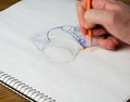
| 04/23/2009 02:40:16 PM | Photo of a Drawing of a Cameraby tpbremerComment: Greetings from the Critique Club!
Initial impression: Made me smile with the hand drawing the camera and a picture being taken of the hand drawing the camera.
Technical: Like the execution here; the lighting is good, composition is made more interesting by the angles of the paper and the hand.
Artistic: I like the blurred hand, because I feel the pic would have looked too static otherwise. The orange of the pencil helps offset the blue of the camera body. There does seem to be a lot of white space at the lower right, though.
FWIW: I probably would have cropped in a bit more, or have the drawing closer to the spine of the sketchbook. In voting, I would give this a 6.
Feel free to PM me with any questions,
Susan | | Photographer found comment helpful. |
|
Showing 3921 - 3930 of ~8163 |
Home -
Challenges -
Community -
League -
Photos -
Cameras -
Lenses -
Learn -
Help -
Terms of Use -
Privacy -
Top ^
DPChallenge, and website content and design, Copyright © 2001-2026 Challenging Technologies, LLC.
All digital photo copyrights belong to the photographers and may not be used without permission.
Current Server Time: 06/20/2026 04:27:19 PM EDT.
|