|
|
|
Showing 2021 - 2030 of ~3441 |
| Image |
Comment |
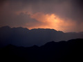
| 06/09/2006 11:26:06 PM | The World Is Waiting For The Sunrise (Hamburg 1960)by TejComment: ::: Greetings from Critique Club :::
Hi, as requested, here is an indepth critique of your submission.
First Impression - the most important one:
Nice landscape, but I think not being able to PP it hurt the shot quite a bit.
Composition:
I'm not sure that I like that the mountain top nearly centers the photo. I think it should be moved somewhat near a more strong point in the photo.
Technical (Color, focus, and light):
Color is nice, but seems a bit undersaturated.
Focus is sharp.
Light: excellent!
To grow its vote?:
Get to a computer with photoshop :-) Really, I think this had a lot more potential than the score it recieved.
Summary:
Nice shot, keep up the good work.
Hope to see more from you soon,
Leroy |  Photographer found comment helpful. Photographer found comment helpful. |
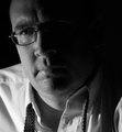
| 06/09/2006 11:05:50 PM | Late Night At The Officeby GT350Comment: ::: Greetings from Critique Club :::
Hi, as requested, here is an indepth critique of your submission.
First Impression - the most important one:
Nice shot, but I'm seeing a few imperfections that could have easily been fixed.
Composition:
I like the composition for a portrait. It may be a little tight, but not by much.
Subject:
Can't really miss him and there isn't any distracting background ,so all is good on that front. Also, looks like you met the challenge well.
Technical (Color, focus, and light):
Color: I like the black and white treatment, very natural feeling. I think I'd like to see a bit more midtone contrast, but overall the treatment is good.
Focus: Sharp and nice detail. Losing a bit of sharpness on the end of the nose, so perhaps a bit deeper DoF is needed.
Light: I like the lighting. I wish the light fall off on the face would have followed down the neck though.
Other: There is a big distracting white spot over the glasses in the dark part of the face. Since this was an advance editting challenge, I think you should have cloned that out. I think it would make a big difference in the shot.
To grow its vote?:
Well, the overall quality of photos in this challenge was very good, so I'd guess that you just got beat by other more interesting subject matter, rather than by your technique. A few technical flaws fixed would have helped a bit.
Summary:
A rather nice portrait with nice lighting. Good work.
Hope to see more from you soon,
Leroy | | Photographer found comment helpful. |
| 06/09/2006 10:43:47 PM | | | Photographer found comment helpful. |
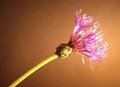
| 06/09/2006 06:48:36 PM | Into The Light......by sailjoComment: ::: Greetings from Critique Club :::
Hi, as requested, here is an indepth critique of your submission.
First Impression - the most important one:
Too shallow DoF and blown highlights hurt what could have been a pretty decent photo.
Composition:
Compositionally, not too bad, I most often like the diagonal cutting of a photo. This one though I think I'd like to see the flower head down in the bottom left corner of the picture. With less stem and more negative space, I think you'd have a much stronger photo.
Subject:
It stands out well from the background, although I think the flower head (the main subject) should be more in focus.
Technical (Color, focus, and light):
Color is a bit warm. I suggest a custom white balance for working under lights.
Focus: As I mentioned earlier the DoF is a bit shallow for my taste. However, this DoF would work if you had focused the camera on the flower and then recomposed the shot.
Light: A bit harsh and it's blowing some of the highlights.
To grow its vote?:
Generally flower shots have to be excellent to score well at DPC. Voters don't treat flowere kindly around here :-( Bad voters! LOL Really though a few technical issues here could help you out a bit.
Summary:
Not bad for your third challenge here. Keep on shooting and you will definitely see better scores.
Hope to see more from you soon,
Leroy | | Photographer found comment helpful. |
| 06/08/2006 11:24:42 PM | | | Photographer found comment helpful. |
| 06/08/2006 12:47:04 PM | Enigmaby rhungComment: ::: Greetings from Critique Club :::
Hi, as requested, here is an indepth critique of your submission.
First Impression - the most important one:
Nice portrait Simple and effective.
Composition:
I like that the fan takes of most of the composition allowing only the eyes to show. Very nice.
Subject:
The eyes become the subject in this photo and you have successfully isolated them.
Technical (Color, focus, and light):
Artistically I like this shot but, you do have some technicals issues.
Color: A bit warm for my taste. The halogens put off a rather warm light that using a tungsten WB doesn't completely compensate for. The only way to deal with this in-camera is a custom WB.
Focus: Eyes are a little soft, I think a bit of USM in photoshop would have given them a sharper look.
Light: It comes across a bit flat. I'm not sure what position the light source was in, but I'd probably move it a bit more off center.
To grow its vote?:
I think voters were expecting more dramatic lighting (often sidelighting) and your photo while lit by a single light source doesn't have that pop.
Summary:
Nice portrait. Very artistic, a few technical issues, but overall nice.
Hope to see more from you soon,
Leroy | | Photographer found comment helpful. |
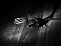
| 06/08/2006 09:55:47 AM | Cut Flowersby TimComment: ::: Greetings from Critique Club :::
Hi, as requested, here is an indepth critique of your submission.
First Impression - the most important one:
You've made this critique pretty easy on me, because you see most of the issues with the photo yourself. Overall, the photo is intriguing though.
Composition:
I'm not fond of the centered vertically comp in this photo. I think shifting the whole composition to the bottom of the frame would have worked better for you.
Subject:
I think the light and texture of the cutting board emphasize your subject well. Good job there. The cutting board was a good idea.
Technical (Color, focus, and light):
Color: I like the B&W conversion technique. It might be a bit too contrasty though, you may want to scale it back some.
Focus: You see the issues yourself, just a bit soft.
Light: Blown highlights as you said.
To grow its vote?:
The technical issues you brought up: so you know where the shot went wrong. Also, a little stronger composition would have helped.
Summary:
I like the idea and the shot. I kinda like that the flower is closed, it seems to work well with the dark photo.
Hope to see more from you soon,
Leroy | | Photographer found comment helpful. |
| 06/08/2006 09:43:54 AM | Mean Mr Mustardby GeckogirlComment: ::: Greetings from Critique Club :::
Hi, as requested, here is an indepth critique of your submission.
First Impression - the most important one:
Well, to be honest, at first I saw no connection to the challenge. The title helped, but even then it was a stretch.
Composition:
It's pretty tight. It's about what you expect to see in a nature photograph.
Subject:
He's right in front. but he gets kinda lost in the background due to natural camo and harsh lighting.
Technical (Color, focus, and light):
Color is pretty good, the lighting makes it seem kinda washed out though.
Focus: A tad soft and then a bit over-sharpened.
Light: This is the cause of most of the issues with this photo. It seems it was shot at about midday with shadows in all the wrong places.
To grow its vote?:
I'm sure the link to the challenge wasn't strong enough to get most voters to pay attention. Also, the lighting issues didn't help.
Hope to see more from you soon,
Leroy | | Photographer found comment helpful. |
| 06/08/2006 01:45:48 AM | Polythene Pamby AghrisComment: ::: Greetings from Critique Club :::
Hi, as requested, here is an indepth critique of your submission.
First Impression - the most important one:
Neat shot and I like the plastic look you seem to have been trying to achieve. She doesn't look much like a man though ;-)
Composition:
I like the square crop, but I think I want to see it a little less tight. It's sorta feeling crowded the way it is.
Subject:
Clear, in your face and works well.
Technical (Color, focus, and light):
Color: A bit warm for my tastes, but not overly distracting.
Focus: Focus looks sharp, but perhaps could stand a little more USM in post.
Light: I like it, it works well for you, other than beinga bit warm.
To grow its vote?:
I'm sure you got voted down a bit for the Neat Image, overprocessing. Not really anyway around that with what you were trying to do. That's more the fault of the voters. Colling the WB might have helped some as would a bit less crowded composition.
Summary:
Cool shot, shows creativity.
Hope to see more from you soon,
Leroy | | Photographer found comment helpful. |
| 06/07/2006 08:55:48 PM | Here Comes the Sunby GinaRothfelsComment: ::: Greetings from Critique Club :::
Hi, as requested, here is an indepth critique of your submission.
First Impression - the most important one:
Nice warm shot fits the title and challenge well.
Composition:
I'm not that educated with landscape type shots, but I think yoou could have strengthened this composition a bit by excluding some of the dark space at the top of the photo and moving the sun a little further left in the composition.
Technical (Color, focus, and light):
Color: Warm feeling and I like it.
Focus seems good.
I love the light play in this image. Good work.
To grow its vote?:
More dramatic post processing could have helped some. Also, strengthening the composition would have helped.
Summary:
I really like this shot, very warm and inviting.
Hope to see more from you soon,
Leroy |
|
Showing 2021 - 2030 of ~3441 |
Home -
Challenges -
Community -
League -
Photos -
Cameras -
Lenses -
Learn -
Help -
Terms of Use -
Privacy -
Top ^
DPChallenge, and website content and design, Copyright © 2001-2026 Challenging Technologies, LLC.
All digital photo copyrights belong to the photographers and may not be used without permission.
Current Server Time: 06/21/2026 02:59:38 PM EDT.
|