| Image |
Comment |
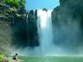
| 07/15/2002 02:57:00 PM |
Grifoby AlemmsanComment: Unfortunately your photo doesn't do much for me - too dark (which in turn perhaps is why it's so grainy), water coming out too fast to see any real stopped motion. IMO you would do yourself a huge favor by reading your manual and turning off that offensive date stamp - that's horrible. ~ cthenk |
| 07/22/2002 12:35:00 AM |
Falling into a Dream by timj351Comment: Woo Hoo to you on your ribbon - I must say, this pic made an impact on me this week - I saw a waterfall and was telling a friend about your photo...I'm glad you placed! :) |
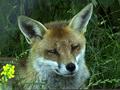
| 07/18/2002 04:40:00 PM |
Sleepy foxby JonniboyComment: This would make a fantastic cover for a book or in a book about them, I'm not quite sold on his eyes, but great job with DOF, coloring, lighting - great job. 9 cthenk |
| 07/18/2002 03:55:00 PM |
Bottle Rocketby Frank BeckmanComment: This is a great capture! In a perfect world I would have liked to see it cropped just above finger on bottle in hopes of seeing more of the rocket trail. The arm and shirt sleeve are distracting. Great job! 8 cthenk |
 Photographer found comment helpful. Photographer found comment helpful. |
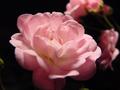
| 07/20/2002 02:48:00 AM |
Practicing with Lightby RWTaylorComment: pretty, but it's the background that's distracting - I wonder what this would look like if this main flower was set back to look like it's in a spotlight (I like the lighting alot) surrounded by blackness - all by itself. If you are able to try it I hope you post it, I really would like to see it - I hope you post what you did to 'try' out your lighting, I like it. good job. 7 cthenk |
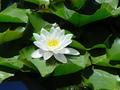
| 07/18/2002 10:37:00 PM |
Water Lillyby SwashbucklerComment: wow, that is some white! I kind of like the shadows and I kinda don't - I do like how crisp and bright the colors are in this. good job. 7 cthenk |
| Photographer found comment helpful. |
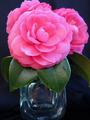
| 07/18/2002 04:12:00 PM |
Cameliasby andrewmComment: Beautiful flowers!! However, I'm sorry but I hate the vase! Not a fan of the water of leaf - unless you put some on the petals too. A black vase to just blend into the background would be prettier (IMO) - then again I'm partial to 'floating' flowers ;) good job. 7 cthenk |
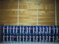
| 07/15/2002 03:02:00 PM |
Addicted to Pepsi?by snergurComment: Perhaps if you had come in closer, to get rid of left side thing, would have made the logo that much clearer, and would have gotten rid of more of whatever the cans are sitting on, turned up the lighting, and made sure all the cans were facing in more of a patternistic way - just my thoughts. Of course it may be my biased opinion, I'm a Coke drinker ;P Good job. ~ cthenk |
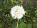
| 07/18/2002 03:53:00 PM |
Blow me awayby freetimeComment: focus is backwards - clarity and sharpness should of been on flower, not grass behind it. |
| 07/18/2002 10:38:00 PM |
Restby millerComment: bizzare. this one has me 50/50 I just can't decide if I like the effect or not. I do like the bright green. 5 cthenk |
| Photographer found comment helpful. |
Home -
Challenges -
Community -
League -
Photos -
Cameras -
Lenses -
Learn -
Help -
Terms of Use -
Privacy -
Top ^
DPChallenge, and website content and design, Copyright © 2001-2026 Challenging Technologies, LLC.
All digital photo copyrights belong to the photographers and may not be used without permission.
Current Server Time: 07/16/2026 03:26:28 PM EDT.