| Image |
Comment |
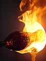
| 08/14/2002 05:51:00 PM |
Created by Fireby LindaLeeComment: Tel me that this was taken in manual mode and I will give you "Highest Technical Honors". The only thing I can find that in my opinion could be improved is framing/croping of the port to show just a sliver more to the right so that the full rim is in frame. My ten this week. |
 Photographer found comment helpful. Photographer found comment helpful. |
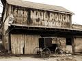
| 08/07/2002 01:26:00 PM |
Weatheredby sohrComment: I knew someone would find a barn with the "Mail Pouch" advertisement on the side. |
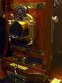
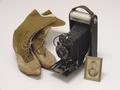
| 08/07/2002 12:54:00 PM |
My Other Cameraby jmsetzlerComment: I'll trade ya'. I have always wanted to play with swings and tilts. A well preserved camera, I feel full color was a good choice for this picture. I have two thoughts as I look at this composition, first I would like to see more of this wonderfull camera (only because I admire the craftsmanship and function) and second I am slightly uncomfortable with the lens (the camera's eye) looking out of the picture. Still this is one of my top ten picks this challenge. |
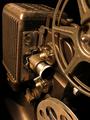
| 08/07/2002 01:05:00 PM |
The Forgotten 8mmby sylkComment: A classic projector shot, are you sure you took this picture just last week. Is that a little dust I see around the top of the light housing? :-P I like the way the lighting was done and the coloring, gives it that preserved look. The only nit pic I have is that I would have liked to have the knurling on the projection lens in sharp focus. Still, one of my top ten picks. |
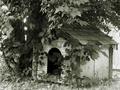
| 08/07/2002 12:42:00 PM |
Lucy's Doghouseby muckpondComment: In doggy years I imagine this house is verry old. Composition, focus and exposure are all good. Choice of monotone with the greenish-grey cast is good for the something old challenge. Will a famos art collector buy a print and hang it on his galllery wall? Probablu not in your or my lifetimes but still a high score in my book. |
| Photographer found comment helpful. |
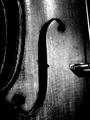
| 08/07/2002 12:32:00 PM |
Portrait of an Old Violinby paganiniComment: Ooh! I realy like the tezture of the wood grain and the monotone makes it look old. the contrast is a little strong for my tasts but that in no way detracts from the picture. What I am having trouble with is the composition, the curved symbol or cutout, whatever it is, as the center of focus needs to be at a prominate point of the picture, ie. center or at a third, In my opinion. Even so this is one of my top ten. |
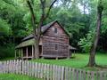
| 08/07/2002 12:22:00 PM |
The Tipton Place by indigo997Comment: I realy like the greens and browns of this picture. I am not all that comfortable with the composition, in my opinion the main porch should be facing onto the picture and that would place the striking wood siding on the right third for a more pleasing composition. |
| Photographer found comment helpful. |
| 08/07/2002 01:20:00 PM |
|
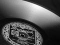
| 08/07/2002 01:16:00 PM |
78 rpmby floydComment: Does this bring back memories if my childhood. Sit'n round the phonograph player listnen to records. Excllent composition and lighting angle to highlight the groves in the vinyl. My ten pick this week. |
| Photographer found comment helpful. |
| 07/30/2002 12:15:00 PM |
|
Home -
Challenges -
Community -
League -
Photos -
Cameras -
Lenses -
Learn -
Help -
Terms of Use -
Privacy -
Top ^
DPChallenge, and website content and design, Copyright © 2001-2026 Challenging Technologies, LLC.
All digital photo copyrights belong to the photographers and may not be used without permission.
Current Server Time: 07/16/2026 08:57:57 AM EDT.