| Image |
Comment |
| 08/26/2003 06:41:04 AM |
Grandma's Vasesby Faye PekasComment: Pottery from the past is also a good idea. The image comes over a little on the soft side however, I would have liked to have seen it a bit sharper. |
| 08/26/2003 06:39:19 AM |
Evil from the shadows - Lest we forgetby JC_HomolaComment: A touchy subject especially over here in Germany, you wouldn't want to get caught with one of those flags here. The composition is good, I like the idea with the shadowy parts, althought the lighter parts I would have made a tad lighter, especially to bring out the white on the flag a little more. |
 Photographer found comment helpful. Photographer found comment helpful. |
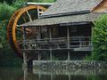
| 08/26/2003 06:35:48 AM |
Technology of Yesteryear by karmatComment: Good capture, very serene and a good example of the past. For me it is a little too tightly cropped, I would have liked to see more water in the foreground and a bit more room around the building, but then again that's only me - 9. |
| Photographer found comment helpful. |
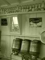
| 08/26/2003 06:32:26 AM |
Keeping cool, 40's style by jab119Comment: I don't know how you managed this straight from the camera but it turned out amazingly well. It's excellent and my pick for a top three placing - 10. |
| 08/26/2003 06:30:31 AM |
Milkin' Barnby muckpondComment: This is one of my three top favourites for this challenge. It immediately gives me the feeling I am back in the past in this actual room, wonderful! |
| Photographer found comment helpful. |
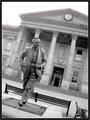
| 08/26/2003 06:16:19 AM |
Lord Wilson of Rievaulxby BobsterLobsterComment: That guy looks like he's in a hurry :-) I like how you put the tilt into the image, it does a lot for it. Good lighting (although it was taken at midday :-) and the idea to convert to grayscale was the best choice in my opinion. |
| Photographer found comment helpful. |
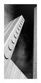
| 08/26/2003 06:01:36 AM |
November 22, 1963by crabappl3Comment: I don't know how you got that effect with one pillar tilting inwards and the one on the right being straight but it works! And how! The texture of the clouds in the background gives this that extra boost. The framing is spot on n'all. If this doesn't ribbon I'm selling my camera and taking up chess :-) |
| Photographer found comment helpful. |
| 08/26/2003 05:58:28 AM |
Sam Houstonby jab119Comment: This is an amazing photo, the contrast between the blue sky, black tree silohuettes, statue color and yellow light is an optimal mix. Just fantastic! This is one of my top picks for a ribbon. |
| Photographer found comment helpful. |
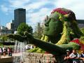
| 08/26/2003 05:01:31 AM |
Mosaicultureby nathaliedooComment: This is a nice statue, is that grass all around it? The rest of the photo seems a little too busy with all the buildings and tourists everywhere. I guess you couldn't have told everyone to go away, but maybe a different shooting angle could have made a difference. Perhaps going in lower and shooting upwards to get more sky into the shot and less people could have been a good idea. |
| Photographer found comment helpful. |
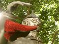
| 08/26/2003 04:46:12 AM |
Tin-Manby justineComment: Wizard of Oz right? The main focus is on the head and the shoes and hand are not fully in focus. Also the shoes seem to be a little distracting in the postion you have them. A slightly different shooting angle and different f/stop would have improved this somewhat. |
Home -
Challenges -
Community -
League -
Photos -
Cameras -
Lenses -
Learn -
Help -
Terms of Use -
Privacy -
Top ^
DPChallenge, and website content and design, Copyright © 2001-2025 Challenging Technologies, LLC.
All digital photo copyrights belong to the photographers and may not be used without permission.
Current Server Time: 11/22/2025 01:42:37 AM EST.