| Image |
Comment |
| 10/22/2003 09:13:27 AM |
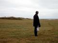
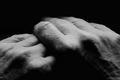
Where to?by valborgComment: The aimless footprints leading up to your subject show that this guy really doesn't know where to go, and the way he looks back to where he has come from is very fitting. This pic tells me a story, I like it! |
 Photographer found comment helpful. Photographer found comment helpful. |
| 10/22/2003 09:10:56 AM |
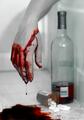
Escapeby seancComment: Now that is overkill! Pills, alcohol and slashed wrists! The capture of that blood drip is what gives this photo it's kick. Morbid but fantastic at the same time (10) |
| Photographer found comment helpful. |
| 10/22/2003 09:09:29 AM |
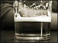
nursing a beerby ursulaComment: It's not good drinkin' alone you know :-) Good shot, looks like you just took a swig of that beer the second before you took the photo. The sepia is spot on (9) |
| Photographer found comment helpful. |
| 10/22/2003 09:02:48 AM |
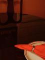
Dinner For Oneby sherComment: Good idea this one. It gave you a chance to polish the table huh? I'm trying to read what is on the poster in the reflection, I can't work it out tho :-) |
| Photographer found comment helpful. |
| 10/22/2003 09:00:29 AM |
Waitingby pcodyComment: Good depiction to the challenge, just a little too soft. Good choice of cropping (7) |
| Photographer found comment helpful. |
| 10/22/2003 08:57:09 AM |
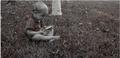
Contemtplating Potty Trainingby CamComment: A couple of small points could have changed this a lot. The crop is a little too tight at the top of the boys head. A tad more breathing space would have helped. The white line on the far left is distracting. Actually the whole border is uneven, there is no white at all on the bottom. I won't even go into the spelling mistake :-) (6) |
| Photographer found comment helpful. |
| 10/22/2003 08:28:06 AM |
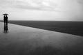
Grado, Italyby paolobnrComment: Nice B&W pic, very serene. Effective are the leading lines leading to the main subjects. I personally would have left a little more breathing space to the left of the people (8) |
| Photographer found comment helpful. |
| 10/22/2003 08:25:49 AM |
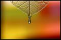
Just a drip!by JeanComment: Just amazing! The colors and tones work well, the leaf and water drop are very focused and sharp. If it weren't for the darkness in the lower right and upper left this would be one of the best pics I've ever seen on DPC (10) |
| Photographer found comment helpful. |
| 10/22/2003 08:18:03 AM |
Still single!by ParentxComment: Made me smile! Good idea, the challenge is well depicted here. I always like seeing original pics that don't follow the main flow. And this is one of those pics, good work - 8. |
| Photographer found comment helpful. |
| 10/22/2003 07:53:32 AM |
A Treeby yeamg4Comment: The photo is awesome! The title is "so so" and the border is basically lowering the quality of your image. This would have been way better without that distracting border there. Without the frame (10) with the frame (8). |
| Photographer found comment helpful. |
Home -
Challenges -
Community -
League -
Photos -
Cameras -
Lenses -
Learn -
Help -
Terms of Use -
Privacy -
Top ^
DPChallenge, and website content and design, Copyright © 2001-2026 Challenging Technologies, LLC.
All digital photo copyrights belong to the photographers and may not be used without permission.
Current Server Time: 01/14/2026 05:39:55 PM EST.