| Author | Thread |
Comments Made During the Challenge  |
|
|
10/28/2003 01:38:29 AM |
|
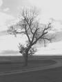
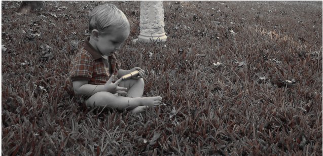
the crops a bit close and the pillar (probably reason for crop?) distracts from the image. |
|
 Photographer found comment helpful. Photographer found comment helpful. |
|
|
10/27/2003 12:02:30 PM |
|
Interesting color treatment. |
|
| Photographer found comment helpful. |
|
|
10/26/2003 10:54:53 PM |
|
Cute image, interesting use of duotone as well. Not getting a feeling of solitude or loneliness due to the happy tone to the image though. Fits the challenge generally. Focus is pretty good, lighting is okay, but a little dark to me. Also would prefer that white stand thing wasn't there, definitely distracts. A fine photo. 5 |
|
| Photographer found comment helpful. |
|
|
10/25/2003 04:23:20 PM |
|
desaturation is a beautiful thing....... especially for an image like this..... lends a hand coloured aura. |
|
| Photographer found comment helpful. |
|
|
10/24/2003 12:53:26 PM |
|
I think this one would have been better in either full color or full black and white, the desaturated coloring effect doesn't work well with this shot in my opinion. |
|
| Photographer found comment helpful. |
|
|
10/23/2003 09:33:30 PM |
|
I am not crazy about the use of desaturation here, and the garden item (bird bath?) is distracting the way it is placed and cropped. |
|
| Photographer found comment helpful. |
|
|
10/22/2003 03:42:14 PM |
|
I really like the colouring in this picture. My suggestions would be to remove the distracting objects, such as the white base, and the leaf? in the upper left corner. Cute kid, great pose |
|
| Photographer found comment helpful. |
|
|
10/22/2003 01:37:20 PM |
|
Interesting use of black and white with a hint of color. I feel that if the white bird bath or whatever it is in the back ground is too distracting and it takes away from the main subject. Without it I think the image would have been stronger. I like the composition otherwise. |
|
| Photographer found comment helpful. |
|
|
10/22/2003 01:27:34 PM |
|
what's the white stump coming out of the center of the frame ? It seems to take away from what would be a good portrait. same with the thing (leaf?) in the top left. The colour processing seems odd for the subject matter |
|
| Photographer found comment helpful. |
|
|
10/22/2003 08:57:09 AM |
|
A couple of small points could have changed this a lot. The crop is a little too tight at the top of the boys head. A tad more breathing space would have helped. The white line on the far left is distracting. Actually the whole border is uneven, there is no white at all on the bottom. I won't even go into the spelling mistake :-) (6) |
|
| Photographer found comment helpful. |
|
|
10/22/2003 08:46:33 AM |
|
very interesting colors here, nicely done, the chopped off birdbath/ornament detracts a little |
|
| Photographer found comment helpful. |
Home -
Challenges -
Community -
League -
Photos -
Cameras -
Lenses -
Learn -
Help -
Terms of Use -
Privacy -
Top ^
DPChallenge, and website content and design, Copyright © 2001-2026 Challenging Technologies, LLC.
All digital photo copyrights belong to the photographers and may not be used without permission.
Current Server Time: 06/28/2026 04:40:21 PM EDT.