| Image |
Comment |
| 06/21/2006 01:14:02 AM |
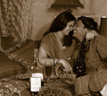
Indulge into happinessby DigiFotoBuddyComment: Hi Shailesh-
I agree with the voters who wanted the color version. Colored fabrics imply a certain richness and luxury that just don't come across in duotone.
Something that might be interesting with a shot like this is more depth of field. Maybe focus just on the wine and grapes and let the models be a background element instead of competing for focus with the wine. Or vice versa - show the couple enjoying their time. There have been a lot of Lensbaby posts lately, this might be an interesting shot to try something like that as well. Good solid concept! |
 Photographer found comment helpful. Photographer found comment helpful. |
| 06/21/2006 01:10:26 AM |
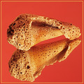
Naturally Textured - Take IIby DigiFotoBuddyComment: Hi Shailesh-
Don't hit me, but I like the original photo much better. I think that red is a very very difficult color to photograph, since it tends to oversaturate very easily, and it overwhelms the natural color variations of the shell. The original looks much cleaner and much sharper, where the retake lacks that nice sharp quality. |
| Photographer found comment helpful. |
| 06/21/2006 01:07:23 AM |
tag.... you're it!by margiemuComment: Hi Margie!
What a couple of cuties! I love the way your daughter's pigtails are caught mid-bounce.
You did well capturing a shadow and really making it a main element in the photo. A lot of the other entries included a shadow but weren't about the shadow, and you've avoided that particular pitfall of the theme. I do think the light here is a bit harsh, and it should use some sharpening. I think a polarizer might help tone down the brightness, since I know the kids probably don't play like that at sunrise when the light is all golden and pretty. |
| Photographer found comment helpful. |
| 06/21/2006 01:02:57 AM |
Ahhh....by margiemuComment: Hello Margie!
This is a great concept. Great bubbles! I think the composition would benefit from some more, warmer lighting. There's a lot of dark and empty space, especially along the windows. I wonder if moving the camera more to the left and adding a vase of flowers or a box of chocolates would help? Definitely a couple lower votive candles on the ledge along the front right. Basically the scene just needs some fleshing out. |
| Photographer found comment helpful. |
| 06/21/2006 12:58:28 AM |
paper = outletby blackenedwhiteComment: CTP2 Becky here -
I actually wondered if this was you during the voting... I think this was a fantastic concept. A refreshingly unusual take on the theme. I like the sort of urban grunge feeling, it adds to the sense of being frustrated ad burnt out very well. I think my only critique is that the lighting is a bit harsh on the whites, especially the teeth. It's almost hard to look at. Maybe a polarizer would help tone it down? Nice work for a last minute entry! |
| Photographer found comment helpful. |
| 06/21/2006 12:54:12 AM |
|
| Photographer found comment helpful. |
| 06/21/2006 12:50:23 AM |
Poppyby KitaComment: grr, double posted. ignore this one. ;-) Message edited by author 2006-06-21 00:50:52. |
| Photographer found comment helpful. |
| 06/21/2006 12:50:11 AM |
Poppyby KitaComment: Honestly, Kita, I loved this one precisely because he wasn't smiling. I think this picture is much better than the score it received. |
| Photographer found comment helpful. |
| 06/20/2006 10:18:02 AM |
|
| Photographer found comment helpful. |
| 06/17/2006 10:28:50 PM |
|
| Photographer found comment helpful. |
Home -
Challenges -
Community -
League -
Photos -
Cameras -
Lenses -
Learn -
Help -
Terms of Use -
Privacy -
Top ^
DPChallenge, and website content and design, Copyright © 2001-2026 Challenging Technologies, LLC.
All digital photo copyrights belong to the photographers and may not be used without permission.
Current Server Time: 06/26/2026 04:30:24 PM EDT.