| Image |
Comment |
| 06/12/2006 12:17:25 AM |
|
 Photographer found comment helpful. Photographer found comment helpful. |
| 06/07/2006 09:52:21 PM |
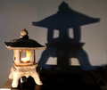
Fool On The Hillby GunnsiComment: Hi Gunnar -
I think the frame is what really makes this image interesting. I actually don't like the processing on it very much, The clouds and the hill are nice and sharp, though verging on looking computer generated. There's a little hint of oversharpening along the horizon on the left, where there's a visible halo. The model obviously has been cut into a different layer from the rest of the image, and looks very unnatural - much too sharp and angular - as well as having absolutely no natural texture left. Overall, it looks more like a scene from an online mass-multi or Final Fantasy, which might be cool for a gaming graphic but just does nothing for me as a photograph.
Perhaps much of that is more taste than tech, since it did have a rather decent finish. Congrats on breaking into the double digits on this one! |
| Photographer found comment helpful. |
| 06/07/2006 09:43:23 PM |
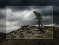
"Sitting in his nowhere land"by yankoComment: Hi Richard -
For being a shoehorned entry, you certainly found a good title. Fitting and not overused throughout the field of entries.
One thing I've noticed here is that DPC voters do hate dark, processed images, except when it looks like a draganizer action. We probably have Joey to blame for bringing that style into vogue here.
Whatever you did put the photo through, it has retained really nice clarity and texture. |
| Photographer found comment helpful. |
| 06/07/2006 09:39:01 PM |
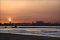
Here comes the sunby alexgarciaComment: Hi Alex!
Ahh, one of my challenge twins! Congrats on picking such a fine title for your entry ;-)
I can't say I don't like the concept, but I think the sunrises and sunsets probably gave the voters the impression that the entries were shoehorned in.
From a more technical perspective, it's a rather dull sunrise, with little texture and color variation in the sky. The buildings along the shore are rather uninteresting, and the pier(?) in the foreground is really distracting. |
| Photographer found comment helpful. |
| 06/07/2006 09:32:43 PM |
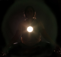
Enlighteningby DigiFotoBuddyComment: Hi Shailesh!
I definitely think you suffered from the problem that truth and perception are not one in the same. Without knowing how this was done, it does look like at least two light sources. Knowing after the fact how it was done, it's truly ingenious, but we don't know that during voting.
As a photograph in general, some things I would do are to let the model's hair down to spill over her shoulders, put her in a black shirt to match the background, and add a reflector in front to reflect light onto her face and hands. I'd love to see the serene meditative expression on her face, and her mudhras currently are lost in the dark. |
| Photographer found comment helpful. |
| 06/07/2006 09:25:49 PM |
Engrossedby margiemuComment: Hi Margie!
Nice work here! I'll echo what others have said about the reflected light, that's really an inventive and yet totally commonplace use of a single light source. Heh! I might have tried to shoot this a more of a side angle so it looked more candid - it's easier to sneak up on people from the side than straight on, so a slightly sideways shot might have looked more.. natural? believable? Not sure of the word I'm searching for. Congrats on finishing in your own top four! |
| Photographer found comment helpful. |
| 06/07/2006 09:19:52 PM |
Desvasidizedby blackenedwhiteComment: Hi OJ!
High scoring photos are always hard to critique, so I'm generally rather brief about them.
I like the world of darkness comic book feel of this photo. There is a terrific texture in your skin here that lends the image a nice grittiness. The soft focus works well, and the blown highlights give an impression of heat. I also like that your hair is in your eyes, but perhaps there is just a touch too much there. |
| Photographer found comment helpful. |
| 06/07/2006 08:31:02 PM |
|
| Photographer found comment helpful. |
| 06/07/2006 08:27:23 PM |
|
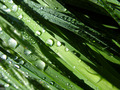
| 06/07/2006 08:25:50 PM |
grass with dewby shaundpComment: Nice texture here, would like to see it a bit larger and with more vibrancy. |
Home -
Challenges -
Community -
League -
Photos -
Cameras -
Lenses -
Learn -
Help -
Terms of Use -
Privacy -
Top ^
DPChallenge, and website content and design, Copyright © 2001-2026 Challenging Technologies, LLC.
All digital photo copyrights belong to the photographers and may not be used without permission.
Current Server Time: 06/26/2026 06:28:28 PM EDT.