| Image |
Comment |
| 05/15/2002 03:19:00 AM |
Up and Overby elliottwhitleyComment: A fair catch, but a faster shutter would have worked better here, IMO. A little motion blur is sometimes a good thing, but the only things sharp here are the lower end of the pole and the crossbar. Tell her to watch the grip on that left hand. Did you prefocus on the crossbar? |
| 05/14/2002 04:00:00 AM |
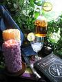
Tea Time at Martha Stewart'sby hokieComment: Hmmm. Nicely composed, and the exposure up front is good. A lower angle might have let the rear candle flame show against the cloth, but would have complicated getting the wiccan whatnot to show. I guess I just can't see iced tea as belonging in this setting - maybe some dark red wine. Overexposure in URHC detracts. |
| 05/13/2002 10:38:00 PM |
|
| 05/14/2002 04:09:00 AM |
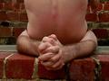
Halasanaby lisaeComment: Could be sharper, but I'm a bit relieved it's not. Thank you for saying no to crack. |
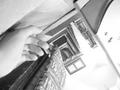
| 05/20/2002 06:25:00 PM |
dang... by iraeComment: Thanks so much for the comments, and especially the ones with suggestions (lighting and composition). I had some trouble taming the little slave flash behind my left leg, and I think I kicked it out of position while hobbling onto the set. Tough shot to do solo. The waistband at the back bugged me a little, too, but after thirty or so attempts (hop into the frame, adjust pants, drop change, trip shutter, hop behind camera to check composition) I'd had enough. Cheers! |
| 05/15/2002 03:26:00 AM |
The Thinkerby DavidComment: Good looking kid, and a well set scene. Pretty good tones - I prefer a little more contrast, but this probably accurately reflects the quality of the available light. A bit dark, though. I'd set gamma to 1.1 and/or increase the brightness just a notch. |
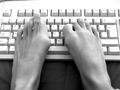
| 05/14/2002 04:13:00 AM |
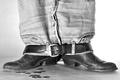
my left footby censuraComment: That explains all kind of things I've been reading in people's comments, although I bet their toes are hairier and more dexterous. Very nice B/W tone, and an interesting take on 'upside down'. Might have cropped down to lose the edge of the keyboard in the ULCH. |
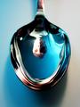
| 05/14/2002 03:54:00 AM |
Blue Moon Spoonby greenem2Comment: Oooooh. Very nice. Excellent sharpness and clarity. Face a little closer to the spoon, perhaps? The mixed lighting shows (yellow at R, blue at L), but it's a weird enough image (IMO) that it doesn't matter. Looks like an awful haircut. |
 Photographer found comment helpful. Photographer found comment helpful. |
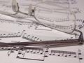
| 05/14/2002 04:14:00 AM |
The Concertoby AndyLeeG4Comment: Pretty. I'd rather have the lenses at front and in focus with the temples receding into the blur. |
| 05/13/2002 10:28:00 PM |
two weeks laterby jonathansComment: Better with your pet iguana munching on your fingers. heh heh heh. One of the few submissions that aren't embarassingly horrible. |
Home -
Challenges -
Community -
League -
Photos -
Cameras -
Lenses -
Learn -
Help -
Terms of Use -
Privacy -
Top ^
DPChallenge, and website content and design, Copyright © 2001-2026 Challenging Technologies, LLC.
All digital photo copyrights belong to the photographers and may not be used without permission.
Current Server Time: 07/17/2026 05:41:45 PM EDT.