| Image |
Comment |
| 05/25/2002 02:21:00 AM |
Mind Games: A game within a gameby dpchallengerComment: Great story here! Love how hard you're gripping your hand. Looks like the edge of the king and the R edge of the 4 are oof, and I'd like more light on the fg (slight color cast there, red or magenta?). Not an easy kind of image to pull off. Nice work. |
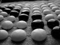
| 05/25/2002 01:42:00 AM |
Ancient Atariby svaledaComment: Excellent contrast bwt the smooth stones and rough cloth. Great clarity in the fg and selective focus. Looks like the camera wasn't quite level, but that could be fixed (and the unnecessary bit of bg removed) if you cropped to 640X427. One of my favorites. |
| 05/25/2002 03:20:00 AM |
Sin Is Inby ReubenComment: Well done except for the shadow on S and I. Does draw attention there, but I'd have found another way. |
 Photographer found comment helpful. Photographer found comment helpful. |
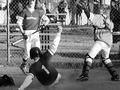
| 05/26/2002 02:23:00 AM |
One Steals Homeby cthenkComment: Good timing, but composition is too tight, IMO, bg is distracting and focus looks off. Don't know if B/W was a good choice here, although it does give that newspaper look. |
| 05/21/2002 10:35:00 AM |
|
| 05/26/2002 02:06:00 AM |
Eight ball corner pocket..by justineComment: Good idea to turn the other numbers away to keep the attention on the eight ball. Wish it weren't right in the center of the frame. Seems a bit underexposed, as well. |
| 05/25/2002 03:32:00 AM |
Sunday Morning Thumb Wrestlingby lisaeComment: Lisae? (I'd recognize those forearms anywhere.) It looks to me like the camera decided to focus on the pattern on the couch instead of on your hands, since the sleeve of your shirt and BF's arm hair are oof. The motion blur on the thumbs works, but the still bits ought to be a little sharper. Compositionally, I'd like more focus on the hands rather than including your knee and the whatsit at the LLHC. |
| 05/25/2002 02:17:00 AM |
It's My Turn!by MrsKroComment: Great subject and colors. I'd have stopped down a little to get the red piece in the fg into focus. Composition is a little crowded at the top, and you might have moved the dice (they make a good focal point) more off center by shooting from a little further left. |
| 05/25/2002 02:03:00 AM |
Days Gone By by tlalondeComment: Fantastic textures and wonderful light. This is what B/W is for. Don't let anyone tell you otherwise. The photograph vanishing into the shadow bothers me a little, and its edge shows some jaggies from sharpening. I find that for web images, a positive gamma adjustment of 1.1 is a good idea, as shadow detail seems to get lost otherwise. Top ten. |
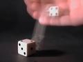
| 05/25/2002 03:01:00 AM |
High Rollerby connieComment: Interesting effect. Almost looks like you used two dice, or covered the lens during exposure (no trail from the lower moving die to the one in fg). The blurry hand is a little distracting. You might have held it very still, then dropped the die to bounce off instead of moving your hand to drop it. Just an idea. |
Home -
Challenges -
Community -
League -
Photos -
Cameras -
Lenses -
Learn -
Help -
Terms of Use -
Privacy -
Top ^
DPChallenge, and website content and design, Copyright © 2001-2026 Challenging Technologies, LLC.
All digital photo copyrights belong to the photographers and may not be used without permission.
Current Server Time: 07/17/2026 03:48:15 AM EDT.